Accessibility Features to Prioritize in Online Learning Platforms
 Jun, 27 2026
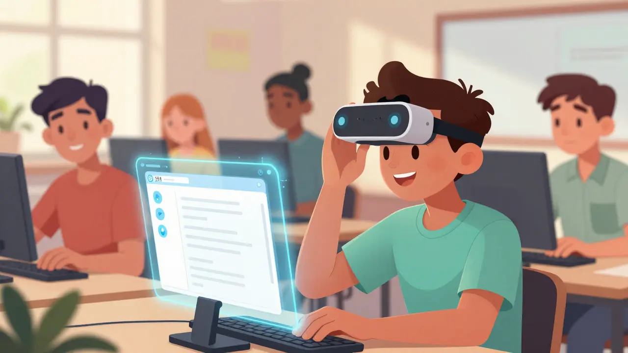
Imagine trying to read a textbook where the text is blurred, or listening to a lecture without any audio cues. For millions of students with disabilities, this isn't an imagination exercise-it's their daily reality on many online learning platforms. When you build or choose a Learning Management System (LMS), ignoring accessibility doesn't just hurt a small group of users; it breaks your platform for everyone. From students using screen readers to those navigating with keyboards alone, the right features make content usable for all.
In 2026, accessibility is no longer a nice-to-have bonus. It’s a legal requirement under laws like the Americans with Disabilities Act (ADA) and Section 508 in the US, and similar regulations globally. But beyond compliance, accessible design improves engagement, retention, and grades for every learner. So, what exactly should you prioritize when setting up or evaluating an online learning environment?
Navigational Clarity: Keyboard and Screen Reader Support
The first barrier most learners hit is navigation. If a student can’t move through your platform logically, they can’t learn. This starts with robust keyboard support. Many users with motor impairments or visual disabilities rely entirely on a keyboard to browse. Your platform must allow full navigation using the Tab, Shift+Tab, Enter, and arrow keys.
Think about the last time you tried to use a dropdown menu or a modal popup with only a keyboard. Did it trap you? Did you lose your place? These are common pitfalls. A good LMS ensures that focus indicators-those visible outlines around clickable elements-are high-contrast and obvious. Without them, a user might not know which button they’re about to click.
Then there’s screen reader compatibility. Tools like JAWS, NVDA, and VoiceOver interpret digital content aloud. For these tools to work, your platform needs proper semantic HTML structure. This means using actual heading tags (<h1> to <h6>) rather than bolded text to show hierarchy. It means labeling buttons clearly instead of relying on icons alone. An icon of a "gear" means nothing to a screen reader unless it has an aria-label saying "Settings."
- Skip Navigation Links: Allow users to jump straight to the main content, bypassing repetitive menus.
- Logical Tab Order: Ensure the sequence of focusable elements follows the visual layout.
- ARIA Landmarks: Use Accessible Rich Internet Applications (ARIA) roles to define regions like "navigation," "main," and "complementary."
Visual Design: Contrast, Color, and Text
Visual accessibility covers more than just making text large. It’s about ensuring information is perceivable regardless of how someone sees. The Web Content Accessibility Guidelines (WCAG) 2.2 provide specific standards here, particularly regarding color contrast.
Text must have a contrast ratio of at least 4.5:1 against its background for normal size, and 3:1 for large text. Low contrast makes reading exhausting for people with low vision, dyslexia, or even just those looking at a screen in bright sunlight. Don’t rely on color alone to convey meaning. For example, don’t mark required form fields only with a red border. Add an asterisk (*) and a text label like "Required." This helps color-blind users who might not see the red distinction.
Font choice matters too. Sans-serif fonts like Arial, Verdana, or Open Sans are generally easier to read on screens than decorative or serif fonts. Allow users to resize text up to 200% without breaking the layout. If the text expands, does the container expand with it? Or does it overflow and get cut off? Testing this simple scenario reveals many hidden bugs in responsive designs.
| Feature | WCAG Standard | Why It Matters |
|---|---|---|
| Color Contrast | 4.5:1 (AA Level) | Ensures readability for low-vision users |
| Text Resizing | Up to 200% | Accommodates varying visual acuity |
| Color Dependency | Not used alone | Supports color-blind users |

Audio and Video: Captions, Transcripts, and Audio Descriptions
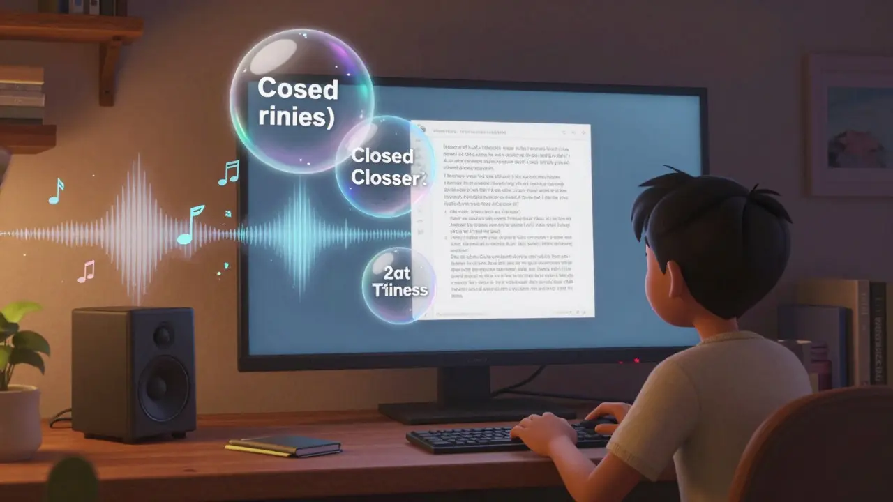
If your courses include video lectures or audio podcasts, you’re dealing with two major accessibility hurdles: hearing and cognitive processing. Closed captions are non-negotiable. They help deaf and hard-of-hearing students, but also benefit anyone learning in a noisy environment or studying a second language.
Captions must be accurate, synchronized, and identify speakers. Auto-generated captions from AI tools are getting better, but they still struggle with technical jargon, accents, and overlapping speech. Always have a human review and edit them. Inaccurate captions are worse than none because they confuse the learner.
Transcripts go a step further. They provide a full text version of the audio/video content, including descriptions of important visual elements. A transcript allows a student to skim for key points, search for terms, or read along while listening. This supports diverse learning styles and aids in retention.
For videos, consider audio descriptions. This is a secondary audio track that describes key visual actions, scenes, and expressions. Imagine a biology lesson showing a diagram of a cell. A sighted student sees the mitochondria labeled. A blind student hears the narrator say, "The image shows a cell diagram. On the left, the nucleus is highlighted in blue." Without this description, the visual data is lost.
Document Accessibility: PDFs and Office Files
One of the biggest pain points in online education is downloadable documents. Instructors often upload scanned PDFs or complex Word files that are essentially images to screen readers. This creates a wall between the student and the material.
To fix this, promote the use of accessible document creation practices. PDFs should be tagged correctly, with a logical reading order defined. Headings, lists, and tables must be structured semantically within the file. Alt text for images inside the PDF is crucial. If you share PowerPoint slides, ensure they follow the same rules: proper heading levels, alt text for charts, and readable contrast.
Consider offering alternative formats. Plain text (.txt), HTML, or EPUB files are often more accessible than PDFs because they are inherently flexible and reflowable. Encourage instructors to create content natively in accessible formats rather than converting inaccessible ones later.
Cognitive Load and Customization
Accessibility isn’t just about physical disabilities; it includes neurodiversity. Students with ADHD, autism, or anxiety may struggle with cluttered interfaces, flashing animations, or rigid deadlines. Your platform should offer customization options.
Allow users to adjust the pace of learning. Disable auto-play videos. Provide clear, consistent layouts across all pages so users don’t have to relearn navigation for each new module. Avoid timed quizzes unless absolutely necessary, and if you do use them, provide extra time accommodations easily.
Use plain language. Break complex instructions into short, bulleted steps. Define jargon on first use. A clean, distraction-free interface reduces cognitive load and helps all students focus on the content, not the tool.
Testing and Continuous Improvement
You can’t assume your platform is accessible. You have to test it. Start with automated tools like WAVE or Axe DevTools. These plugins scan your site for common errors like missing alt text or poor contrast. But remember: automation only catches about 30-40% of issues.
The rest requires manual testing. Test with keyboard-only navigation. Test with a screen reader. Even better, involve real users with disabilities in your beta testing phase. Their feedback will reveal nuances that scripts miss. Create a feedback loop where students can report accessibility barriers easily, and commit to fixing them promptly.
Accessibility is not a one-time checklist. It’s an ongoing process. As you update your LMS, add new plugins, or change templates, you must re-evaluate. Keep documentation updated. Train your instructional designers and faculty on accessible content creation. When everyone shares responsibility, the entire learning ecosystem becomes more inclusive.
What is the most important accessibility feature for an LMS?
Keyboard navigability is arguably the most critical. If a user cannot access the interface without a mouse, other features like captions or contrast adjustments become irrelevant because they can't reach them. Ensuring all interactive elements are reachable and operable via keyboard is the foundation of digital accessibility.
Do I need to caption all videos on my learning platform?
Yes. Under WCAG guidelines and laws like the ADA, all time-based media (video and audio) must have captions. This includes pre-recorded lectures, embedded YouTube videos, and audio-only podcasts. Accurate, human-edited captions are preferred over auto-generated ones to ensure clarity and correctness.
How can I make PDFs accessible for students with disabilities?
Accessible PDFs require tagging, logical reading order, proper heading structures, and alt text for images. Avoid scanning documents as images. Instead, create PDFs from well-structured Word or HTML sources. Use Adobe Acrobat Pro or similar tools to check and repair PDF accessibility tags before uploading them to your LMS.
What is the difference between WCAG AA and AAA?
WCAG AA is the standard level of compliance required by most laws and institutions. It includes criteria like 4.5:1 contrast ratio and basic keyboard access. AAA is the highest level, requiring stricter standards like 7:1 contrast and sign language interpretation for some videos. Aim for AA as your baseline, and strive for AAA where feasible.
Can automated tools fully check my platform's accessibility?
No. Automated tools can identify technical errors like missing HTML attributes, but they cannot judge context, usability, or logic. For example, a tool won't know if alt text is meaningful or if the navigation flow makes sense. Manual testing with assistive technologies and real user feedback is essential for true accessibility.