Accessibility in Design Courses: Mastering Contrast, Motion, and Keyboard Use
 Jul, 12 2026
Most design students learn color theory before they learn contrast ratios. They study animation curves before they understand motion sensitivity. And they obsess over mouse interactions while ignoring the keyboard entirely. This gap isn't just an oversight; it's a structural flaw in how we teach digital product creation. When you ignore accessibility during the learning phase, you bake exclusion into your professional habits. Fixing this later is expensive and difficult.
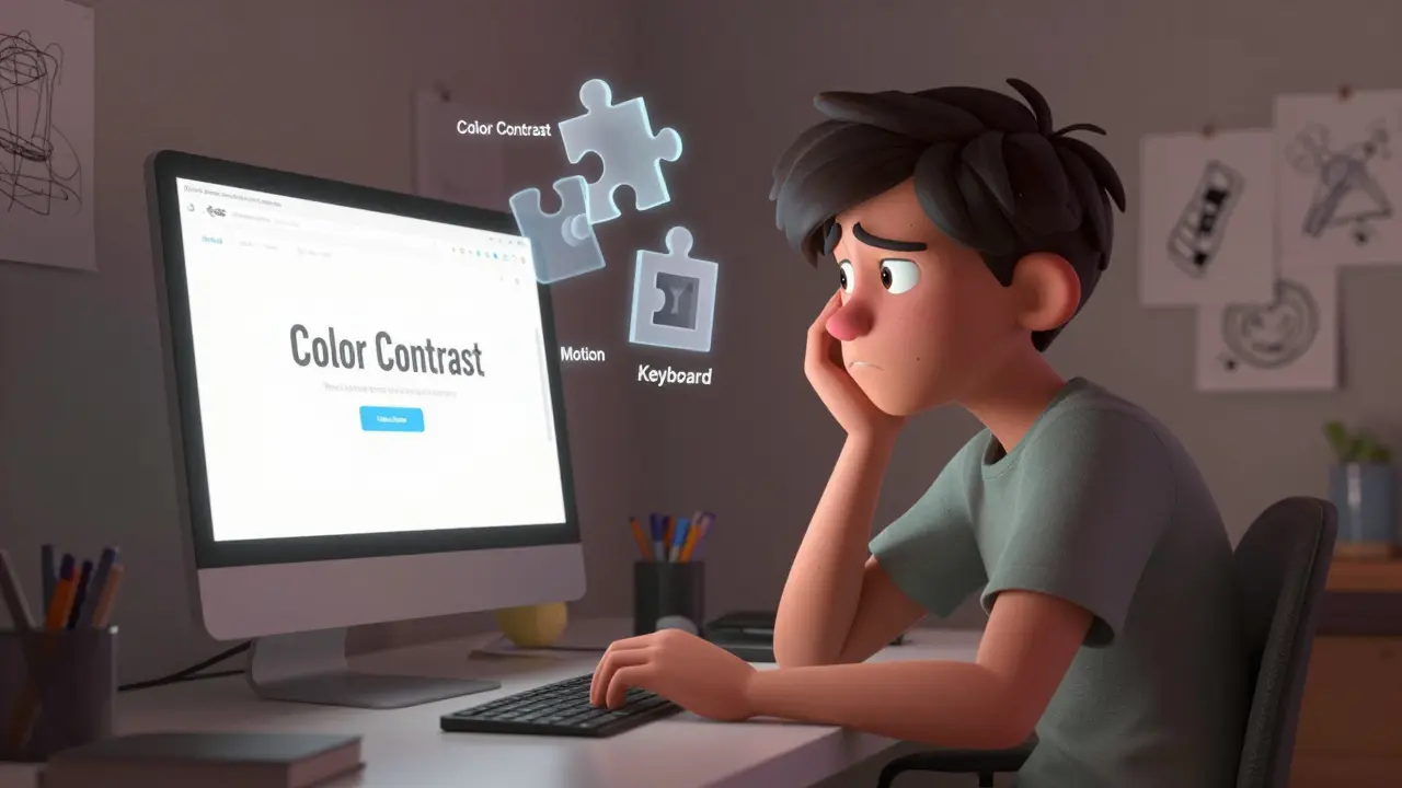
The good news? You don't need to be an expert in disability advocacy to start designing better interfaces. You just need to treat three specific pillars-color contrast, motion control, and keyboard navigation-as non-negotiable fundamentals, right alongside typography and layout. Let's look at how to integrate these concepts effectively into your workflow and your education.
Why Accessibility Fails in Traditional Curricula
Design schools often treat accessibility as a "nice-to-have" module added at the end of a semester. Students build beautiful prototypes using Figma, get praised for their visual flair, and move on. The result is a generation of designers who can make things look great but struggle to make them usable for everyone. This approach creates a disconnect between aesthetic goals and functional reality.
The problem compounds when tools themselves hide complexity. Modern design software automates many technical details, which is helpful for speed but harmful for understanding. If you never have to manually set a tab order or check a contrast ratio because the tool does it for you, you won't know what happens when that automation fails. Real-world development doesn't always forgive lazy assumptions.
Pillar One: Color Contrast Beyond Aesthetics
Contrast is about readability, not just style. Many students pick colors based on brand guidelines or personal taste without considering how those colors perform under different lighting conditions or for users with visual impairments. Low contrast text causes eye strain and makes reading difficult for people with low vision, color blindness, or even just cataracts.
| Content Type | AA Standard (Minimum) | AAA Standard (Enhanced) |
|---|---|---|
| Normal Text (< 18pt) | 4.5:1 | 7:1 |
| Large Text (≥ 18pt or 14pt bold) | 3:1 | 4.5:1 |
| UI Components & Graphics | 3:1 | N/A |
The Web Content Accessibility Guidelines (WCAG) provide clear numbers here. For normal body text, you need a contrast ratio of at least 4.5:1 against the background. Large text gets a bit more leeway at 3:1. But don't stop there. UI components like input borders, icon buttons, and focus indicators also need a 3:1 contrast ratio against adjacent colors. If your button border blends into the white background, a screen reader user might hear the label, but a sighted keyboard user won't see where the button ends and the page begins.
Practical tip: Stop guessing. Use browser extensions like Stark or Axe DevTools to audit your designs in real-time. These tools overlay heat maps showing exactly where your contrast fails. It’s shocking how often light gray text on a white background passes a designer's eye but fails the math.
Pillar Two: Respecting User Control Over Motion
Animation adds delight, but it can also cause nausea, dizziness, and disorientation. For users with vestibular disorders, severe motion sickness, or epilepsy, uncontrolled movement isn't a feature-it's a barrier. Yet, design courses frequently encourage "micro-interactions" and "smooth transitions" without teaching how to disable them.
The key concept here is the CSS media query @media (prefers-reduced-motion: reduce). Operating systems allow users to signal that they prefer minimal animation. Your design must respect this setting. If a user has this preference enabled, parallax scrolling should stop, fade-ins should become instant cuts, and auto-playing videos should pause by default.
How do you teach this? Start by auditing your own animations. Ask yourself: Is this motion necessary for function, or is it purely decorative? If it's decorative, it must be skippable or reducible. If it's functional (like a loading spinner), ensure it doesn't flash more than three times per second to avoid triggering seizures. Simple rule: Never force motion. Always give the user the off switch.

Pillar Three: Keyboard Navigation is Not Optional
This is where most portfolios fail. You open a case study, hit the 'Tab' key, and nothing happens. Or worse, the focus jumps randomly across the screen. Keyboard-only users include people with motor disabilities, repetitive strain injuries, and even power users who simply prefer efficiency. If your site isn't navigable via keyboard, it's broken for millions of people.
Keyboard accessibility relies on two main things: logical tab order and visible focus states. Logical tab order means elements are visited in a sequence that matches the visual flow of the page. Don't let the DOM structure dictate a chaotic jump from header to footer to sidebar. Visible focus states mean the currently selected element is clearly highlighted. The default blue outline browsers add is ugly, yes, but removing it without replacing it with something equally visible is a cardinal sin of accessible design.
- Test with no mouse: Unplug your mouse. Navigate your entire prototype using only Tab, Shift+Tab, Enter, and Spacebar.
- Check skip links: Add a "Skip to Content" link at the very top of your HTML. This allows keyboard users to bypass repetitive navigation menus.
- Manage focus traps: Modals and pop-ups must trap focus within themselves until closed. Users shouldn't accidentally tab out of a critical dialog box.
In design tools, this means prototyping interaction flows that account for focus management. In code, it means using semantic HTML tags like <button> instead of <div> elements styled to look like buttons. Semantic HTML comes with built-in keyboard support; custom divs do not.
Integrating Accessibility into Your Learning Process
You don't need a separate course to learn this. Weave it into every project. When you start a new assignment, create a checklist:
- Did I check contrast ratios for all text and UI elements?
- Have I provided a reduced-motion alternative for all animations?
- Can I navigate the entire interface using only a keyboard?
- Are my images tagged with descriptive alt text?
- Is my form labeled correctly with associated labels, not just placeholders?
Treat these checks as part of your critique process. When presenting work, ask peers to try navigating with their eyes closed (simulating screen reader use) or using only the keyboard. This builds empathy and practical skill simultaneously.
Tools That Bridge the Gap Between Design and Code
Designers often feel disconnected from the implementation phase. However, several tools now help bridge this gap. Storybook allows you to build isolated components and test them for accessibility early. Lighthouse in Chrome DevTools provides automated audits that score your accessibility performance. While automated tools catch only about 30-40% of issues, they are excellent for catching common errors like missing alt tags or insufficient contrast.
For deeper testing, consider using actual assistive technologies. Try navigating your site with VoiceOver on macOS or NVDA on Windows. It sounds tedious, but hearing how your headings are read aloud will instantly reveal if your information hierarchy makes sense. If the screen reader reads "Heading level 6" for your main title, you've messed up your semantic structure.

The Business Case for Accessible Design Education
Beyond ethics, there's a strong business argument. The World Health Organization estimates that over one billion people worldwide have a disabling condition. Ignoring this demographic means ignoring a massive market segment. Moreover, accessible design improves usability for everyone. Captions help people watching videos in noisy cafes. High contrast helps people reading screens in bright sunlight. Keyboard shortcuts help power users work faster.
Companies are increasingly demanding accessibility expertise. Job postings for UX designers now regularly list WCAG knowledge as a requirement. By mastering these skills early, you position yourself as a versatile, forward-thinking professional. You're not just making pretty pictures; you're building inclusive products.
Common Pitfalls to Avoid
Even well-meaning designers fall into traps. Here are the most frequent mistakes:
- Relying on color alone: Don't use red/green to indicate error/success. Add icons or text labels. Color-blind users won't see the difference.
- Hiding focus styles: Removing the browser's default focus outline without providing a custom one leaves keyboard users lost.
- Auto-playing media: Videos or audio that play automatically disrupt screen readers and can trigger seizures. Always require user initiation.
- Vague alt text: "Image of a dog" is okay. "Dog" is better. But for decorative images, use empty alt attributes (alt="") so screen readers skip them entirely.
Avoiding these pitfalls requires intentionality. It means slowing down your design process to think about edge cases. It means accepting that perfect aesthetics sometimes need to yield to clarity and function.
Building a Habit of Inclusive Thinking
Accessibility isn't a checkbox. It's a mindset. Once you start seeing interfaces through the lens of diverse abilities, you'll notice barriers everywhere. You'll spot confusing forms, hidden controls, and overwhelming layouts. This awareness makes you a better designer, period.
Start small. Pick one project. Audit it for contrast, motion, and keyboard use. Fix what you find. Then do it again on the next project. Over time, these practices become second nature. You'll stop thinking "I need to make this accessible" and start thinking "This is how I design." That shift is the ultimate goal of any design education.
Do I need to be a developer to implement accessibility?
No. While developers handle the code, designers define the requirements. You must specify contrast ratios, focus states, and animation preferences in your handoff files. Clear design specs prevent developers from having to guess how to make things accessible.
What is the difference between AA and AAA WCAG standards?
AA is the minimum legal standard for most websites and apps. It requires 4.5:1 contrast for normal text. AAA is enhanced accessibility, requiring 7:1 contrast. Aim for AA as a baseline, but strive for AAA where possible, especially for large text and critical UI elements.
How do I test keyboard navigation in Figma?
Figma's prototype mode supports basic tab navigation. Click "Play," then press Tab to move between interactive elements. Ensure the focus ring appears on each element and moves in a logical order. Note that Figma doesn't perfectly simulate real browser behavior, so always test live code as well.
Is it okay to remove the default browser focus outline?
Only if you replace it with a custom focus indicator that is equally visible. Never remove focus outlines entirely. Keyboard users rely on them to know where they are on the page. A subtle colored border or background change works well.
What tools should beginners use for accessibility auditing?
Start with free browser extensions like WAVE or Axe DevTools. They highlight errors directly on the page. For design files, use Stark or Contrast plugins in Figma/Sketch. These tools provide immediate feedback without requiring coding knowledge.
michael rome
July 13, 2026 AT 10:35I've been in UX for fifteen years and I can tell you that the gap between design school theory and production reality is wider than most people realize. The problem isn't just about learning the rules of WCAG, it's about internalizing the mindset that accessibility is a feature, not a compliance checkbox. When you start treating contrast ratios and keyboard navigation as fundamental building blocks rather than afterthoughts, your entire design process becomes more robust. You stop relying on visual cues alone and start thinking about information hierarchy and interaction patterns in a much deeper way. It changes how you approach every single project.
Andrea Alonzo
July 14, 2026 AT 14:26It is absolutely heartbreaking to see how many talented designers are completely unaware of the barriers they are creating for users with disabilities, especially when those barriers could be so easily avoided with just a little bit of upfront planning and consideration for diverse needs. I have spent countless hours trying to explain to junior team members why removing the default focus outline is such a critical error, and it often feels like speaking a different language because they simply do not understand the cognitive load placed on keyboard-only users who rely on that visual feedback to navigate complex interfaces efficiently. We need to integrate these concepts into the very first week of any design curriculum so that students develop an inclusive instinct from day one rather than having to unlearn bad habits later in their careers when the stakes are much higher and the consequences of exclusion are far more damaging to both the user experience and the brand reputation.
Saranya M.L.
July 16, 2026 AT 06:22The pedagogical framework currently employed by Western design institutions is fundamentally flawed in its prioritization of aesthetic superficiality over functional inclusivity, which results in a systemic failure to produce competent practitioners capable of adhering to international standards such as WCAG 2.1 AA. In India, we recognize early on that technology must serve the masses, including those with varying abilities, and thus our educational models emphasize rigorous technical validation alongside creative expression, ensuring that contrast ratios and motion preferences are not merely optional add-ons but core components of the design methodology itself. This disparity highlights a significant cultural divergence in how digital equity is perceived and implemented across global markets.
om gman
July 18, 2026 AT 03:58oh look another lecture on how to make things boring and safe while ignoring the actual art of design because apparently aesthetics don't matter if some random person can't tab through your masterpiece properly i mean sure lets all pretend that creativity is dead if we follow a few simple rules about contrast and motion sensitivity but really who cares if the site looks amazing right
Jeanne Abrahams
July 19, 2026 AT 04:05In South Africa, we deal with infrastructure challenges that make lightweight, accessible code essential, not just a nice-to-have for disability advocacy. If your site is heavy with unnecessary animations and poor contrast, it fails not just for visually impaired users but for anyone on a slow connection or using an older device. Accessibility is often a proxy for performance and resilience in emerging markets, so framing it solely as a 'disability issue' misses the broader economic and practical implications entirely.
Bineesh Mathew
July 19, 2026 AT 23:34The essence of true design lies not in the fleeting beauty of pixels but in the profound moral imperative to include all consciousnesses within the digital realm, for to exclude is to fracture the collective soul of humanity and deny the sacred right of every individual to participate fully in the modern discourse. When we ignore the vestibular disorders of others or the motor limitations of our neighbors, we are not merely making a technical error but committing a philosophical sin against the unity of human experience, reducing our creations to shallow echoes of vanity rather than deep resonances of empathy and shared understanding. Thus, the keyboard becomes a symbol of liberation, allowing those bound by physical constraints to traverse the vast landscapes of information with dignity and grace, reminding us that technology should elevate the spirit rather than imprison the body.
Oskar Falkenberg
July 21, 2026 AT 22:55i totally agree with the part about tools hiding complexity because ive noticed that figma does a lot of the heavy lifting for us which is great for speed but sometimes i feel like im not actually learning how the underlying structure works so when i hand off to developers there are always issues with tab order or focus states that i didnt even think about during the design phase and it would be really helpful if there were more resources that show exactly how to prototype these interactions properly without needing to know code yet
Stephanie Frank
July 21, 2026 AT 23:31This is just another way for companies to shift liability onto designers instead of hiring proper QA teams. You're telling people to audit their own work with free tools while ignoring the fact that automated checks only catch 30% of issues. It's lazy advice wrapped in ethical packaging.
Marissa Haque
July 23, 2026 AT 11:44Wow!!! This is such an important topic!! I cannot believe how many portfolios I review that fail basic keyboard navigation!! It’s literally broken for millions of people!! Please everyone start testing with no mouse today!! It’s not hard!! Just unplug it and try to use your site!! Thank you for sharing this!!
Keith Barker
July 25, 2026 AT 04:52the real issue is that accessibility is treated as a separate discipline rather than an integral part of design thinking which leads to fragmentation in practice and education alike
Lisa Puster
July 26, 2026 AT 01:06only in america do we expect designers to be experts in every field including law and medicine because apparently wcag is now a legal requirement and if you dont know the difference between aa and aaa you deserve to get sued its pathetic that we have to teach basic contrast ratios in 2024 when this stuff has been known for decades
Joe Walters
July 26, 2026 AT 15:48look i get it acessibility is good but come on some of these guidelines are just killing the vibe of modern web design why do we need such strict contrast ratios when pastel colors are so trendy right now its like they want us to make everything look like a newspaper from the 90s instead of something beautiful and engaging
Francis Laquerre
July 26, 2026 AT 17:02As someone who bridges design and development, I see this gap daily. Designers create beautiful mockups, but the handoff lacks critical accessibility specs like focus states and reduced-motion alternatives. It’s not enough to say 'make it accessible'; you need to define exactly what that means in your design files. Storybook is a game-changer here because it allows you to build and test components in isolation, ensuring that accessibility is baked in from the start rather than bolted on at the end.
Caitlin Donehue
July 28, 2026 AT 14:25I’ve started using Stark in Figma and it’s shocking how many times my initial color choices fail the contrast check. It’s a small step, but it makes a huge difference.
Patrick Dorion
July 28, 2026 AT 17:43The key takeaway here is that accessibility is not a feature you add; it’s a constraint you design within. Think of it like gravity. You don’t 'add' gravity to your building plans; you design with it in mind from the start. Same with contrast, motion, and keyboard navigation. Once you accept these as non-negotiable fundamentals, your designs become more robust and usable for everyone, not just those with disabilities.
Robert Barakat
July 30, 2026 AT 15:17there is a quiet tragedy in the disconnect between the designer’s intent and the user’s reality where the former seeks beauty and the latter seeks function and when these two worlds collide without a mediator like accessibility principles the result is often frustration and exclusion for those who cannot bridge the gap themselves
Michael Richards
July 30, 2026 AT 23:56If you’re still arguing that accessibility is a 'nice-to-have,' you’re not just outdated; you’re incompetent. The business case alone should shut down any debate. Ignoring a billion potential users is bad strategy, plain and simple.
Laura Davis
August 1, 2026 AT 19:56Let’s normalize talking about this! Every time I present a project, I ask my team to try navigating it with just a keyboard. It’s eye-opening and builds so much empathy. Keep pushing for this change!
Lisa Nally
August 2, 2026 AT 16:40The implementation of semantic HTML tags such as <button> instead of styled <div> elements is paramount because the former inherently supports keyboard navigation and screen reader interpretation without additional scripting, whereas the latter requires extensive ARIA attributes and custom event handlers to achieve similar functionality, which often leads to errors and inconsistencies in assistive technology compatibility. Furthermore, the use of proper heading structures ensures that the information hierarchy is logically conveyed to users who rely on linear navigation methods, thereby enhancing the overall usability and accessibility of the digital product.
Edward Gilbreath
August 3, 2026 AT 08:35they probably paid for this article because big tech wants to avoid lawsuits not because they care about disabled people its all about profit margins and compliance checkboxes nothing more