Design Systems Course: Mastering Tokens, Components, and Documentation
 Jun, 14 2026
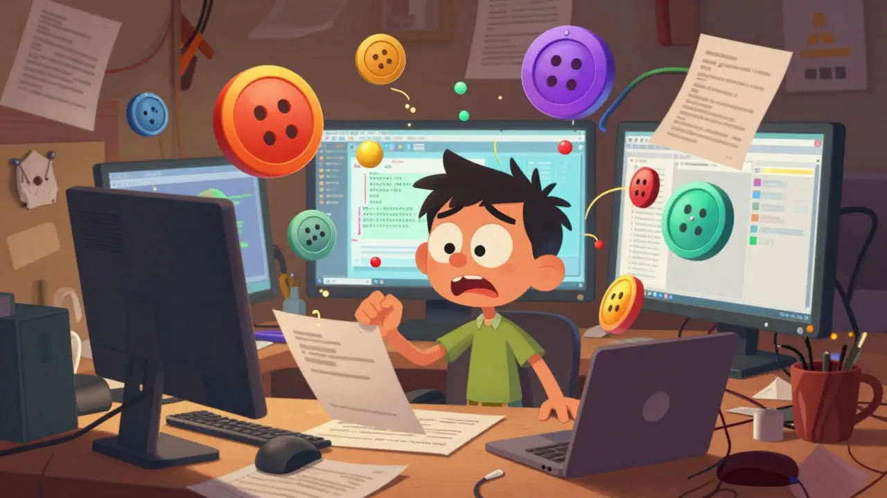
You have spent months building a beautiful interface. It looks great in Figma. The handoff to developers went smoothly. But six months later, the app feels... messy. Buttons are slightly different sizes. Colors don't match the brand guidelines anymore. A new designer joined the team and recreated a card component from scratch because they couldn't find the original file. Sound familiar? This is the "spaghetti code" of visual design.
The solution isn't just better design skills; it's better structure. That is exactly what a comprehensive design systems course teaches you. It moves you beyond making pretty screens to engineering scalable, consistent, and maintainable product experiences. In 2026, with AI-assisted tools changing how we work, understanding the underlying architecture of a design system-tokens, components, and documentation-is no longer optional for senior designers. It is essential.
Why Design Systems Are More Than Just Libraries
Many people mistake a design system for a library of buttons and inputs. While that is part of it, a true design system is a living ecosystem. Think of it as the operating system for your product’s user interface. It connects design, development, and product management under one roof.
When you take a proper course on this subject, you learn that a design system solves three critical problems:
- Inconsistency: Users get confused when similar actions look different across the app.
- Inefficiency: Teams waste hours rebuilding basic elements instead of solving unique user problems.
- Scalability Issues: As the product grows, maintaining hundreds of disparate screens becomes impossible without a central source of truth.
A good curriculum will show you how to shift from a "pixel-pushing" mindset to an "architectural" mindset. You stop asking, "How do I make this button look nice?" and start asking, "How does this button behave across all states, platforms, and contexts?"
Design Tokens: The Atomic Foundation
If components are the bricks of your house, design tokens are the clay from which the bricks are made. Tokens are the smallest units of a design system. They are named values that replace hard-coded values like hex codes or pixel measurements.
In a traditional workflow, a designer might use `#0055FF` for a primary blue button. In a token-based system, that value is stored as `color-primary-500`. Why does this matter? Because if the marketing team decides to rebrand and change the primary blue to purple, you don't need to update every single screen. You update the token once, and every instance where `color-primary-500` is used automatically updates.
A robust course will teach you the hierarchy of tokens:
- Global Tokens: Raw values like `blue-500`, `16px`, or `Roboto`. These have no context.
- Semantic Tokens: Values with meaning, like `background-header` or `text-body-small`. These map to global tokens.
- Component Tokens: Specific to a UI element, like `button-border-radius`.
Understanding how to structure these tokens in JSON or YAML formats is crucial because this is the language that bridges Figma and code. Modern tools like Style Dictionary allow you to generate CSS, iOS, and Android code directly from these tokens. If your course doesn't cover the technical implementation of tokens, it is missing half the picture.
| Token Type | Purpose | Example Name | Value Source |
|---|---|---|---|
| Global | Store raw design values | gray-300 |
Brand Guidelines |
| Semantic | Provide context to values | bg-surface-secondary |
Maps to Global |
| Component | Control specific UI parts | input-padding-x |
Maps to Semantic |
Components: Building Blocks of Interaction
Once you have your tokens, you build UI components. A component is a reusable chunk of interface-a button, a modal, a navigation bar. But in a professional design system, a component is not just a static image. It is a complex object with variables, states, and behaviors.
When learning about components, focus on the concept of "variants." A button isn't just one thing. It has variants: Primary, Secondary, Tertiary. It has states: Default, Hover, Active, Disabled, Loading. A strong design systems course will emphasize designing for edge cases. What happens when the text is too long? Does the button truncate? Wrap? Break?
Here is where many self-taught designers struggle: they design the "happy path" only. Professional courses teach you to define the logic behind the component. For example, a "Date Picker" component needs rules for leap years, international date formats (DD/MM/YYYY vs MM/DD/YYYY), and accessibility labels for screen readers.
You should also learn about atomic design methodology, popularized by Brad Frost. This approach organizes components into five tiers:
- Atoms: Inputs, labels, icons.
- Molecules: Search bars (input + button).
- Organisms: Header sections (logo + nav + search).
- Templates: Page-level layouts.
- Pages: Real content instances.
This structure helps teams understand how small pieces combine to create complex interfaces. It prevents the "Frankenstein" effect, where designers mash unrelated elements together without a logical structure.

Documentation: The Glue That Holds It Together
You can have the best tokens and most polished components in the world, but if no one knows how to use them, your design system fails. This is why design documentation is often cited as the most neglected part of design systems. It is boring to write, but vital for adoption.
Good documentation answers two questions: "What is this?" and "When should I use it?"
For each component, your documentation should include:
- Usage Guidelines: Clear examples of correct usage.
- Anti-Patterns: Explicit examples of what NOT to do. Showing a "wrong" example is often more effective than describing it.
- Accessibility Standards: Contrast ratios, keyboard navigation paths, and screen reader text requirements.
- Code Snippets: Ready-to-copy HTML/CSS or React/Vue code blocks for developers.
- Governance Rules: Who owns this component? How do we request changes?
In 2026, documentation is rarely a static PDF. It is usually hosted on a live website built using tools like Storybook, Zeroheight, or Supernova. These platforms sync directly with your design files and code repositories, ensuring that the docs are always up to date. A quality course will walk you through setting up one of these platforms, teaching you how to write clear, concise copy that appeals to both designers and engineers.
The Role of AI in Modern Design Systems
We cannot talk about design systems in 2026 without mentioning Artificial Intelligence. AI is not replacing design systems; it is accelerating their maintenance. Newer courses now include modules on how AI tools can help audit your design system for consistency.
Imagine uploading your entire Figma file to an AI tool that scans for unused components, detects color contrast violations, and suggests token renames for better clarity. Tools like Figma's native AI features and third-party plugins are making this possible. Learning how to leverage these tools means you spend less time policing consistency and more time innovating.
However, AI requires clean data. If your design files are messy, the AI output will be garbage. This reinforces the importance of the foundational skills taught in the earlier sections: clean token naming, structured components, and rigorous documentation. Garbage in, garbage out.

How to Choose the Right Course for You
Not all design systems courses are created equal. Some are superficial overviews; others are deep dives into engineering-grade practices. Here is a checklist to evaluate any program before you enroll:
- Practical Projects: Do you build a real system from scratch? Avoid courses that only show slides.
- Cross-Functional Focus: Does it address developer handoff? If it ignores code, it is incomplete.
- Tool Agnostic: While Figma is dominant, the principles should apply to Sketch, Adobe XD, or even pure CSS.
- Governance & Culture: Does it discuss how to get buy-in from stakeholders? Technical skills mean nothing if the team won't adopt the system.
- Recent Updates: Ensure the curriculum covers modern standards like CSS Variables, WAI-ARIA accessibility, and current Figma variable workflows.
Look for instructors who have shipped products at scale. Industry experience beats academic theory every time. Check their portfolio. Have they worked at companies like Airbnb, Spotify, or Shopify, known for their mature design systems?
Implementing What You Learn: Next Steps
After completing a course, you will likely feel overwhelmed. Where do you start? Don't try to boil the ocean. Start small.
First, audit your current project. Identify the top five most-used components (probably buttons, inputs, cards, modals, and headers). Define their tokens. Build their variants. Document them. Once those are stable, expand outward. This "crawl, walk, run" approach minimizes resistance from your team and delivers quick wins.
Remember, a design system is never "done." It is a continuous process of iteration, feedback, and refinement. The goal is not perfection; it is progress. By mastering tokens, components, and documentation, you are not just learning a skill set. You are becoming a leader who enables your entire organization to move faster, smarter, and more consistently.
Do I need to know how to code to learn design systems?
You do not need to be a full-stack developer, but you must understand the basics of HTML, CSS, and JavaScript. Design systems exist to bridge the gap between design and code. If you cannot explain how a token translates to a CSS variable or how a component state maps to a JavaScript event, your system will fail in production. A good course will teach you enough technical literacy to collaborate effectively with engineers.
Is a design system necessary for small startups?
It depends on your growth rate. If you are a team of two moving fast, a formal system might slow you down. However, if you are hiring or launching multiple features, starting early saves massive amounts of technical debt later. Even a lightweight system with just a few core tokens and components is better than nothing. The key is to keep it simple and scalable.
How long does it take to build a design system?
There is no fixed timeline because a design system is never truly finished. However, you can build a Minimum Viable System (MVS) in 2-4 weeks. This includes defining your color palette, typography, spacing scale, and 5-10 core components. Full maturity, including extensive documentation and cross-platform support, can take 6-12 months of continuous effort.
What is the difference between a style guide and a design system?
A style guide is a static reference document showing logos, fonts, and colors. It is descriptive. A design system is dynamic and prescriptive. It includes interactive components, code snippets, governance rules, and tools that enforce consistency. A style guide tells you what things should look like; a design system gives you the tools to build them correctly.
Can I use a design system for mobile apps?
Absolutely. In fact, mobile apps benefit greatly from design systems due to strict platform guidelines (like Material Design for Android or Human Interface Guidelines for iOS). A good design system adapts its tokens and components to respect these native conventions while maintaining your brand identity. Ensure your course covers multi-platform adaptation strategies.
Edward Gilbreath
June 15, 2026 AT 14:59its all a lie they want you to think tokens save time but really its just another layer of bureaucracy for the devs to complain about. i bet half these courses are funded by figma stockholders
Francis Laquerre
June 17, 2026 AT 04:00Oh, what a magnificent exposition on the structural integrity of modern interface design! The concept of treating a design system as an operating system rather than a mere library is truly profound and deeply resonant with my own experiences in cross-functional teams. It is absolutely vital that we recognize the shift from pixel-pushing to architectural thinking, for this transition represents the very essence of professional maturity in our field. The explanation regarding global, semantic, and component tokens is nothing short of brilliant, illuminating the hierarchical nature of value storage in a way that is both accessible and technically rigorous. One cannot overstate the importance of documentation as the glue that holds this entire ecosystem together, for without clear governance and usage guidelines, even the most beautiful components will fall into disuse and chaos. The integration of AI tools for auditing consistency is a fascinating development that promises to elevate our standards further, provided we maintain the foundational cleanliness of our data structures. This article serves as a beacon of clarity in an often murky landscape of design trends.
Edward Nigma
June 19, 2026 AT 01:26I totally disagree with the premise here because design systems are actually a waste of time for most startups who need to move fast not slow down to document every single button variant. You say it solves inconsistency but I have seen too many companies where the design system becomes so rigid that designers feel like robots just dragging and dropping pre-approved blocks instead of solving unique user problems creatively. The idea that you need to know HTML and CSS to be a designer is elitist nonsense because designers should focus on visuals and empathy not code syntax which is the developers job entirely. Also the atomic design methodology is outdated and overly complex for real world applications where speed matters more than theoretical purity. Stop trying to turn design into engineering it kills the soul of creativity and makes products look sterile and corporate.
Andrea Alonzo
June 20, 2026 AT 00:08I completely understand why someone might feel overwhelmed by the sheer volume of information presented here, especially if they are coming from a background where design was treated as purely visual and artistic rather than structural and systematic, and it is so important to remember that adopting a design system is not about achieving perfection overnight but rather about embracing a journey of continuous improvement and collaboration across disciplines, which can be incredibly rewarding when you see your team working more efficiently and users experiencing a more consistent and intuitive product, and I would gently suggest that starting with a small audit of your most frequently used components is a wonderful first step that allows you to build momentum and demonstrate value without getting bogged down in the complexities of building an entire enterprise-level system from day one, because the goal is progress and empowerment not paralysis by analysis or fear of making mistakes along the way.
Patrick Dorion
June 21, 2026 AT 05:11Here's the thing about design systems that nobody wants to admit until they're deep in the weeds: they are fundamentally a communication protocol between two tribes who speak different languages. If you treat them like art, they fail. If you treat them like software, they succeed. The token hierarchy described here is spot on because it mirrors how CSS variables work in production. Global tokens are your raw materials, semantic tokens are your application logic, and component tokens are your specific implementations. The biggest mistake I see is teams trying to skip the semantic layer and mapping globals directly to components, which creates a nightmare when rebranding happens. You end up hunting through hundreds of files to change a shade of blue. Don't do that. Build the abstraction early.
kimberly de Bruin
June 21, 2026 AT 22:45the structure of a design system reflects the structure of consciousness itself where tokens are the atoms of perception and components are the molecules of interaction creating a reality that is shared and understood by all participants in the digital space
Saranya M.L.
June 22, 2026 AT 15:43As a senior UX architect based in India, I must point out that this article lacks depth regarding the scalability challenges faced by emerging markets where resource constraints are significantly higher than in Western tech hubs. While the theoretical framework of atomic design is sound, the practical implementation often fails due to inadequate stakeholder buy-in and poor governance models that are not addressed sufficiently here. Furthermore, the assertion that AI will solve consistency issues is naive; AI requires pristine data inputs which most organizations simply do not possess, leading to garbage output that exacerbates existing technical debt rather than resolving it. A true expert understands that cultural alignment within the team is more critical than any tool or methodology, and without addressing the human element of adoption, no amount of tokenization will save a fragmented product experience.
om gman
June 23, 2026 AT 18:49oh wow another american telling us how to design like we dont know better here in india we build systems that handle millions of users with half the budget and twice the efficiency so please spare me the lecture on 'best practices' from someone who probably spends more time on figma plugins than actual coding
Jeanne Abrahams
June 23, 2026 AT 20:08From Cape Town, I can tell you that while the theory is pretty, the reality is messy. We deal with load shedding affecting server times and diverse user bases that don't fit neatly into your neat little atomic buckets. But hey, keep dreaming of perfect consistency.
Bineesh Mathew
June 25, 2026 AT 09:43The moral decay of modern design is evident in this obsession with systems over soul. When did we decide that a button's radius was more important than the emotional resonance of the user's journey? We are building cages of consistency and calling it freedom. The tragedy is not in the lack of tokens but in the abundance of control. We must rebel against the tyranny of the style guide and reclaim the wild, untamed beauty of individual expression in every pixel we place. Let the buttons bleed. Let the colors clash. Only then will we find true digital enlightenment.
Oskar Falkenberg
June 25, 2026 AT 19:19I think the point about documentation being the glue is super important and honestly something we always forget till it's too late and then everyone is arguing about why the new feature looks different from the old one even though it uses the same component library because nobody read the damn docs which is a shame because writing them down helps clarify your own thoughts about why you made certain decisions in the first place so maybe try to write them as you go instead of waiting till the end when you're tired and just want to ship it.
Caitlin Donehue
June 26, 2026 AT 05:25I've been using Figma variables for a few months now and it's interesting how much it changes the workflow. Still figuring out the best way to name things though.
Stephanie Frank
June 26, 2026 AT 19:50This is basically just corporate speak for 'make it easier to fire junior designers because seniors can do everything now'. The whole 'architectural mindset' is just a way to gatekeep entry level jobs and make sure only people who went to expensive bootcamps get hired. Meanwhile the apps still suck and users are confused anyway.
Marissa Haque
June 27, 2026 AT 18:56Wow!!! This is exactly what I needed to hear today!! I have been struggling with inconsistency in my team for years and seeing this laid out so clearly gives me so much hope!! The part about anti-patterns is genius!! Showing what NOT to do is so much more effective than just listing rules!! Thank you for sharing this incredible resource!!
Keith Barker
June 28, 2026 AT 06:51tokens are just variables with extra steps
Lisa Puster
June 28, 2026 AT 16:28only amateurs worry about design systems professionals know that true innovation comes from breaking the rules not following them and anyone who says otherwise is just trying to sell you a course or a plugin to make their life easier while stifling creativity
Joe Walters
June 30, 2026 AT 13:50i tried implementing this at my last job and it was a disaster everyone hated it and the devs refused to use the tokens so we ended up with two versions of every component and it took forever to fix. maybe it works for big companies like airbnb but for the rest of us its just a headache.