Multimedia Learning Principles Every Course Designer Should Use
 Jun, 5 2026
Have you ever watched a training video where the speaker reads every single word on the slide? You probably zoned out. That’s not because you’re lazy; it’s because your brain has limits. When we design digital courses, we aren’t just arranging pretty graphics and catchy audio. We are managing how human beings process information.
The science behind this is called Multimedia Learning, which is an educational theory based on how people learn from words and pictures combined. Developed largely by psychologist Richard Mayer at UC Santa Barbara, these principles are not just academic suggestions-they are hard rules for cognitive efficiency. If you ignore them, your learners will struggle. If you follow them, they will retain more with less effort.
The Cognitive Bottleneck: Why Less Is More
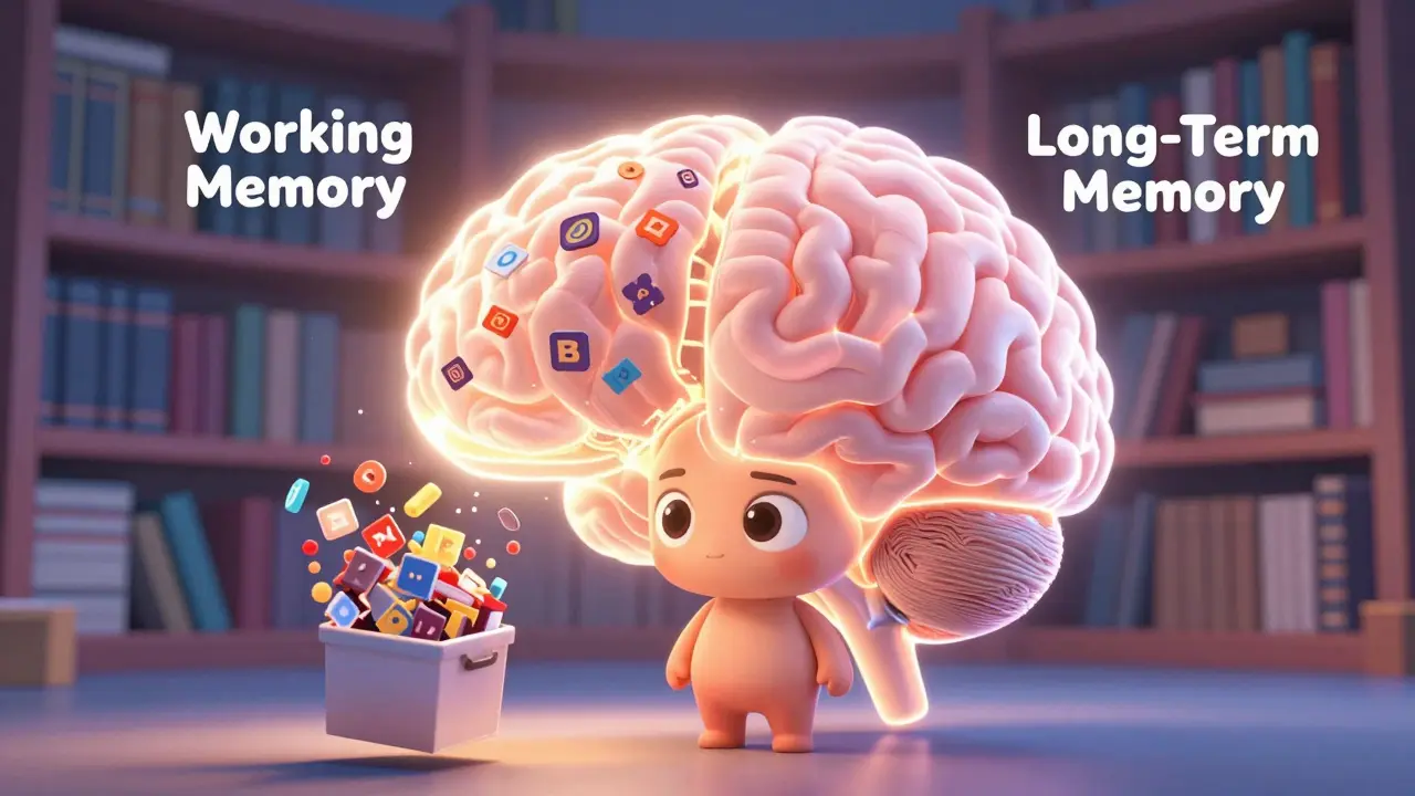
To understand why multimedia principles matter, you have to look at how our memory works. Think of your brain as having three storage systems: sensory memory, working memory, and long-term memory. Sensory memory holds visual and auditory input for just a few seconds. Working memory is where active thinking happens, but it is incredibly small-it can only hold about four chunks of information at once. Long-term memory, however, is vast.
The goal of any course designer is to move information from that tiny working memory into the expansive long-term memory. This happens through two processes: selecting relevant material and organizing it into coherent mental models. The problem arises when we overload the learner. This is known as extraneous cognitive load. It’s the mental effort spent figuring out the interface or decoding confusing graphics instead of learning the content. Multimedia principles exist specifically to reduce this waste.
The Core Principles You Must Apply
While there are over ten specific principles identified in research, five stand out as non-negotiable for modern instructional design. These address the most common mistakes designers make when combining text, images, and sound.
1. The Coherence Principle
This is the easiest one to implement and the hardest for stakeholders to accept. The Coherence Principle states that people learn better when extraneous material is excluded rather than included. By "extraneous," I mean anything that doesn’t directly support the learning objective. This includes background music, decorative clip art, witty anecdotes that don’t relate to the task, or redundant data points in a chart.
If you are designing a module on cybersecurity threats, do not add a funny cartoon of a hacker unless that cartoon illustrates a specific attack vector. Decorative elements compete for attention in the limited capacity of working memory. Cut the fluff. Keep it lean.
2. The Signaling Principle
If coherence is about removing noise, signaling is about highlighting the signal. Learners often don’t know what is important. They scan slides looking for cues. The Signaling Principle suggests that learning is enhanced when cues are added that highlight the organization of the instructional material.
You can achieve this through:
- Visual arrows: Pointing to the specific part of a diagram being discussed.
- Bolding key terms: Emphasizing critical vocabulary in the transcript.
- Numbered lists: Showing the sequence of steps clearly.
- Audio emphasis: Changing pitch or volume slightly to stress a crucial point.
Think of signaling as giving the learner a map. Without it, they are wandering in the woods. With it, they know exactly where to go next.
3. The Spatial Contiguity Principle
This principle deals with layout. People learn better when corresponding words and pictures are presented near each other on the page or screen. Imagine a diagram of a car engine. If the labels are placed in a legend box at the bottom right corner, the learner’s eye has to jump back and forth between the piston and the text. This jumping creates cognitive friction.
Instead, place the label directly next to the piston. Connect them with a line if necessary. The closer the text is to the image it describes, the less mental energy the learner spends connecting the two concepts. This applies to both static slides and interactive simulations.
4. The Temporal Contiguity Principle
Similar to spatial contiguity, this applies to time rather than space. People learn better when corresponding words and pictures are presented simultaneously rather than successively. This is critical for narrated animations.
A common mistake is showing an animation first, then displaying the explanatory text afterward. Or worse, playing the narration while the text appears on screen (which leads us to the next principle). Instead, reveal the parts of the diagram exactly as the narrator describes them. If the voice says, "The valve opens," the valve should open at that exact moment. Synchrony reduces the need for the learner to hold the image in their mind while waiting for the explanation.
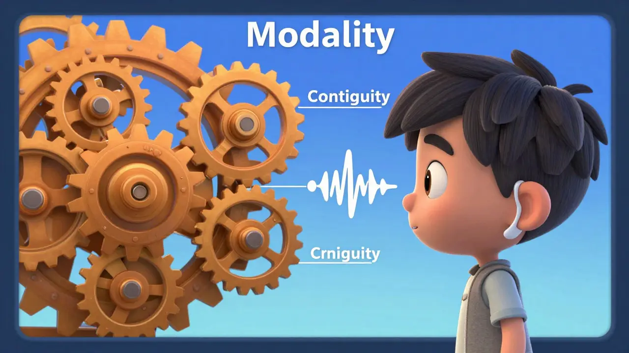
5. The Modality Principle
This is perhaps the most counterintuitive rule. People learn better from graphics and narration than from graphics and on-screen text. Why? Because our visual channel is overloaded if we are trying to read text and watch a complex diagram at the same time. Our auditory channel, however, is free.
By moving the text to audio (narration), you split the processing load. The eyes handle the graphics; the ears handle the explanation. This prevents the visual bottleneck. So, if you have a complex process flow, use a voiceover script instead of bullet points on the slide. Reserve on-screen text for simple facts or labels, not for dense paragraphs.
| Common Mistake | Violated Principle | Cognitive Consequence | Recommended Fix |
|---|---|---|---|
| Reading slides verbatim | Redundancy Principle | Dual coding failure; boredom | Use visuals + narration; remove on-screen text |
| Background music in tutorials | Coherence Principle | Distraction; increased extraneous load | Remove all non-essential audio/visuals |
| Labels far from diagrams | Spatial Contiguity | Split-attention effect | Place labels adjacent to objects |
| Text blocks with complex charts | Modality Principle | Visual channel overload | Convert text to spoken narration |

Addressing the Redundancy Trap
Closely related to the Modality Principle is the Redundancy Principle. This states that people do not learn better when on-screen text duplicates the spoken words. In fact, they learn worse. This seems obvious now, yet I still see course developers pasting the entire script onto the slide.
When a learner reads along with the narration, they are not listening. They are reading. Reading speed varies by person. If the narrator speaks faster than the learner reads, the learner misses audio cues. If slower, they lose engagement. The solution is simple: trust the narration. Provide a transcript for accessibility and review purposes, but do not display it during playback unless the content is highly technical and requires precise reference (like code snippets or legal statutes).
Practical Implementation Checklist
How do you apply this in your daily workflow? Before publishing any module, run it through this quick audit:
- Audit the Assets: Delete any image, sound, or text that does not directly answer the learning objective. Be ruthless.
- Check Alignment: Are labels touching or next to the objects they describe? Are numbers aligned with the correct bars in a chart?
- Sync Timing: Watch the animation with the audio. Do the visual changes happen exactly when the narrator mentions them?
- Review Text Density: If a slide has more than 30 words, consider moving half of them to the voiceover script.
- Test for Noise: Remove background music, stock photos of handshakes, and decorative borders.
Why This Matters for Retention
The ultimate goal of instructional design is transfer-can the learner apply what they learned in the real world? Cognitive load theory tells us that if working memory is overwhelmed during instruction, encoding into long-term memory fails. No encoding means no retention. No retention means no behavior change.
By adhering to these multimedia principles, you are not just making "nicer" videos. You are optimizing the biological hardware of your learners. You are respecting their cognitive limits. In an era where attention spans are shrinking and information overload is rampant, efficient design is an ethical imperative. Your learners deserve content that works with their brains, not against them.
What is the difference between Spatial and Temporal Contiguity?
Spatial contiguity refers to the physical placement of text and images on the same screen (near each other). Temporal contiguity refers to the timing of presentation (presenting them at the same time). Both aim to reduce the cognitive effort required to connect related information.
Should I always avoid on-screen text?
Not always. On-screen text is useful for labels, titles, and key terms. However, you should avoid long paragraphs or sentences that duplicate the narration. Use text for reference, not for primary explanation in complex scenarios.
Does the Modality Principle apply to simple slides?
The benefit is most pronounced with complex graphics or animations. For simple bullet points or static text-heavy slides, the visual load is low, so the advantage of switching to narration is smaller. However, it is still generally safer to use narration for engagement.
Who developed the Multimedia Learning Principles?
These principles were primarily developed by Dr. Richard E. Mayer, a professor of psychology at UC Santa Barbara, through decades of empirical research comparing different instructional methods.
Can I use background music in my e-learning courses?
According to the Coherence Principle, you should generally avoid it. Background music adds extraneous cognitive load and can distract from the primary message. It is best reserved for introductory or concluding screens where no learning is taking place.