Testing Screen Reader Flows in iOS and Android Learning Apps: A Complete Guide
 Jun, 18 2026
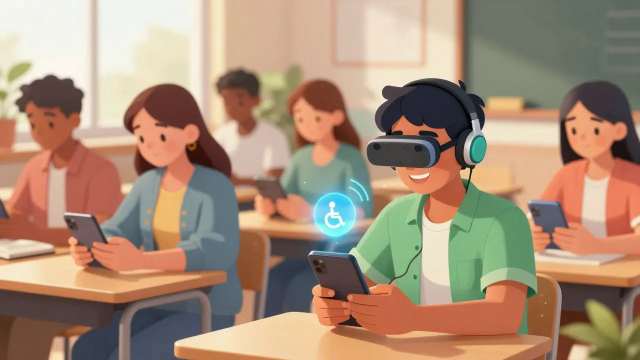
Imagine you are trying to learn a new language or master calculus on your phone. You tap a button, but nothing happens. You swipe right, expecting the next lesson, but you hear a confusing jumble of text that makes no sense. For millions of users who rely on assistive technology, this isn't just an annoyance; it is a complete barrier to education. If your learning app fails screen reader tests, you aren't just losing users-you are excluding them entirely.
Accessibility in mobile apps is often treated as an afterthought, added at the end of development cycles if there is time left. But for educational platforms, where interaction and feedback are core to the experience, accessibility must be baked into the design from day one. Testing screen reader flows in iOS VoiceOver and Android TalkBack environments requires a specific mindset. It’s not about checking boxes; it’s about ensuring the cognitive load matches what a sighted user experiences visually.
The Core Challenge: Linear vs. Spatial Interaction
Sighted users scan screens. They see a header, a progress bar, three buttons, and a footer all at once. Their brain processes this spatial layout instantly. Users of VoiceOver on iOS or TalkBack on Android do not have this luxury. They navigate linearly, element by element. This fundamental difference creates unique challenges for learning apps, which often feature complex layouts like flashcards, interactive quizzes, and video players.
If your app relies heavily on visual cues-like color changes to indicate a correct answer or proximity to show related items-it will fail for screen reader users. The goal is to translate spatial information into logical sequence. When a user swipes through a math problem, they need to hear the equation clearly, followed by the input field, and then the submit button, without getting lost in decorative icons or irrelevant menu items.
Setting Up Your Testing Environment
You cannot test accessibility effectively using only automated tools. While tools like Accessibility Scanner on Android or Accessibility Inspector on Xcode can identify contrast issues or missing labels, they cannot tell you if the flow makes sense. You need to turn on the actual screen readers and use the devices as intended.
- iOS Setup: Go to Settings > Accessibility > VoiceOver and toggle it on. Remember, the standard gestures change. One finger navigates, two fingers scroll. Practice the rotor control, which allows users to jump between headings, links, and form fields quickly.
- Android Setup: Go to Settings > Accessibility > TalkBack and enable it. Note that the gesture system is different here; swiping up opens apps, and double-tapping activates elements. Familiarize yourself with the "Explore by Touch" feature, which announces elements as your finger hovers over them.
Test on real devices whenever possible. Simulators can mimic basic behavior, but they often miss nuances in timing, audio focus management, and hardware-specific interactions. Use both iPhone and iPad models, as well as various Android screen sizes, because responsive design affects the reading order differently on each device.
Key Areas to Test in Learning Apps
Educational apps have distinct components that require special attention during screen reader testing. Here are the critical areas where accessibility often breaks down.
1. Interactive Quizzes and Assessments
Quizzes are high-stakes interactions. If a user selects an answer, they need immediate, clear feedback. In a sighted interface, a green checkmark might appear. For a screen reader, this needs to be announced audibly. Ensure that when a radio button or checkbox is selected, the state change is communicated. Avoid relying solely on color to indicate correct or incorrect answers. Instead, use aria-labels (on Android) or accessibility identifiers (on iOS) to provide descriptive text like "Correct answer" or "Incorrect, try again."
2. Video and Audio Content
Many learning apps embed videos. Screen reader users need access to captions and transcripts. But beyond that, the controls themselves must be accessible. Play, pause, seek, and volume buttons should have clear labels. If your app uses custom video players, ensure that the playback progress is announced periodically. Users should know how much content remains without having to guess.
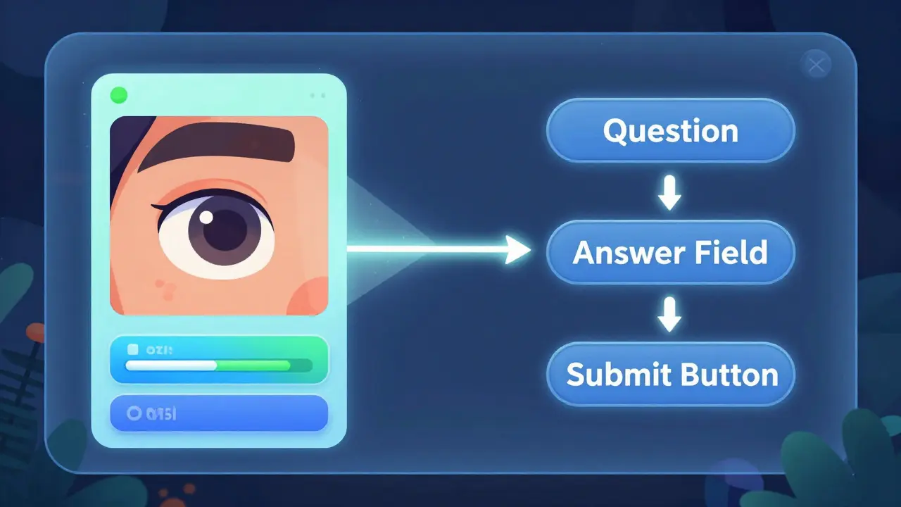
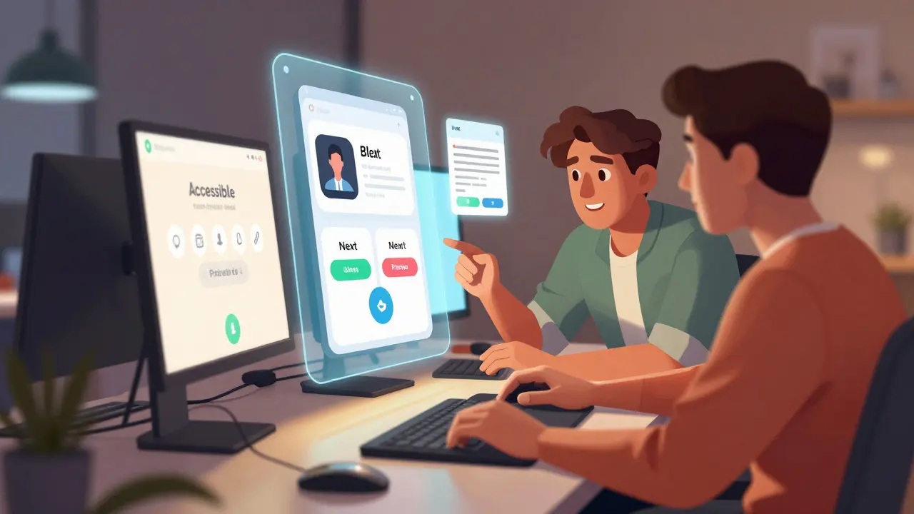
3. Flashcards and Swipeable Interfaces
Flashcard apps often use swipe gestures to move to the next card. These gestures can conflict with screen reader navigation. On iOS, a single-finger swipe moves focus, while a two-finger swipe scrolls. If your app uses a single-finger swipe to flip a card, it may interfere with VoiceOver's ability to navigate the page. Consider adding explicit buttons like "Next Card" and "Previous Card" that are easy to find and activate via double-tap.
4. Progress Tracking and Dashboards
Dashboards often display charts, graphs, and progress bars. These visual elements are notoriously difficult to convey to screen readers. You must provide alternative text descriptions for data visualizations. For example, instead of just showing a pie chart, include a text summary: "You have completed 75% of the module, with 25% remaining." Ensure that progress bars are labeled with their current value and maximum value so users understand their standing.
Common Pitfalls and How to Avoid Them
Even experienced developers make mistakes when implementing accessibility. Here are some common errors I’ve seen in learning apps and how to fix them.
| Issue | Impact on User | Solution |
|---|---|---|
| Missing Labels | User hears "Button" or "Image" with no context. | Add descriptive accessibility labels to all interactive elements. |
| Wrong Reading Order | User encounters elements in a confusing sequence. | Adjust the view hierarchy or use accessibility traversal APIs to set the correct order. |
| Touch Target Size | User accidentally taps wrong elements due to small hit areas. | Ensure touch targets are at least 44x44 points (iOS) or 48x48 dp (Android). |
| Dynamic Content Updates | User doesn't know when new content appears (e.g., quiz results). | Use live regions or announcements to notify users of dynamic changes. |
| Conflicting Gestures | App gestures override screen reader navigation. | Provide alternative button controls for all swipe-based actions. |
One subtle but critical issue is the handling of dynamic content. In a learning app, when a user submits an answer, the interface might update to show the result. If this update isn't announced, the user is left waiting. On iOS, you can use `UIAccessibilityPostNotification` to announce the result. On Android, use `ViewCompatannounceForAccessibility`. This ensures that the user knows immediately whether they were right or wrong, maintaining the flow of the lesson.
Best Practices for Developers and Designers
Accessibility is a team sport. Designers, developers, and QA testers all play a role. Here are some actionable steps to integrate into your workflow.
- Design with Contrast in Mind: Use tools like Stark or Adobe Color to ensure your color palettes meet WCAG AA standards. High contrast helps users with low vision who may not use screen readers but still struggle with readability.
- Label Early: Don't wait until development to think about labels. Designers should specify accessibility text in their mockups. For example, an icon of a book should be labeled "Library" or "Lessons," not just "Book Icon."
- Test with Real Users: Nothing replaces feedback from people who actually use screen readers. Recruit beta testers who rely on VoiceOver or TalkBack. Watch them navigate your app. Where do they get stuck? What confuses them? Their insights are invaluable.
- Automate Where Possible: Integrate accessibility checks into your CI/CD pipeline. Tools like Axe or SonarQube can catch obvious issues like missing alt text or poor contrast before code reaches production.
- Document Accessibility Features: Let users know your app is accessible. Include an accessibility statement in your app store description and within the app settings. Provide instructions on how to use the app with a screen reader if there are any unique interactions.
Conclusion: Accessibility as a Quality Metric
Testing screen reader flows isn't just about compliance; it's about creating a better product for everyone. Clear labels, logical navigation, and robust feedback mechanisms improve the user experience for sighted users too. Think about the last time you used an app in bright sunlight or with one hand. Good accessibility design makes those situations easier to handle.
In the competitive world of EdTech, inclusivity is a differentiator. By investing in thorough screen reader testing for iOS and Android, you demonstrate a commitment to all learners. You open your platform to a vast audience that has been historically underserved. Start small, test often, and listen to your users. The effort pays off in higher retention, better reviews, and a more equitable learning environment.
What is the best tool for testing screen readers on iOS?
The best approach is to use the native VoiceOver feature built into iOS. While Xcode includes the Accessibility Inspector for debugging, actual usability testing requires turning on VoiceOver and navigating the app with one-hand gestures. Combine this with the Accessibility Audit tool in Xcode for automated checks.
How do I test TalkBack on Android without a physical device?
While physical devices are preferred, you can use the Android Emulator in Android Studio. Enable TalkBack in the emulator's settings. However, note that gesture emulation can be tricky. For accurate testing of touch interactions, a real Android phone or tablet is highly recommended.
Why is my app's reading order wrong on screen readers?
Screen readers typically follow the DOM order or view hierarchy. If your UI uses absolute positioning or complex layouts, the visual order may not match the code order. Fix this by adjusting the z-index or using accessibility-specific properties like `accessibilityTraversalOrder` on iOS or `importantForAccessibility` on Android to guide the reader.
Do I need to provide audio descriptions for all videos?
Yes, for educational content, audio descriptions (or descriptive transcripts) are crucial. Screen reader users cannot see visual cues in videos. Providing a separate audio track or detailed text transcript ensures they receive the same information as sighted viewers.
How can I make swipe gestures accessible in flashcard apps?
Swipe gestures often conflict with screen reader navigation. Always provide alternative button controls, such as "Next" and "Previous" buttons, that are easily accessible via double-tap. Ensure these buttons have clear labels and are placed logically in the reading order.