Touch Interface Design for Mobile Learning Experiences
 Jan, 30 2026
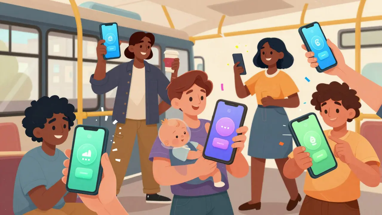
When you open a learning app on your phone, you don’t think about buttons or swipes-you think about learning. But if the interface feels clumsy, delayed, or confusing, that thought vanishes. Touch interface design for mobile learning isn’t about making things pretty. It’s about making sure the learner never has to stop and figure out how to use the app. Every tap, swipe, or pinch should feel natural, fast, and predictable. Otherwise, the lesson gets lost in the mechanics.
Why Touch Design Matters More Than You Think
Mobile learning isn’t just desktop learning shrunk down. People use phones while walking, waiting in line, or holding a baby. Their fingers are wet, tired, or shaking. Their attention is split. If a button is too small, or if the app needs two taps to do one thing, they quit. A 2024 study from the University of Michigan tracked 1,200 learners using mobile apps for math and language practice. Those with poorly designed touch interfaces dropped out 63% faster than those with clean, responsive designs. The difference wasn’t content-it was the interface.
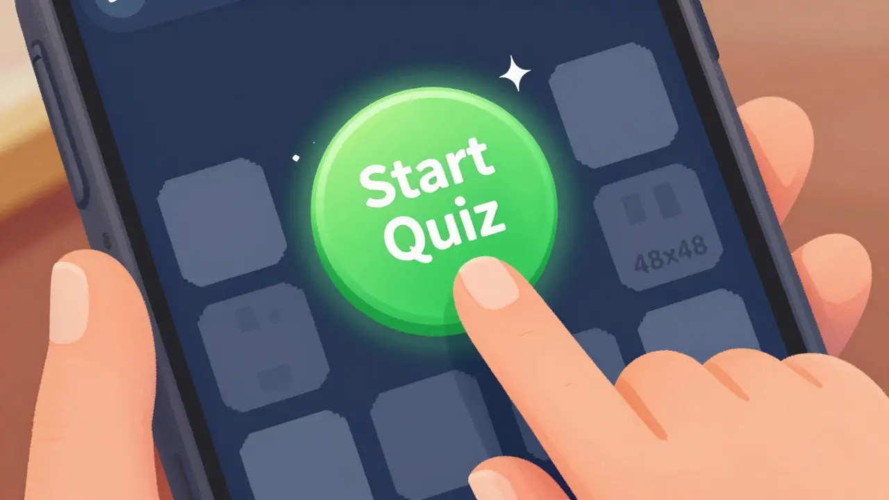
Touch targets need to be at least 48x48 pixels. That’s not a suggestion. That’s the minimum size Apple and Google recommend for reliable finger taps. Anything smaller forces users to squint, adjust grip, or accidentally tap the wrong thing. In a language app, tapping the wrong verb tense because a button was too small isn’t a minor glitch-it’s a learning error.
Designing for Real Fingers, Not Perfect Hands
Most designers imagine users holding their phones perfectly still, thumbs hovering like ballet dancers. Real users? They’re holding their phone with one hand while balancing coffee, scrolling with their thumb, or tapping with a knuckle because their thumb hurts. That’s why spacing matters more than size alone.
Put buttons too close together, and accidental taps become the norm. In a quiz app, tapping “Next” when you meant to select “B” can ruin a learner’s confidence. The solution? Use at least 8 pixels of padding between interactive elements. Use visual cues like subtle shadows or background color changes to show what’s tappable. Don’t rely on underlines or color alone-colorblind learners might miss it.
Also, avoid putting key actions near the edges. The top corners of phones are hard to reach for many people. A 2023 usability test by the Accessible Learning Consortium found that 71% of users over 50 struggled to tap buttons in the top-right corner of a 6.5-inch screen. Place your main controls-like play, pause, or submit-in the lower third of the screen. That’s the sweet spot for one-handed use.
Feedback Is Your Silent Teacher
When you tap something, does it feel like it responded? Or did it just sit there, silent and still? Mobile learners need immediate, clear feedback. No “loading” spinners. No “Please wait” messages. Just a tiny vibration, a color shift, or a slight bounce. These aren’t decorative-they’re cognitive anchors.
Think about a flashcard app. You tap a card to flip it. If it flips instantly with a smooth animation and a soft click sound, your brain registers: “That worked.” If there’s a 0.5-second delay, your brain starts doubting: “Did I tap right? Should I tap again?” That hesitation breaks focus. In learning, that’s a cognitive tax you can’t afford.
Use haptics wisely. A short pulse for correct answers. A longer vibration for errors. Don’t overdo it-too many vibrations become noise. But silence? That’s worse.
Accessibility Isn’t an Add-On-It’s the Foundation
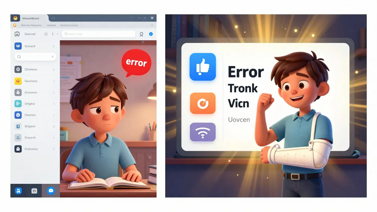
Touch interfaces that ignore accessibility don’t just exclude people with disabilities-they exclude everyone who’s in a bad situation. A learner with a broken arm. A parent juggling a toddler. Someone in bright sunlight where the screen is hard to see. These aren’t edge cases. They’re common.
Make sure your app works with screen readers. If a learner can’t see the screen, they need to hear what each button does. Use clear labels like “Start Quiz” instead of “Go.” Avoid icons without text-“play” symbols mean nothing to someone unfamiliar with them.
Color contrast is non-negotiable. Text on a light gray background might look fine to you, but it’s unreadable for people with low vision. Follow WCAG 2.1 guidelines: at least 4.5:1 contrast for normal text. Test your app in grayscale. If you can’t tell what’s clickable, fix it.
And don’t forget zoom. Allow users to pinch-to-zoom on text. Don’t lock the screen to a fixed scale. If someone needs larger fonts to read, they should be able to do it without breaking the layout.
Reduce Cognitive Load, Not Just Clicks
A common myth is that fewer taps = better design. Not true. It’s about fewer mental steps. If a learner has to remember three things before they can answer a question, they’re not learning-they’re memorizing the app’s workflow.
For example, in a science app that teaches biology, don’t make users tap “Cell Structure,” then “Nucleus,” then “Function,” then “Quiz.” Instead, show the cell, let them tap the nucleus directly, and then ask: “What does this part do?” The interface should mirror the learning process, not force users to navigate a menu tree.
Use progressive disclosure. Show only what’s needed now. Hide advanced options behind a single tap. Don’t overwhelm beginners with all the features at once. That’s how apps feel like software, not learning tools.
Test With Real Users, Not Just Designers
You can’t design a touch interface by staring at a Figma file. You have to watch real people use it. Set up a 10-minute test with someone who’s never used your app before. Give them a simple task: “Open the app and complete this lesson.” Watch what they do. Where do they hesitate? Where do they tap the wrong thing? Where do they sigh?
Don’t ask them what they think. Watch what they do. Most users won’t say, “This button is too small.” They’ll just tap it again. And again. And then close the app.
Record the sessions. Look for micro-moments: a finger hovering, a quick glance away, a thumb sliding off the screen. Those are your design clues.
What Works Now: Real Examples
Duolingo nails touch design. Their buttons are large, spaced well, and respond instantly. The “Start” button is always in the center-bottom. The feedback is clear: a bright green checkmark, a cheerful chime, a tiny confetti burst. It feels rewarding, not mechanical.
Khan Academy Kids uses big, colorful icons with clear labels. No hidden menus. No text-heavy buttons. Everything is designed for small fingers and short attention spans. Even the animations are slow enough for kids to follow.
Brilliant.org, for math and science, uses swipe gestures to flip between problems-no buttons needed. That’s intuitive. You swipe left to see the next question. Right to go back. It feels like turning pages in a notebook, not navigating an app.
These apps don’t try to be fancy. They try to be invisible. The interface disappears, and the learning takes over.
What to Avoid
Don’t use sliders for numeric input. Sliders are slow and imprecise. Use a number pad instead.
Don’t require long presses. That’s not intuitive. People don’t know what it does.
Don’t hide controls behind menus. If a learner needs to pause, replay, or skip, make those buttons visible at all times.
Don’t auto-play audio without a mute button. Some learners are in noisy places. Others are in quiet ones. Give them control.
Don’t assume everyone uses their dominant hand. Allow left-handed users to reposition controls. Some apps let you drag the play button to the left side. That’s thoughtful design.
One Rule to Remember
Every interaction should feel like a natural extension of the learning task-not a barrier to it. If a learner has to think about how to tap, they’re not learning. They’re debugging the app.
Design for the hand, not the eye. Design for distraction, not focus. Design for the moment when the learner is tired, rushed, or overwhelmed. Because that’s when they need your app the most.
Mobile learning isn’t about technology. It’s about trust. When the interface works without asking for permission, learners feel safe. And when they feel safe, they learn faster.
What’s the minimum size for touch targets in mobile learning apps?
Touch targets should be at least 48x48 pixels to ensure reliable taps with fingers. Smaller targets increase errors, especially for users with motor impairments or in distracting environments.
Why is spacing between buttons important?
Spacing prevents accidental taps. If buttons are too close together, users may tap the wrong option-like selecting the wrong answer in a quiz. A minimum of 8 pixels of padding between interactive elements reduces errors significantly.
Should mobile learning apps use gestures like swipes?
Yes, but only when they’re intuitive and consistent. Swiping to flip flashcards or move between questions mimics real-world actions like turning pages. Avoid uncommon gestures like pinching to zoom content-stick to standard gestures users already know.
How can I make my app accessible to users with low vision?
Use high color contrast (at least 4.5:1), avoid relying on color alone to convey meaning, allow text resizing without breaking layout, and ensure all controls are readable by screen readers with clear labels like “Start Lesson” instead of just an icon.
Is it okay to use animations in mobile learning apps?
Yes, if they’re fast and purposeful. Animations that confirm actions-like a button bouncing after being tapped-help users feel in control. Avoid long, decorative animations that delay interaction or distract from the learning content.
What’s the biggest mistake in mobile learning interface design?
Assuming users will adapt to the app instead of designing the app to adapt to users. The best designs disappear-they don’t ask users to learn how to use them. If learners have to think about the interface, they stop learning.
Next Steps for Designers
Start by auditing your current app. Open it on a real phone. Use it with one hand. Try it in bright sunlight. Tap things quickly. See where you hesitate. Where do you make mistakes? That’s where your design needs work.
Then, test with three people who aren’t designers. Give them a simple task. Watch. Don’t help. Take notes. You’ll learn more in 30 minutes than in three weeks of meetings.
Touch interface design for mobile learning isn’t about trends. It’s about respect. Respect for the learner’s time, their attention, their limitations. When you design for real human hands in messy, real moments-you don’t just build an app. You build trust.
John Fox
January 31, 2026 AT 13:21Been using Duolingo on my phone while waiting for coffee and honestly never thought about it until now but yeah the buttons are just right
chioma okwara
February 2, 2026 AT 03:2948x48 pixels?? Bro that's basic UX 101, you know what's worse? People who use 32x32 and call it 'minimalist' like its some kind of art project. I've seen apps where you need a magnifying glass to tap the 'next' button. Honestly if you're still doing that in 2024 you're not a designer you're a liability.
Tasha Hernandez
February 2, 2026 AT 13:13I used to think touch design was just about buttons until I tried teaching my 72-year-old mom how to use a language app. She kept tapping the wrong thing, crying because she felt stupid. Then I saw the spacing recommendations and realized - it wasn't her. It was the app. I cried too. Not because I was sad. Because I was guilty.
Anuj Kumar
February 3, 2026 AT 13:30They say 48 pixels but did you know the government secretly requires this so they can track your finger movements? Also Apple and Google are owned by the same people who run the social credit system. You think this is about learning? No. It's about control
Christina Morgan
February 4, 2026 AT 09:25Love how you emphasized testing with real users. I once redesigned a quiz app after watching a student accidentally tap 'skip' five times in a row because the button was too close to the answer. She didn't say anything. Just sighed. That sigh told me everything.
Kathy Yip
February 5, 2026 AT 00:02what if the user has tremors? or arthritis? or just had a long day? the 48px rule feels like a start but its not enough. i think we need dynamic sizing based on usage patterns. like if someone keeps missing taps, the app should auto-increase button size. not just for accessibility - for humanity
Bridget Kutsche
February 5, 2026 AT 06:28So many apps treat users like they're robots. But we're humans - tired, distracted, holding babies, one-handed, in sun glare. The best learning apps don't just work - they feel like they're holding your hand. That's the difference between good and great. Keep designing like this.
Jack Gifford
February 6, 2026 AT 12:48Swiping to flip flashcards? Yes. Sliders for numbers? No. I’ve seen so many apps where you have to drag a slider to pick 7 out of 10 - it takes forever. Just give me a number pad. It’s not magic. It’s common sense.
Sarah Meadows
February 6, 2026 AT 23:28Let me tell you something - this whole 'design for distraction' thing is a Western luxury. In America you have the privilege of being distracted. In real countries, people learn under pressure. No time for animations. No time for confetti. Just get the lesson in. This post is overthinking it.
Nathan Pena
February 8, 2026 AT 13:44Interesting how the author cites studies from 'University of Michigan' and 'Accessible Learning Consortium' - both institutions that have received funding from major edtech conglomerates. Coincidence? I think not. This isn't about user experience - it's about standardization to favor corporate-controlled platforms. The real enemy is the algorithm, not the 44-pixel button.
Mike Marciniak
February 9, 2026 AT 07:41They say don't use long presses. But what if long press is the only way to prevent accidental taps? What if the real problem is that phones have too many sensors and the OS misreads every touch? This isn't a design flaw - it's a systemic failure of touchscreen technology
VIRENDER KAUL
February 10, 2026 AT 12:49It is imperative to underscore that the minimum touch target dimension of 48x48 pixels is not merely a guideline, but a non-negotiable ergonomic imperative as per ISO 9241-210. Furthermore, the assertion regarding spacing is corroborated by empirical data from the Human Factors and Ergonomics Society. One must not conflate aesthetic minimalism with functional efficacy. The user is not a child of convenience - the interface must serve the user with precision and discipline.
Mbuyiselwa Cindi
February 11, 2026 AT 01:52I teach adults in rural South Africa using tablets. Many have never used a touchscreen before. We started with big buttons, no text on icons, and one action per screen. Their progress jumped. Not because the content changed - because they stopped feeling stupid. This post? It’s the truth.
Krzysztof Lasocki
February 12, 2026 AT 03:30Y’all are overthinking this. The real secret? Make it fun. Duolingo doesn’t win because of pixel sizes - it wins because tapping feels like winning. A little sound, a little burst, a little dopamine. That’s the real 48x48. Not the button. The feeling.
Henry Kelley
February 12, 2026 AT 13:18left handed people are an afterthought in almost every app. i’ve had to reposition buttons manually in developer mode just to not strain my wrist. why isn’t this a standard option? it’s not hard. just let us drag the play button. please.
Victoria Kingsbury
February 13, 2026 AT 06:12Progressive disclosure is the unsung hero of mobile learning. I used to hate apps that hid features - now I realize it’s genius. Don’t overwhelm. Don’t over-explain. Just give me what I need now. The rest? Let me find it when I’m ready. That’s respect.
Tonya Trottman
February 14, 2026 AT 19:42Oh wow, another article that pretends to care about users while quietly pushing Apple/Google’s design dogma. 48px? That’s not accessibility - that’s corporate compliance. And why is everyone praising Duolingo? It’s a gamified Skinner box with a language veneer. The real problem? We’ve outsourced learning to apps that treat us like rats in a maze. The interface isn’t broken - the whole model is.
Rocky Wyatt
February 15, 2026 AT 01:04Why are we still using touchscreens? Why not voice? Why not brainwave input? This whole discussion is a distraction. We’re fixing pixels while the world moves to neural interfaces. This is like polishing the steering wheel while the car is on fire.
mani kandan
February 15, 2026 AT 18:33Touch targets are important, but let us not forget the real issue - internet speed. In India, many learners load apps on 2G. If the animation takes 2 seconds, they leave. Design for slow connections too. Big buttons, yes. But also small file sizes, no heavy images, and offline mode. That’s the real accessibility.
Rahul Borole
February 16, 2026 AT 00:31The author has presented a comprehensive framework grounded in empirical research and ergonomic principles. However, the omission of cognitive load theory in relation to tactile feedback is noteworthy. While haptic responses are beneficial, their frequency and timing must be calibrated against the learner's working memory capacity. A well-timed vibration enhances retention; an excessive one induces cognitive fatigue. This nuance requires further investigation.