Color Contrast in Course Design: Ratios, Tools, and Fixes
 Mar, 15 2026
Ever opened a course and couldn’t read the text because it blended into the background? You’re not alone. A 2024 study by the Web Accessibility Initiative found that over 60% of online learners with visual impairments abandoned a course within the first five minutes due to poor color contrast. It’s not just about aesthetics-it’s about access. If your course materials don’t meet basic contrast standards, you’re excluding real people.
Why Color Contrast Matters in Learning
Color contrast isn’t a luxury. It’s a requirement for anyone who learns differently. People with low vision, color blindness, or even temporary issues like eye strain from screen glare rely on strong contrast to read text, follow buttons, and understand diagrams. When a light gray label sits on a white background, it doesn’t just look bad-it becomes unreadable.
The WCAG 2.1 guidelines set the global standard. For regular text, the minimum contrast ratio is 4.5:1 between text and background. For large text (18pt or bold 14pt), it drops to 3:1. These aren’t suggestions. They’re the baseline for legal accessibility in many countries, including the U.S. under Section 508.
But here’s the catch: many course designers think they’re fine if they use black and white. That’s not enough. A dark blue on navy, a deep green on charcoal, even a dark gray on black-all these look fine to you but fail the test for others. Contrast isn’t about what looks good to your eyes. It’s about what works for everyone else’s.
What Counts as a Valid Contrast Ratio
A contrast ratio measures the difference in brightness between two colors. It’s calculated using a formula based on luminance. You don’t need to do the math yourself, but you do need to know what numbers to aim for.
- 4.5:1 - Minimum for normal-sized text (under 18pt)
- 3:1 - Minimum for large text (18pt or larger, or bold 14pt)
- 7:1 - Recommended for enhanced accessibility (especially for older learners or those with low vision)
- 10:1 - Ideal for critical UI elements like buttons, form fields, or navigation
Text that’s part of a logo or decorative graphic doesn’t need to meet these ratios. But anything that conveys information-headings, instructions, quiz options, labels on charts-does.
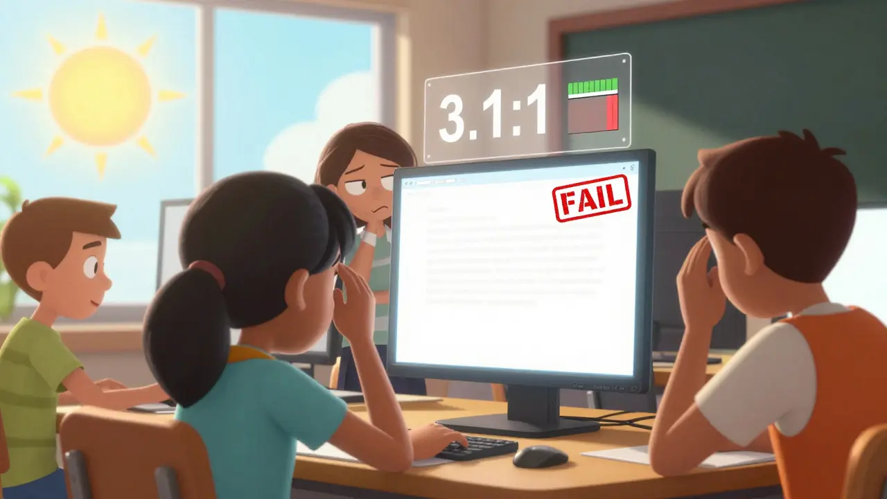
Let’s say you’re designing a quiz. The question is in #333333 on a #F5F5F5 background. Sounds fine? Run the numbers. That’s a 3.1:1 ratio. It fails for small text. You’d need to darken the text to #222222 or lighten the background to #FFFFFF to hit 4.5:1.
Tools to Test and Fix Contrast
You don’t need to guess. There are free, easy tools that tell you exactly if your colors pass or fail.
- WebAIM Contrast Checker - Paste your foreground and background colors. Instant result. Works in any browser.
- Stark (Figma, Sketch, Adobe XD plugin) - Test contrast right inside your design tool. No export needed.
- Chrome DevTools - Right-click any text, select "Inspect," then click the color swatch. The contrast ratio shows up in the panel.
- Color Oracle - Simulates how your design looks to people with red-green-blue color blindness. Free download.
Pro tip: Don’t just test one state. Test hover, focus, and active states too. A button that’s clear when idle might disappear when you hover over it.
Some platforms, like Canvas or Moodle, have built-in accessibility checkers. But they often miss contrast issues in custom HTML or uploaded PDFs. Always double-check with an external tool.
Common Mistakes and How to Fix Them
Here are the top 5 errors we see in course design-and how to fix them fast.
- Light text on pastel backgrounds - A #E0E0E0 background with #888888 text? That’s 1.8:1. Fix: Switch to #000000 text on #FFFFFF or use a darker background like #F0F0F0.
- Using color alone to convey meaning - "Incorrect answers are red" is a problem. People with color blindness won’t know which ones are wrong. Fix: Add icons (❌) or text labels ("Wrong") next to color-coded feedback.
- Text over images - A quote over a photo with varying tones? It’s a gamble. Fix: Add a semi-transparent dark overlay behind text, or use solid color bars.
- PDFs with poor contrast - Many instructors upload scanned slides. If the text is blurry or light gray, it’s inaccessible. Fix: Rebuild the PDF using accessible templates with proper contrast.
- Assuming "dark mode" fixes everything - Dark backgrounds with light text can still fail. A #333333 background with #CCCCCC text is only 2.5:1. Fix: Use #111111 for backgrounds and #FFFFFF for text.
Designing for Real Users
Think about your learners. A 72-year-old student with early-stage macular degeneration doesn’t care if your course looks "modern." They care if they can read the lesson titles. A student with dyslexia might struggle with low-contrast text but thrive with high-contrast, bold fonts.
Test your course with real people. Ask a colleague to view your materials on a phone in bright sunlight. Ask someone with color vision deficiency to use it. You’ll be shocked at what you miss.
Also, don’t forget contrast in interactive elements. A disabled button might be grayed out, but if it’s too light, learners won’t know it’s clickable. A focus ring around a selected option? Make sure it’s thick and high-contrast. Many screen readers rely on visual cues too.
When You Can’t Change the Colors
Sometimes you’re stuck. Maybe your institution uses a brand palette that doesn’t pass contrast. Maybe you’re using a third-party template you can’t edit.
Here’s what to do:
- Add a text alternative. If a chart uses color to show trends, include a table or legend with clear labels.
- Offer a downloadable version in high-contrast mode. Use a simple white-on-black or black-on-white version.
- Include a toggle button on your course page. "Switch to high contrast" with a simple CSS override.
- Provide a link to a contrast checker so learners can test their own view.
Accessibility isn’t about perfection. It’s about options. If someone can’t access your content, they’ll leave. And once they leave, they won’t come back.
Final Checklist: Your Quick Audit
Before you publish your next module, run through this:
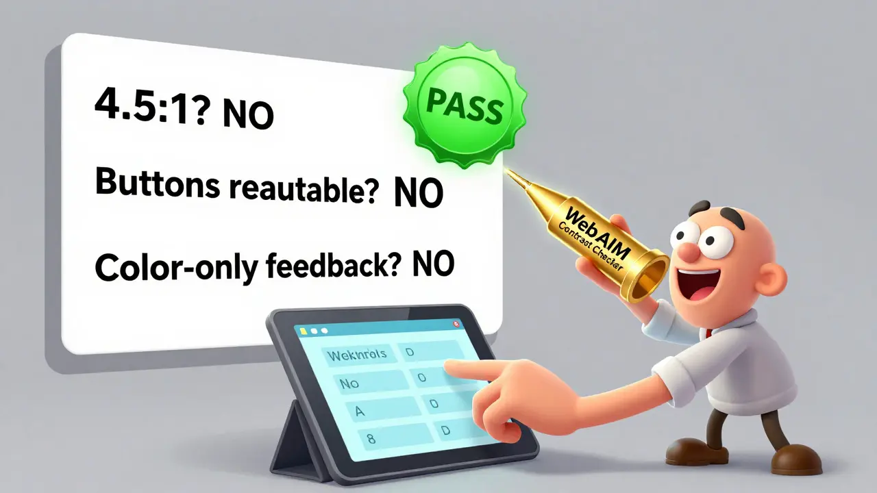
- Are all text elements at least 4.5:1 contrast against their background?
- Are buttons, links, and form fields clearly distinguishable?
- Is text readable on mobile screens in direct sunlight?
- Do color-coded elements have text labels too?
- Have you tested with a contrast checker tool?
- Can someone with color blindness understand the content without color?
If you answered "yes" to all of these, you’re not just compliant-you’re creating a course that actually works for everyone.
What is the minimum color contrast ratio for text in online courses?
The minimum contrast ratio for regular text (under 18pt) is 4.5:1 according to WCAG 2.1. For large text (18pt or bold 14pt), the minimum is 3:1. These ratios ensure readability for people with low vision and color blindness. Always test your text with a contrast checker tool to confirm compliance.
Can I use dark mode to fix poor contrast?
Dark mode alone doesn’t fix contrast problems. If your dark background is #333333 and your text is #CCCCCC, the ratio is only 2.5:1-still too low. To make dark mode accessible, use #111111 for backgrounds and #FFFFFF for text. Always test with a contrast tool, even in dark mode.
Do I need to fix contrast in PDFs I upload?
Yes. Scanned PDFs or poorly designed ones often have light gray text on white or colored backgrounds, making them unreadable for many learners. Rebuild them using accessible templates with high-contrast text (black on white or white on dark). Tools like Adobe Acrobat’s accessibility checker can help identify issues.
Is it enough to rely on platform accessibility checkers?
No. Platforms like Canvas or Moodle have basic checkers, but they often miss contrast issues in custom HTML, images, or uploaded files. Always verify with external tools like WebAIM Contrast Checker or Stark. Manual testing catches 80% of issues that automated tools overlook.
How do I make color-coded feedback accessible?
Never rely on color alone. If correct answers are green and incorrect ones are red, add icons (✅ and ❌) or text labels ("Correct" and "Incorrect"). This ensures learners with color blindness or monochrome screens understand the feedback. Combine color with shape, pattern, or text for full accessibility.
Gareth Hobbs
March 16, 2026 AT 22:53Zelda Breach
March 18, 2026 AT 11:27Alan Crierie
March 19, 2026 AT 03:53Nicholas Zeitler
March 19, 2026 AT 20:53Teja kumar Baliga
March 20, 2026 AT 23:24k arnold
March 21, 2026 AT 04:43Tiffany Ho
March 22, 2026 AT 08:44michael Melanson
March 24, 2026 AT 01:26lucia burton
March 25, 2026 AT 21:48Denise Young
March 27, 2026 AT 17:06Sam Rittenhouse
March 28, 2026 AT 16:49Peter Reynolds
March 30, 2026 AT 01:01Fred Edwords
March 30, 2026 AT 14:55Sarah McWhirter
March 30, 2026 AT 20:18Ananya Sharma
April 1, 2026 AT 15:03kelvin kind
April 3, 2026 AT 04:24Chris Heffron
April 4, 2026 AT 00:01