Course Analytics Dashboard: Key Metrics Every Instructor Should Track
 Jun, 24 2026
You’ve spent weeks designing your curriculum, recording videos, and building quizzes. But once you hit publish, do you actually know what’s happening inside the course? Most instructors rely on gut feeling or simple completion rates to judge success. That approach is risky. A course analytics dashboard is a centralized interface within a Learning Management System (LMS) that visualizes student interaction, performance, and progress data in real-time. It transforms raw numbers into actionable insights.
Without these tools, you’re flying blind. You might assume students are struggling with Module 3 because they asked questions in the forum, but the data could show they’re actually stuck on a technical glitch in the video player. Analytics bridges the gap between assumption and evidence. This guide breaks down the specific metrics you need to watch, how to interpret them, and how to use that data to save failing students before it’s too late.
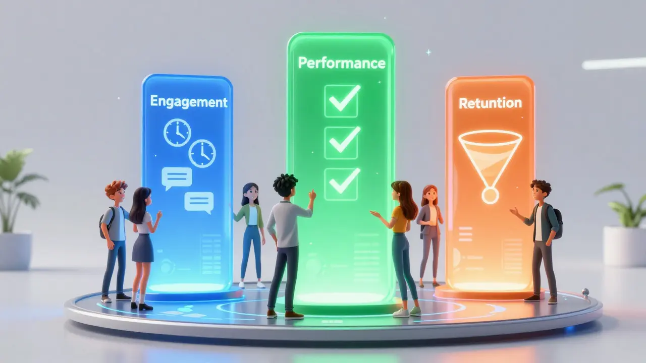
The Core Pillars of Learning Analytics
To build an effective monitoring strategy, you need to understand that not all data is created equal. We categorize metrics into three buckets: Engagement, Performance, and Retention. If you only track one, you’ll miss critical signals. For example, high engagement doesn’t always mean high learning, and high scores don’t always predict long-term retention.
| Metric Category | Primary Focus | Key Indicators | Actionable Insight |
|---|---|---|---|
| Engagement | Student Activity & Interaction | Login frequency, time-on-task, discussion posts | Identify passive learners early |
| Performance | Knowledge Acquisition | Quiz scores, assignment grades, pass/fail rates | Determine content difficulty gaps |
| Retention | Cohort Survival & Completion | Dropout rate, churn point, completion percentage | Optimize course flow to reduce attrition |
Engagement Metrics: Is Anyone Actually Watching?
Engagement is the fuel for learning. If students aren’t interacting with the material, no amount of pedagogical theory will help. The most common mistake instructors make is equating "logged in" with "engaged." They are not the same. A student can log in once a week, stare at the screen for five minutes, and leave. That counts as active in some basic reports, but it tells you nothing about their learning journey.
Time-on-Task is a superior metric. It measures the actual duration a student spends viewing content or interacting with interactive elements. If your average lesson is 10 minutes long, but the median time-on-task is two minutes, you have a problem. Either the content is boring, too difficult, or the video quality is poor. Look for outliers. If 80% of your class spends less than half the expected time on a module, pause and review that specific asset.
Discussion participation is another vital signal. In asynchronous courses, forums are the heartbeat of community. Track the ratio of initiators to responders. A healthy course has a balanced mix where students answer each other, not just wait for the instructor. If you see zero peer-to-peer replies, your prompts might be too vague, or the culture isn’t safe enough for risk-taking. Try switching from open-ended essays to multiple-choice debates to lower the barrier to entry.
Performance Metrics: Where Do Students Struggle?
Grades tell you if learning happened, but granular performance data tells you *where* it broke down. Don’t just look at the final exam score. Drill down into question-level analytics. This is often called Item Response Theory (IRT) in educational psychology, but in your dashboard, it’s simply "Question Analysis."
Look for two specific anomalies:
- High Difficulty, Low Discrimination: Everyone failed this question. This usually means the concept wasn’t taught clearly, or the question wording was ambiguous. Rewrite the explanation and simplify the query.
- Low Difficulty, Low Discrimination: Everyone got it right. This question adds no value. It’s filler. Consider removing it to reduce test fatigue, unless it’s a foundational check-in.
Assignment submission patterns also reveal hidden struggles. Are students submitting assignments at the very last minute? While this might indicate poor time management, a sudden spike in late submissions across a cohort often points to a confusing rubric or a broken file upload link. Check the support tickets alongside the gradebook. Correlation is key here.
Retention & Churn: The Drop-Off Points
In online education, the first two weeks are critical. Research consistently shows that over 50% of dropouts occur within the first 14 days. Your dashboard should highlight "Churn Risk" indicators. These are predictive flags based on historical data. For instance, if a student hasn’t logged in for seven days, or hasn’t submitted the first assignment, they are statistically likely to quit.
Create a "Cohort Funnel" view. This visualization shows the number of students who started the course versus those who completed each module. Look for sharp drops. Did you lose 30% of your class after Module 2? Analyze what changed. Was there a heavy workload? A complex technical requirement? A shift in tone? Identifying the exact "cliff" allows you to intervene. Perhaps add a motivational video or a simplified checkpoint before that heavy module next time.
Completion rate is the vanity metric of online courses. It’s easy to game by making courses shorter or easier. Instead, focus on qualified completion. Did they finish, and did they meet the passing threshold? A 90% completion rate with a 40% failure rate on the final assessment is worse than a 60% completion rate with a 90% pass rate. Quality matters more than quantity.
Real-Time Intervention Strategies
Data is useless if you don’t act on it. The power of a modern LMS analytics suite lies in its ability to trigger alerts. Set up automated notifications for high-risk behaviors. For example, configure your system to email you when a student’s quiz score drops below 60% for two consecutive attempts.
Use segmented communication. Don’t blast the whole class with reminders. Use the data to create lists: "Students who haven’t watched Video 4," or "Students excelling in Module 1." Send targeted messages. To the struggling group, offer office hours or a hint sheet. To the advanced group, offer bonus challenges. Personalization scales through data segmentation.
Consider the "Help Desk" integration. Many dashboards now overlay support ticket volume with activity spikes. If you see a surge in login failures coinciding with a deadline, you know the issue is technical, not academic. Addressing these friction points immediately boosts satisfaction and reduces unnecessary churn.

Tools & Platforms for Tracking
You don’t need to build a custom dashboard from scratch. Most major Learning Management Systems include robust reporting features out of the box. However, their depth varies significantly.
- Moodle: Offers highly customizable reports via plugins like Learner Analytics. Best for institutions needing deep control over data privacy and custom metrics.
- Canvas: Provides clear, user-friendly graphs for course activity and grade distributions. Its "New Analytics" feature uses machine learning to flag at-risk students automatically.
- Blackboard: Strong in compliance and detailed audit trails. Good for corporate training where tracking certification validity is crucial.
- Kajabi/Teachable: Focused on business metrics. They track revenue per student and referral sources better than academic performance details. Best for creators selling standalone courses.
If your native LMS lacks depth, consider integrating third-party tools like Power BI or Tableau. These connect to your LMS database via API and allow you to create drag-and-drop visualizations. This is ideal for large organizations managing thousands of courses simultaneously.
Ethical Considerations in Data Tracking
With great power comes great responsibility. Monitoring every click can feel invasive to students. Transparency is non-negotiable. Clearly state in your syllabus that activity is tracked for support purposes, not punishment. Avoid using engagement data to penalize students directly. Use it to help them.
Data privacy regulations like GDPR and FERPA require strict handling of student information. Ensure your dashboard anonymizes data when used for broader trend analysis. Never share individual student performance data publicly. Keep access restricted to authorized instructors and advisors. Trust is the foundation of any learning environment; misuse of data erodes it instantly.
What is the most important metric for online course success?
While completion rate is popular, engagement consistency is the strongest predictor of success. Specifically, regular login frequency combined with time-on-task correlates most strongly with final grades and satisfaction. A student who logs in daily for short bursts performs better than one who crams for four hours once a week.
How often should I review my course analytics?
For active courses, review key metrics weekly. Daily checks can lead to anxiety over minor fluctuations. Weekly reviews allow you to spot trends, such as a gradual decline in forum participation, and intervene before the semester ends. After the course closes, perform a deep-dive analysis to improve future iterations.
Can analytics predict which students will fail?
Yes, to a significant degree. Predictive analytics models use early indicators like missed deadlines, low initial quiz scores, and infrequent logins to calculate a "risk score." While not 100% accurate, these predictions allow instructors to reach out proactively, offering support that can change the outcome.
What is the difference between formative and summative analytics?
Formative analytics happen during the course to inform teaching adjustments and student support (e.g., mid-module quiz results). Summative analytics occur after the course ends to evaluate overall effectiveness, ROI, and curriculum design for future improvements (e.g., final pass rates and survey feedback).
Do all LMS platforms provide the same level of analytics?
No. Enterprise platforms like Canvas and Blackboard offer deep, customizable reporting with predictive capabilities. Consumer-focused platforms like Teachable or Thinkific prioritize sales and conversion metrics over granular learning behavior. Choose a platform based on whether your primary goal is academic rigor or business growth.