Dashboard Creation and Data Visualization for Course Metrics: A Practical Guide
 May, 23 2026
You have the data. You have the Learning Management System (LMS). But staring at a spreadsheet of login timestamps and quiz scores doesn't tell you if your students are actually learning. That is where dashboard creation comes in. It turns raw numbers into a story you can act on.
If you are an instructor, instructional designer, or administrator, you know that intuition is not enough. You need to see who is falling behind before they fail. You need to know which module is confusing everyone. This guide breaks down how to build effective dashboards for course metrics, focusing on what matters most: student success and course improvement.
Defining the Core Entities of Course Analytics
To build a useful dashboard, you first need to understand what you are measuring. In the world of education technology, we deal with specific entities that drive the narrative.
Learning Management System (LMS) is software used to plan, implement, and evaluate a specific educational course. Popular platforms include Moodle, Canvas, Blackboard, and D2L Brightspace. These systems generate the raw data logs every time a student clicks a link, submits an assignment, or posts in a forum.
The central entity here is the Student Engagement Metric, which refers to quantifiable indicators of a learner's interaction with course content and peers. Unlike simple attendance, engagement metrics capture the depth of involvement. High engagement usually correlates with higher retention rates and better final grades.
We also track Academic Performance Indicator, defined as measures of student achievement such as quiz scores, assignment grades, and completion rates. While engagement tells you if they are there, performance tells you if they got it.
Understanding these three entities-LMS, Engagement, and Performance-is the foundation. Without clear definitions, your dashboard will just be a collection of pretty charts that mean nothing.
Selecting the Right Tools for Visualization
You do not need to be a software engineer to create a dashboard. However, the tool you choose depends on your technical comfort level and the volume of data you handle.
| Tool Type | Examples | Best For | Technical Skill Required |
|---|---|---|---|
| Built-in LMS Reports | Canvas Analytics, Moodle Reports | Quick checks, basic trends | Low |
| BI Platforms | Tableau, Power BI, Looker | Deep dives, cross-platform data | Medium to High |
| No-Code Dashboards | Glide, AppSheet, Retool | Custom views without coding | Low to Medium |
| Python/R Libraries | Plotly, Dash, Shiny | Advanced statistical modeling | High |
For most educators, starting with built-in LMS reports is the smartest move. If you need more power, tools like Tableau Public or Microsoft Power BI offer free tiers that connect easily to CSV exports from your LMS. Avoid overcomplicating things early on. The goal is clarity, not complexity.
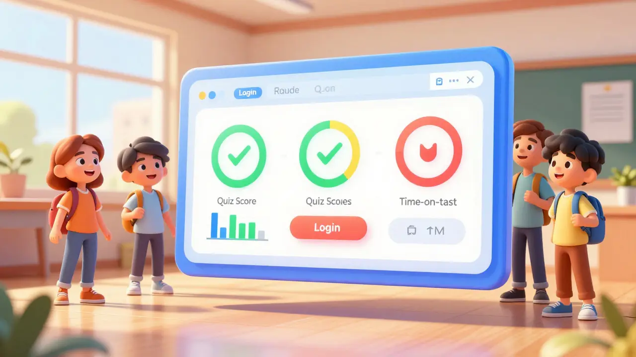
Key Metrics to Track for Student Success
Not all data is created equal. Tracking everything leads to analysis paralysis. Focus on these high-impact metrics:
- Login Frequency: How often does a student access the course? A sudden drop might indicate personal issues or confusion about the schedule.
- Time on Task: How long do students spend on specific modules? If Module 3 takes twice as long as Module 2, it might be too difficult or poorly structured.
- Assignment Submission Latency: Are students submitting late? Early submission often correlates with confidence and understanding.
- Forum Participation: Quality and quantity of peer interactions. Social presence is a key predictor of online course completion.
- Quiz Score Trends: Look for dips. A single low score is noise; a trend across the class signals a teaching gap.
These metrics form the backbone of your dashboard. They answer the question: "Is the student moving forward effectively?"
Design Principles for Effective Data Visualization
A bad chart can hide insights. A good one reveals them instantly. Follow these design principles when creating your visualizations:
- Know Your Audience: Administrators want aggregate trends. Instructors want individual student alerts. Students want personalized progress bars. Build separate views for each.
- Use Color Purposefully: Do not use rainbow colors. Use color to highlight status. Green for on-track, yellow for warning, red for critical. Ensure colorblind accessibility by using patterns or labels alongside colors.
- Simplify the Chart Type:
- Use line charts for trends over time (e.g., weekly login counts).
- Use bar charts for comparisons between groups (e.g., quiz scores by section).
- Use scatter plots to find correlations (e.g., time spent vs. final grade).
- Avoid pie charts for more than three categories. They are hard to read accurately.
- Provide Context: A number alone is meaningless. Add benchmarks. Show the class average next to the individual score. Show last semester's data next to this semester's.
Remember, the best dashboard is one that requires zero explanation. If someone asks, "What does this axis mean?", you have failed the design test.
Building the Dashboard: Step-by-Step Workflow
Here is a practical workflow to go from idea to implementation:
- Define the Question: Start with a problem. "Why are so many students failing Week 4?" rather than "Let's visualize all data."
- Extract Data: Export relevant logs from your LMS. Clean the data. Remove duplicates, fix date formats, and anonymize student IDs if sharing broadly.
- Choose Visuals: Map each metric to a chart type based on the design principles above.
- Build the Prototype: Create a draft in your chosen tool. Keep it simple. One screen, no scrolling if possible.
- Add Interactivity: Allow users to filter by date range, course section, or student group. Drill-down capabilities are powerful.
- Test and Iterate: Share with a colleague. Ask them to interpret a specific insight. If they struggle, simplify.
This iterative process ensures your dashboard remains useful as courses evolve.

Interpreting Insights for Actionable Outcomes
Data is useless without action. Here is how to translate dashboard insights into real-world interventions:
If your dashboard shows a cluster of students with low login frequency but high quiz scores, they might be efficient learners who study offline. No intervention needed.
If you see high login frequency but low quiz scores, those students are likely confused or overwhelmed. Consider sending a targeted email offering office hours or clarifying resources.
If a specific module has significantly longer time-on-task than others, review the content. Is it too dense? Is the instruction unclear? Use this data to refine your course design for future semesters.
Automate alerts where possible. Set up notifications for students who miss two consecutive weeks of activity. Early warning systems save degrees.
Ethical Considerations in Educational Data
With great data comes great responsibility. You must handle student information ethically and legally.
Privacy First: Comply with FERPA (in the US) or GDPR (in Europe). Never display full names in public dashboards. Use student IDs or initials. Aggregate data whenever possible.
Transparency: Tell students their data is being tracked and why. Explain how it helps them succeed. Secret surveillance breeds distrust.
Bias Awareness: Algorithms can perpetuate bias. A model that flags "low engagement" might penalize students who work night shifts or have caregiving responsibilities. Regularly audit your metrics for fairness.
Ethics is not an afterthought. It is a core component of dashboard creation.
What is the difference between descriptive and predictive analytics in course metrics?
Descriptive analytics tells you what happened (e.g., "Student A missed three assignments"). Predictive analytics uses historical data to forecast future outcomes (e.g., "Student A has an 80% chance of failing based on current trends"). Descriptive is easier to build; predictive requires more sophisticated models and larger datasets.
How often should I update my course dashboard?
It depends on the pace of your course. For intensive bootcamps, daily updates may be necessary. For semester-long university courses, weekly updates are usually sufficient. Real-time dashboards are rarely needed and can cause unnecessary anxiety for both instructors and students.
Can I use Excel for dashboard creation?
Yes, absolutely. Excel is powerful for small-scale courses. Use pivot tables and conditional formatting to create simple dashboards. However, Excel struggles with large datasets and lacks robust interactivity compared to dedicated BI tools like Tableau or Power BI.
What are common pitfalls in educational data visualization?
Common pitfalls include cluttered charts, misleading scales (e.g., truncating y-axes), lack of context, and ignoring accessibility needs. Another major pitfall is vanity metrics-tracking data that looks good but doesn't impact student learning.
How do I ensure my dashboard is accessible to all users?
Ensure high contrast ratios, use alt text for images, avoid relying solely on color to convey meaning, and provide keyboard navigation options. Test your dashboard with screen readers. Accessibility benefits everyone, not just users with disabilities.