Designing Online Courses for Color-Blind Learners
 Mar, 11 2026
Over 300 million people worldwide live with some form of color blindness. That’s more than the population of the United States. Yet most online courses still assume everyone sees colors the same way. If your course uses red to mark wrong answers, green for correct ones, or relies on color-coded charts to explain data, you’re leaving a huge chunk of learners behind. Designing online courses for color-blind learners isn’t about adding extra features-it’s about building from the ground up with clarity in mind.
Why Color Matters More Than You Think
Color isn’t just decoration. In online learning, it’s often used as a primary communication tool. Think about it: quizzes use red and green to signal right or wrong. Dashboards show progress with color gradients. Maps use hues to represent population density. Graphs rely on distinct color lines to compare trends. For someone with red-green color blindness-the most common type-these visuals become blurry, muddy, or completely unreadable.
A 2023 study from the University of Michigan found that 42% of color-blind learners abandoned online modules because they couldn’t interpret key visuals. Not because the content was too hard. Not because the pace was too fast. Just because the colors made it impossible to tell what was what.
Start With Contrast, Not Color
The single most effective change you can make? Stop using color alone to convey meaning. Instead, pair every color with a shape, pattern, label, or icon. For example:
- Instead of a red line for "low performance," use a dashed red line with the label "Below Target" next to it.
- Instead of green circles for "completed" and red for "incomplete," use checkmarks and Xs with color as a secondary hint.
- For drag-and-drop activities, use text labels like "Option A" and "Option B" instead of relying on colored tiles.
This isn’t just helpful for color-blind users-it helps everyone. People viewing your course on a dim screen, in bright sunlight, or on a low-quality monitor benefit too. Good design isn’t niche. It’s universal.
Use Tools to Test Your Color Choices
You can’t design for something you can’t see. That’s why you need to simulate what color-blind learners experience. There are free, easy-to-use tools that show you exactly how your course looks to someone with deuteranopia (red-green blindness), protanopia (red deficiency), or tritanopia (blue-yellow blindness).
Try these:
- Color Oracle (free desktop app) - Simulates all major types of color blindness in real time.
- WebAIM Contrast Checker - Checks if text and background meet accessibility standards (minimum 4.5:1 contrast ratio).
- Sim Daltonism (browser extension) - Instantly toggles your screen to show how it appears to color-blind users.
Run every slide, chart, and button through one of these tools before publishing. If a learner can’t tell the difference between two elements without guessing, you’ve got a problem.
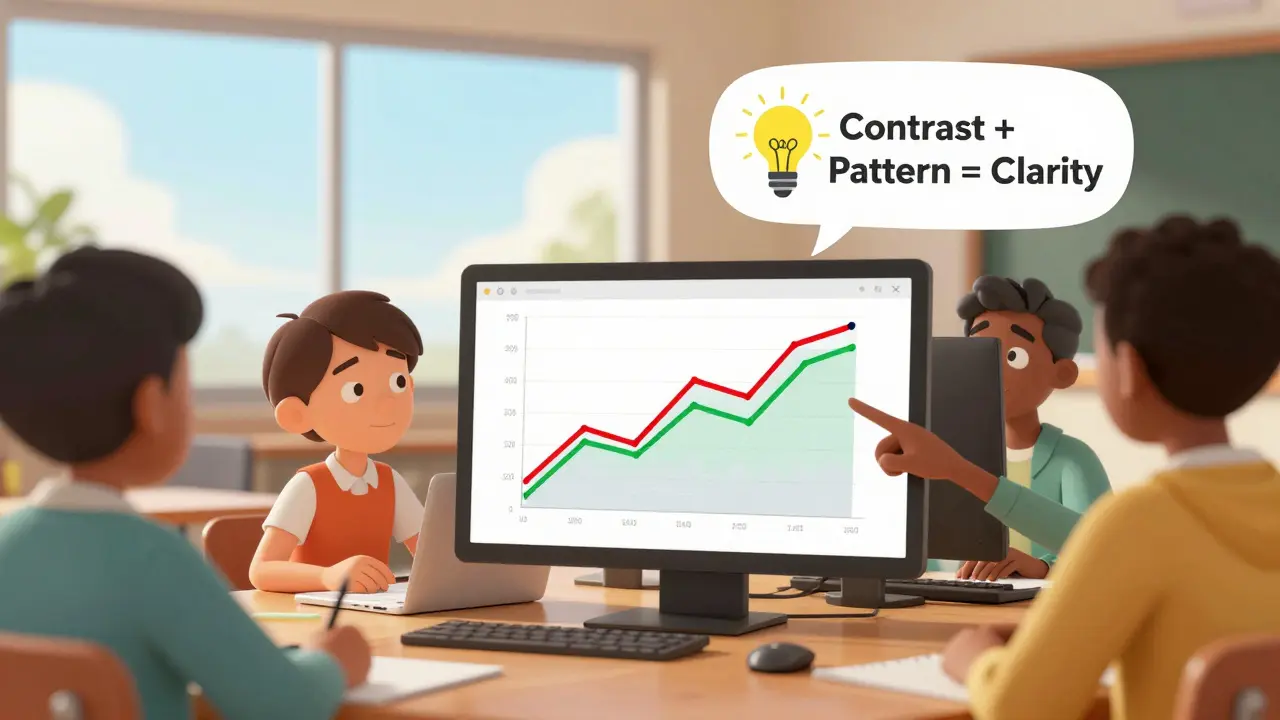
Charts and Graphs That Work for Everyone
Bar charts, pie charts, line graphs-they’re everywhere in online courses. But they’re also the most common source of confusion for color-blind learners.
Here’s how to fix them:
- Use patterns: stripes, dots, hashes, or grids to differentiate data series instead of relying on color.
- Label data points directly on the chart. Don’t make learners hunt for a legend.
- For line graphs, use different line styles-dashed, dotted, thick, thin-along with color.
- Avoid using red and green together. Even if they look different to you, they often blend into the same grayish tone for color-blind viewers.
A real example: A business course used a line graph to compare quarterly sales. The two lines were red and green. To most learners, it looked like one line. After switching to black and navy with a dashed vs. solid line style, completion rates on that module jumped by 37%.

Text and Background: The 4.5:1 Rule
It’s not enough to just pick colors that look nice. You need to meet a measurable standard: contrast ratio. The Web Content Accessibility Guidelines (WCAG) recommend a minimum of 4.5:1 between text and its background. This isn’t optional. It’s the baseline.
Here’s what works:
- Black text on white background: 21:1 - perfect.
- Dark gray (#333) on white: 12:1 - still great.
- Light gray (#AAA) on white: 2:1 - too low. Fails.
- Red text on green background: varies, but often below 3:1 - dangerous.
Many course builders use soft pastels or light backgrounds because they "look calm" or "modern." But if your text disappears against the background, no one is learning. Stick to high-contrast combinations. If you’re unsure, use the WebAIM tool above. It tells you exactly if your combo passes or fails.
Don’t Forget Interactive Elements
Buttons, form fields, progress bars, hover states-they all need to be accessible too.
- Don’t rely on color changes alone to indicate a button is active. Add a border, icon, or text change.
- For drag-and-drop activities, use clear visual cues: outlines, shadows, or animations-not just color shifts.
- Progress bars should show percentage numbers, not just a color fill. "75% complete" is clearer than a yellow bar.
One course creator thought they were being clever by using a glowing blue highlight to show selected answers. But to a color-blind learner, it looked identical to the unselected options. They added a thick border and a checkmark icon. Engagement went up. Confusion dropped.
What Not to Do
Here are common mistakes that still show up in 2026:
- Using color-only navigation menus (e.g., "Click the red button for Module 2").
- Creating quizzes where the correct answer is "the green one" without labeling.
- Using red for errors and green for success without icons or text.
- Assuming "everyone knows what red means"-they don’t, if they can’t see it.
These aren’t just bad design. They’re exclusionary. And they’re easy to fix.

Real-World Impact: More Than Just Accessibility
When you design for color-blind learners, you’re not just helping one group. You’re making your course clearer for everyone.
Think about it:
- People with temporary vision issues-like eye strain or post-surgery recovery.
- Users on low-quality screens or in bright sunlight.
- Learners who are tired, distracted, or learning in a noisy environment.
- Anyone who just prefers text labels over color cues.
A 2025 report from the Global Accessibility Initiative showed that courses designed with color-blind accessibility in mind had 28% higher completion rates overall. Why? Because they were simply easier to understand.
Start Small. Fix One Thing.
You don’t need to rebuild your whole course tomorrow. Pick one module. Run it through Color Oracle. Look at the quiz. Look at the chart. Look at the buttons.
Ask yourself: Could someone with red-green color blindness tell what’s going on? If not, change one thing. Add a label. Change the pattern. Increase the contrast.
Then do it again. And again. Progress isn’t about perfection. It’s about consistency.
Final Thought: Accessibility Is Design
Designing for color-blind learners isn’t a special accommodation. It’s good design. It’s clear communication. It’s respect for how people actually experience the world.
If your course works only for people who see colors the same way you do, you’re not teaching. You’re filtering.
What’s the most common mistake when designing for color-blind learners?
The most common mistake is using color alone to communicate meaning-like saying "click the red button" or "the green line shows growth." Color-blind learners can’t distinguish these colors, so they’re left guessing. Always pair color with shape, pattern, text, or icon.
Do I need to redesign my entire course?
No. Start with one module-preferably one with charts, quizzes, or interactive elements. Test it with a color-blind simulator like Color Oracle. Fix the clearest issues: contrast, labels, patterns. Then move to the next. Small changes add up fast.
Is there a free tool I can use to check my course?
Yes. Use WebAIM’s Contrast Checker to test text readability, Color Oracle to simulate color blindness, and Sim Daltonism (browser extension) to view your course as a color-blind person would. All are free and work in minutes.
What’s the minimum contrast ratio I should aim for?
The WCAG standard is 4.5:1 between text and background. Black text on white is 21:1-ideal. Light gray on white is often below 3:1 and fails. Never assume a color looks fine to everyone. Test it.
Can I still use color in my course?
Absolutely. Color enhances learning when used as a supplement-not the only signal. Use it to highlight, but always pair it with labels, shapes, or patterns. A red circle with a checkmark is fine. A red circle alone is not.
Madhuri Pujari
March 11, 2026 AT 23:57Sandeepan Gupta
March 12, 2026 AT 01:35Tarun nahata
March 13, 2026 AT 02:21Aryan Jain
March 13, 2026 AT 11:29Nalini Venugopal
March 14, 2026 AT 21:24Pramod Usdadiya
March 15, 2026 AT 11:49Aditya Singh Bisht
March 15, 2026 AT 23:29Agni Saucedo Medel
March 17, 2026 AT 15:30ANAND BHUSHAN
March 18, 2026 AT 00:33Indi s
March 19, 2026 AT 14:55Rohit Sen
March 20, 2026 AT 12:46Vimal Kumar
March 22, 2026 AT 01:41Amit Umarani
March 22, 2026 AT 08:52Noel Dhiraj
March 23, 2026 AT 04:16vidhi patel
March 24, 2026 AT 08:22Priti Yadav
March 24, 2026 AT 15:02Ajit Kumar
March 26, 2026 AT 09:58Diwakar Pandey
March 27, 2026 AT 03:00