Dyslexia-Friendly Course Design: Fonts, Layout, and Writing
 Aug, 10 2026
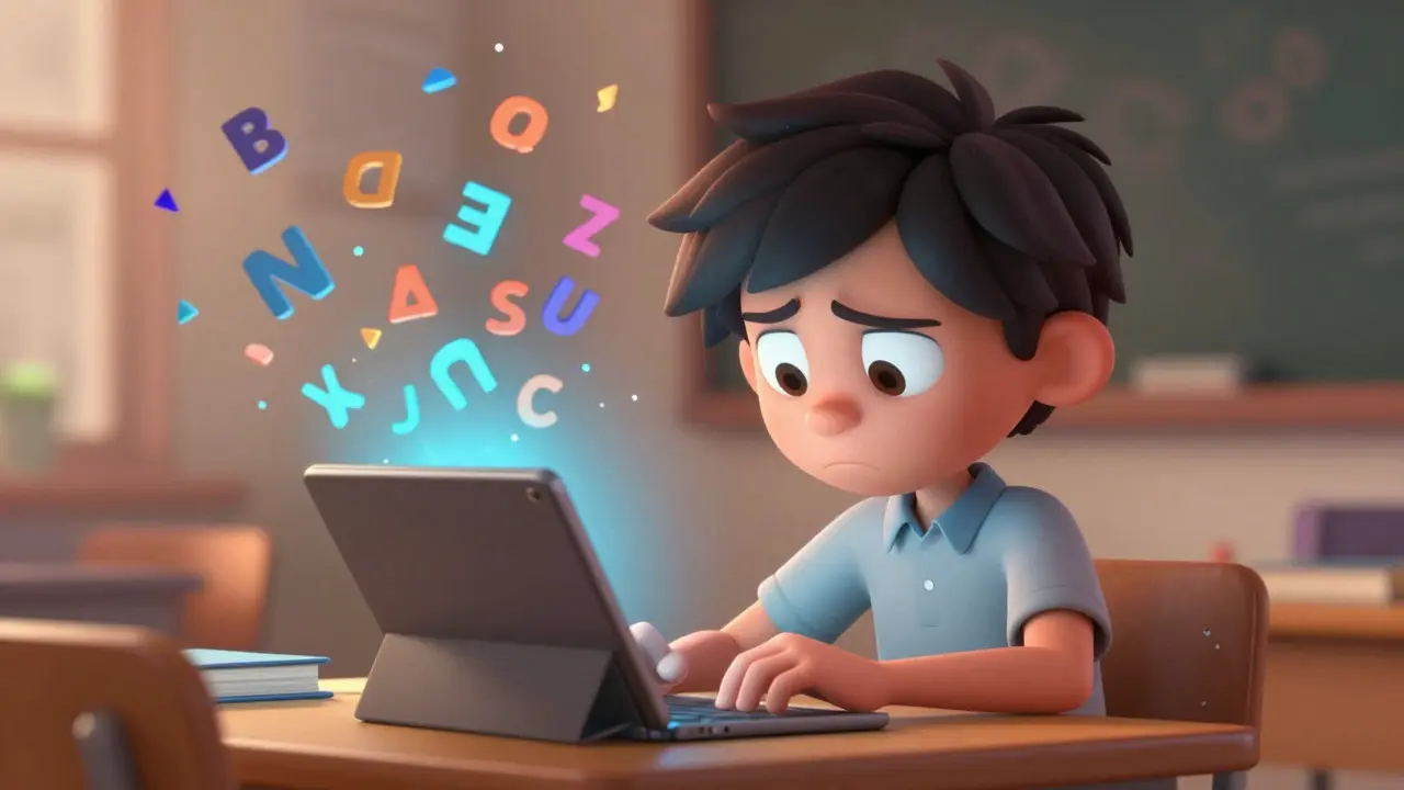
Imagine trying to read a menu where the letters seem to swim across the page, overlapping and blurring into an indecipherable mess. For someone with dyslexia, a specific learning difference that primarily affects reading and spelling, this is not just a bad day; it is their daily reality in many digital learning environments. When you design online courses without considering accessibility, you aren't just making life harder for students with dyslexia-you are building walls that keep potential learners out entirely.
Creating dyslexia-friendly course design, an approach to structuring educational content that reduces cognitive load and visual stress for readers with processing differences doesn't require a degree in graphic design or a massive budget. It requires intentionality. By tweaking fonts, adjusting layouts, and simplifying your writing style, you can transform a confusing module into a clear, engaging experience. This guide breaks down exactly how to do that, ensuring your content is readable for everyone, not just those who learn best from dense blocks of text.
The Right Fonts Make All the Difference
Font choice is often treated as a minor aesthetic detail, but for a dyslexic reader, it is a functional barrier. The goal isn't just "pretty" typography; it is clarity. You want to avoid fonts that have decorative elements, excessive serifs, or similar-looking characters (like 'l', 'I', and '1').
Sans-serif fonts are generally the safest bet because they lack the small lines attached to the ends of strokes, which can create visual clutter. Here are the top contenders:
- OpenDyslexic: This font was specifically designed with weighted bottoms to help prevent the brain from flipping words upside down. While some studies debate its universal effectiveness, many users report a significant reduction in eye strain.
- Verdana: Created by Microsoft, Verdana has wide spacing between letters and distinct character shapes. It was designed for screen readability, making it a natural fit for online courses.
- Arial: A standard sans-serif font that is clean and neutral. It won’t win any design awards, but it gets the job done without adding visual noise.
- Comic Sans: Despite its reputation among designers, Comic Sans is highly recommended by many dyslexia experts. Its irregular letterforms make each character unique, helping the brain distinguish between them more easily.
Whatever font you choose, ensure the size is at least 12pt, though 14pt or 16pt is better for body text. Avoid using all caps for long passages, as capital letters look like uniform blocks to many dyslexic readers, removing the ascenders and descenders that help define word shape.
Layout Strategies That Reduce Visual Stress
If the font is the vehicle, the layout is the road. A bumpy, crowded road makes the journey exhausting. Dyslexic learners often struggle with tracking-keeping their place on the line-and distinguishing where one paragraph ends and another begins. Your layout needs to provide clear visual anchors.
| Element | Standard Practice | Dyslexia-Friendly Approach |
|---|---|---|
| Line Length | Full width of screen | Keep lines short (50-75 characters max) to prevent losing place. |
| Background Color | White background | Use off-white, cream, or light pastel backgrounds to reduce glare. |
| Text Alignment | Justified (flush left and right) | Left-aligned only. Justification creates uneven spacing that disrupts flow. |
| Paragraph Spacing | Single spaced with indent | 1.5 line spacing with no indentation; use blank lines between paragraphs. |
One of the biggest mistakes course creators make is using justified text. When text is justified, the software stretches the spaces between words to force the right edge to align. This creates "rivers" of white space that run through the text, breaking up words and making sentences harder to parse. Always stick to left-aligned text.
Color contrast is also critical. Pure black text on a pure white background can cause visual vibration or halos for some people with dyslexia. Try using dark gray (#333333) text on a soft cream or pale yellow background. Many learning management systems (LMS) now allow users to toggle high-contrast modes, but setting an accessible default shows you care about the user experience from the start.
Writing for Clarity and Cognitive Load
You can have the perfect font and layout, but if your writing is convoluted, the message will still get lost. Dyslexia often co-occurs with difficulties in working memory. This means complex sentence structures can overwhelm the reader before they even finish the thought.
Adopt a "plain language" approach. This doesn't mean dumbing down the content; it means removing unnecessary complexity. Use active voice instead of passive voice. Instead of saying, "The experiment was conducted by the team," say, "The team conducted the experiment." Active sentences are shorter and clearer.
Break information into chunks. The human brain can only hold so much information at once. Use bullet points, numbered lists, and bold headers to break up walls of text. If you are explaining a process, use a step-by-step format. If you are defining terms, put them in a glossary or call-out box rather than burying them in a paragraph.
Avoid idioms and metaphors whenever possible. Phrases like "hit the ground running" or "piece of cake" rely on cultural context and literal interpretation skills that may not translate well for neurodivergent learners. Say what you mean directly. If you must use an idiom, explain it immediately after using it.

Multi-Sensory Learning Opportunities
Visual text is just one channel of input. To truly support dyslexic learners, incorporate multi-sensory elements. This aligns with the Universal Design for Learning (UDL) framework, which suggests providing multiple means of representation.
Include audio narration for your written modules. Tools like text-to-speech plugins or recorded voiceovers allow students to listen while they read. This dual-coding strategy reinforces the material and helps with decoding difficult words. Ensure that any video content includes accurate captions. Captions benefit everyone, including those in noisy environments, but they are essential for learners who process auditory information differently.
Use diagrams and infographics to supplement text. A visual representation of a concept can often convey meaning faster than a paragraph of description. However, never replace text with an image alone. Always provide alt-text for images and a textual summary for charts, ensuring that screen readers can interpret the visual data.
Testing and Iterating Your Design
Designing for dyslexia is not a one-time task; it is an iterative process. The best way to know if your course is accessible is to test it with real users. If you have students with dyslexia in your program, ask for their feedback. Do they find the text easy to track? Is the color scheme comfortable? Are the instructions clear?
You can also use automated accessibility checkers. Tools like WAVE or Lighthouse can scan your web pages for common issues like low contrast ratios or missing alt-text. While these tools don't catch everything-they can't judge whether your writing is too complex-they are a great starting point for technical compliance.
Remember that accessibility benefits everyone. Clear fonts, logical layouts, and plain language make your course easier for non-native English speakers, older adults, and anyone tired or distracted. By designing for the margins, you improve the experience for the center.
What is the best font size for dyslexia-friendly content?
Aim for a minimum font size of 12pt, but 14pt to 16pt is ideal for body text. Larger fonts reduce the density of information on the screen, giving each word more breathing room and reducing visual crowding.
Is Comic Sans really a good font for dyslexia?
Yes, despite its unprofessional reputation in some circles. Comic Sans has distinct letterforms that are less likely to be confused with one another. Its informal nature can also make learning materials feel less intimidating.
Should I use justified text in my online courses?
No. Justified text creates uneven spacing between words, which can disrupt reading flow and make it harder for dyslexic readers to track lines. Always use left-aligned text for better readability.
How does line spacing affect dyslexic readers?
Tight line spacing can cause lines of text to blur together. Using 1.5 line spacing provides enough vertical gap between lines to help the reader's eyes stay on track, reducing the chance of skipping lines or re-reading.
What is the role of color in dyslexia-friendly design?
High contrast between black text and white background can cause visual stress or "glare" for some dyslexic individuals. Using softer backgrounds like cream, pale yellow, or light blue can reduce this strain and improve comfort during long reading sessions.