How to Build Inclusive Learning Experiences for All Learners
 Dec, 9 2025
When you design a course or a learning app, do you assume everyone learns the same way? If you’ve ever watched a student struggle to follow a video because there’s no caption, or a learner with shaky hands skip past a tiny button on a mobile screen, you know that’s not true. Inclusive learning isn’t about making exceptions-it’s about designing for the full range of human difference from the start. And in 2025, with more people learning on phones than ever before, it’s not just nice to do-it’s necessary.
Start with the Real People You’re Teaching
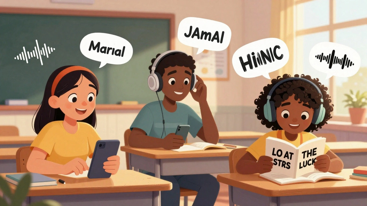
Forget the word "disabled." Think about real people. Maria, a single mom in Phoenix, uses voice commands to navigate her phone because she has carpal tunnel from years of data entry. Jamal, a college student in Detroit, has dyslexia and needs text-to-speech to understand readings. Aisha, a retiree in Tucson, has macular degeneration and needs high-contrast text to see her screen. These aren’t edge cases. They’re your learners.
According to the World Health Organization, over 1.3 billion people live with some form of disability. That’s 1 in 6 people globally. In the U.S., 26% of adults have a disability, and nearly 70% of them use smartphones daily. If your learning content doesn’t work for them, you’re leaving out a huge part of your audience-and you’re missing out on better engagement for everyone.
Build for Movement, Not Just Vision
Most accessibility guides focus on color contrast and screen readers. That’s important, but it’s only half the story. What about learners who can’t use a touchscreen precisely? Or those who need to use a switch device, a head pointer, or just one finger because of tremors or paralysis?
Here’s what works: Make every interactive element at least 48x48 pixels. That’s the minimum size recommended by the Web Content Accessibility Guidelines (WCAG 2.2). Smaller buttons? They’re unusable for people with motor control challenges. Too many taps in a row? That’s a barrier. If your quiz requires five quick taps to submit an answer, someone with Parkinson’s might never finish it.
Also, avoid time limits. If your course says, "Complete this quiz in 90 seconds," you’re excluding people who process information slower-whether due to ADHD, brain injury, or just being tired after a long day. Let learners go at their own pace. Always.
Design for All Senses, Not Just Sight
Video lectures without captions? That’s a wall for Deaf and hard-of-hearing learners. But captions aren’t enough. You need accurate, synchronized text that includes speaker names, sound cues like "door slams" or "music swells," and clear punctuation so it’s readable on small screens.
Audio-only content? That’s a problem for Deaf learners. But it’s also a problem for learners in noisy places-like a crowded bus, a daycare center, or a factory floor. Always provide a transcript. Not a summary. A full, word-for-word transcript. People with cognitive disabilities, non-native speakers, and those learning in low-bandwidth areas rely on this.
And don’t forget tactile feedback. On mobile apps, haptic pulses can signal when an answer is correct or when a section is complete. For learners with visual impairments, this is often the only way they know they’ve moved forward. Test your app with a blind user. If they can’t tell when they’ve submitted a response, you’ve failed.
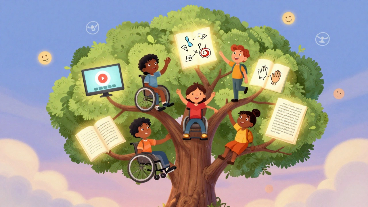
Use Universal Design from Day One
Universal Design for Learning (UDL) isn’t a buzzword. It’s a framework with three core principles: multiple means of representation, multiple means of action and expression, and multiple means of engagement.
Representation means giving learners the same content in different formats. A lesson on photosynthesis? Offer a video with captions, an illustrated diagram, an audio summary, and a plain-text version. Don’t assume one format works for all.
Action and expression means letting learners show what they know in different ways. Instead of forcing everyone to write an essay, let them record a voice memo, draw a diagram, or record a 60-second video. A learner with dysgraphia might ace the content but fail a written test. That’s not their fault-it’s your design.
Engagement is about motivation. Some learners thrive on competition. Others need quiet, self-paced tasks. Offer choices. Let them pick their project topic. Let them choose between a quiz, a journal entry, or a group discussion. Autonomy increases retention by up to 40%, according to a 2024 study from Stanford’s Center for Learning Sciences.
Test with Real Users, Not Just Tools
Automated tools like WAVE or Lighthouse can find color contrast errors or missing alt text. But they can’t tell you if a learner with aphasia can understand your instructions. Or if someone with anxiety feels overwhelmed by flashing animations.
Here’s how to fix that: Recruit real people. Reach out to local disability organizations. Offer a $25 gift card. Ask them to use your course on their own phone. Watch what they do. Listen to what they say. You’ll learn things no checklist can teach you.
One developer in Portland redesigned their app after a user with cerebral palsy said, "I can’t tap the "Next" button because it moves when I hold my hand still." The button was animating slightly to draw attention. To most people, that’s cute. To her, it was impossible. She didn’t need a bigger button. She needed it to stay still.
Fix the Little Things That Break the Experience
Small oversights create big barriers. Here are the most common ones I see in mobile learning apps:
- Text that’s too small to read on a phone without zooming (use relative units like "em," not fixed pixels)
- Links that look like regular text (make them underlined or colored, not just blue)
- Forms with no labels, or labels that disappear when you start typing
- Auto-playing audio or video that starts without warning
- Menus that require swiping left-right to navigate (use vertical lists instead)
- Color-only indicators ("Correct answers are green," but what if you’re colorblind?)
These aren’t "nice-to-haves." They’re deal-breakers. A 2023 report from the National Federation of the Blind found that 83% of learners with visual impairments abandoned an online course because of poor mobile design.
It’s Not Just About Compliance-It’s About Belonging
Legal requirements like the ADA or Section 508 matter. But if your only goal is to avoid lawsuits, you’re missing the point. Inclusive design doesn’t just make learning possible-it makes learners feel seen.
Think about how a student feels when they finally understand a concept because the video had accurate captions. Or when they submit an answer using voice input and the system recognizes them without judgment. That’s not accessibility. That’s dignity.
When you design for the edges, you improve the middle. Captions help ESL learners. Clear navigation helps people multitasking with kids in the background. Flexible pacing helps working adults. Inclusive learning isn’t a special accommodation. It’s better learning-for everyone.
Start Small. Start Now.
You don’t need a big budget or a team of experts to begin. Here’s your 5-minute action plan:
- Turn on captions on your next video and check if they’re accurate.
- Enlarge your buttons to 48x48 pixels on your mobile course.
- Add a transcript to your longest audio lesson.
- Remove any auto-playing media.
- Ask one learner with a disability for feedback-just one.
That’s it. You’ve just made your course more inclusive. No certification needed. No software to buy. Just human-centered thinking.
Learning isn’t a one-size-fits-all experience. And the sooner you stop pretending it is, the better your content will be-for everyone.
What’s the difference between accessibility and inclusion in learning?
Accessibility means removing technical barriers-like adding captions or screen reader support. Inclusion goes further: it’s about creating an environment where every learner feels welcome, respected, and capable of succeeding. You can have accessible content that still feels cold or impersonal. True inclusion means designing with empathy, not just compliance.
Do I need special software to make my course inclusive?
No. Most inclusive design changes cost nothing. Use free tools like YouTube’s auto-captions (then edit them), Canva’s accessibility checker, or Microsoft Word’s readability stats. The real tool you need is empathy-listen to your learners, watch how they interact, and adjust. No expensive platform or plugin replaces real feedback.
Can inclusive design hurt the look or flow of my course?
Not if you do it right. Many people think inclusive design means boring, gray interfaces. That’s a myth. Clear layouts, readable fonts, and thoughtful spacing make courses easier for everyone-not just those with disabilities. Think of it like good typography: it doesn’t scream for attention, but it makes reading effortless. Inclusive design is elegant design.
How do I know if my mobile course works for people with cognitive disabilities?
Simplify. Use short sentences. Break content into small chunks. Avoid jargon. Use consistent navigation-never change where buttons are. Add progress indicators ("You’re on step 2 of 5"). Test with someone who has ADHD, autism, or a brain injury. If they say, "I got lost," or "I didn’t know what to do next," go back and simplify. Less is more.
What if my learners don’t ask for accommodations?
Most people won’t ask. They’ll just quit. A 2024 survey of 1,200 adult learners found that 68% of those with hidden disabilities never requested help because they feared judgment or didn’t think it mattered. If you wait for requests, you’re waiting for people to fight for their right to learn. Design inclusively from the start-so no one has to ask.
Peter Reynolds
December 10, 2025 AT 04:04Been designing e-learning modules for years and this hits different. I used to think accessibility was just adding captions. Turns out it’s about letting people actually use the damn thing.
Just made all my buttons 48x48. Took 5 minutes. No one complained. Everyone finished the course faster.
Amanda Harkins
December 10, 2025 AT 10:01inclusion isn’t a feature. it’s the foundation. if you’re building something and you’re not thinking about maria with carpal tunnel or aisha with macular degeneration, you’re not building for people. you’re building for a fantasy.
and yeah, it’s cheaper to do it right the first time than to patch it later with bandaids and apologies.
Jeanie Watson
December 10, 2025 AT 15:44meh. i’ve seen this before. same old checklist. ‘make buttons bigger’ ‘add transcripts’ whatever.
real talk: most companies don’t care until they get sued.
Tom Mikota
December 12, 2025 AT 02:48Wait-so you’re saying we shouldn’t use tiny buttons? And auto-playing audio is bad? And captions matter? Wow. Groundbreaking. I’m gonna cry. Someone call the media. We’ve uncovered the secret that people with disabilities exist.
Also, WCAG 2.2 says 48x48? That’s not a recommendation-it’s a minimum. You’re still doing it wrong if you’re barely hitting that.
Mark Tipton
December 14, 2025 AT 00:58Let’s be clear: this isn’t about inclusion. It’s about legal liability dressed up as virtue signaling. The ADA was never meant to dictate font sizes. The WHO statistic? Misleading-many ‘disabilities’ are self-reported and transient. And Stanford’s 40% retention claim? Correlation ≠ causation. You’re conflating usability with moral superiority.
Also, ‘test with blind users’? How many blind users do you know? You’re outsourcing your design process to a demographic you don’t understand. That’s not empathy. That’s performative compliance.
Adithya M
December 14, 2025 AT 07:56bro this is basic. in india we have millions learning on cheap phones with bad screens. if your app doesn’t work with one finger or in low light, you’re not a designer-you’re a liability.
also, auto-play audio? criminal. i lost 3 courses because of that. just stop.
Jessica McGirt
December 15, 2025 AT 01:07Universal Design for Learning isn’t a buzzword because it’s trendy-it’s because it works. Multiple means of representation? Yes. Multiple means of expression? Absolutely. Multiple means of engagement? Non-negotiable.
And if your course doesn’t let someone choose how they learn, you’re not teaching-you’re gatekeeping.
Donald Sullivan
December 16, 2025 AT 03:14you think this is hard? try being a single mom in phoenix and having to relearn everything because your phone’s too slow and the app won’t stop buffering.
this isn’t ‘nice to have.’ it’s survival. and if you’re still using fixed pixel fonts? you’re not just lazy-you’re cruel.
Tina van Schelt
December 17, 2025 AT 03:52designing for the edges doesn’t make your course look like a hospital brochure-it makes it feel like home. like someone finally looked you in the eye and said, ‘you belong here.’
that’s the magic. not the 48-pixel button. the quiet realization that you weren’t forgotten.
Jawaharlal Thota
December 18, 2025 AT 00:31Let me tell you, as someone who’s worked with adult learners in rural India with limited connectivity and low literacy, this article nails it. We had a learner who couldn’t read but could hum a tune-so we turned our lesson on plant biology into a 3-minute audio melody with rhythm cues. She passed. And she taught five others. That’s inclusion. Not just captions or alt text-it’s reimagining the entire experience around how people actually live. And yes, it takes time. But the payoff? A student who didn’t think they could learn, now teaching their kid. That’s the real ROI. You can’t measure dignity in analytics. But you can feel it in the silence after someone submits their voice memo and says, ‘I did it.’
Lauren Saunders
December 18, 2025 AT 10:02How quaint. You’re advocating for ‘inclusion’ while ignoring the fact that universal design dilutes aesthetic integrity. Your ‘elegant design’ is just blandness with a side of guilt. Who decided that accessibility should override artistic intent? If I want my course to feel immersive, why should I sacrifice motion, color, or nuance because someone can’t tap a button? You’re not elevating learning-you’re lowering the bar to the lowest common denominator.
sonny dirgantara
December 19, 2025 AT 03:22just made my buttons bigger and turned off auto play. my grandma used the app. she said it finally made sense. i didn’t even know she was learning. lol.
Andrew Nashaat
December 21, 2025 AT 00:45Wait-you didn’t use proper alt text? You didn’t label your form fields? You used color alone to indicate status? Are you serious? You’re not just irresponsible-you’re negligent. This isn’t a suggestion. It’s a legal requirement. And if you’re still using blue links without underlines? You’re actively excluding colorblind users. And you wonder why people hate your platform? It’s because you’re not even trying. Fix it. Now.
Gina Grub
December 21, 2025 AT 17:57Let’s be real: this is the new corporate virtue signal. ‘We tested with real users!’ (as if that’s rare). ‘We removed time limits!’ (as if anyone ever used them). The real issue? Companies still treat accessibility as an afterthought wrapped in a PR campaign. And the worst part? The people who need this the most? They’re too exhausted to complain. So you get performative gestures and zero accountability. Bravo.
Sandy Pan
December 23, 2025 AT 06:23What if the real question isn’t how to make learning accessible-but how to make the world less hostile to difference? We build barriers in code, in curriculum, in language. We call them ‘edge cases.’ But they’re not edges. They’re the center. They’re the quiet, persistent, unacknowledged truth: humanity is messy. And if your learning system can’t hold that mess, then it’s not broken. It’s immoral.
Eric Etienne
December 24, 2025 AT 15:18yeah right. next you’ll tell me we should let people use voice input instead of typing. what’s next? free snacks? naps during quizzes? this is why education is broken. you can’t pander to everyone. some people just need to adapt.
Dylan Rodriquez
December 26, 2025 AT 00:24the most powerful thing you can do? stop thinking of accessibility as a fix. start thinking of it as a gift.
when you design for Maria, you make the interface clearer for everyone. when you remove time limits, you give space for thought. when you offer voice, text, and video-you’re not accommodating. you’re honoring.
this isn’t charity. it’s justice. and it’s the only way learning becomes truly human.