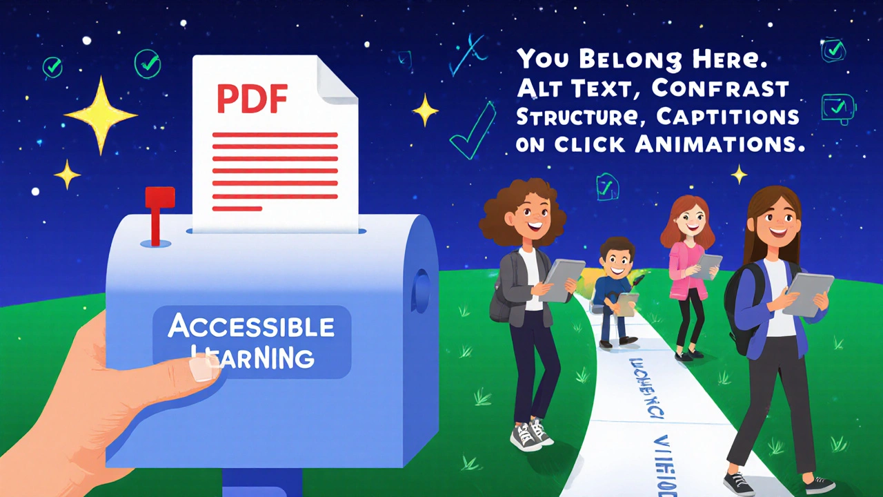
How to Create Accessible PowerPoint and Slide Decks for Online Courses
 Nov, 9 2025
When you build an online course, your slides aren’t just visual aids-they’re the main way students absorb information. But if those slides aren’t designed with accessibility in mind, you’re accidentally shutting out learners with vision impairments, motor disabilities, cognitive differences, or hearing loss. The truth? Making slides accessible isn’t about adding extra work. It’s about building better learning experiences for everyone.
Why Accessibility Matters More Than You Think
One in four adults in the U.S. lives with a disability, according to the CDC. That’s not a small group. In online courses, where students learn from home, on phones, or with assistive tech, inaccessible slides can mean the difference between passing and dropping out. A student using a screen reader won’t hear your chart titles if they’re embedded as images. A learner with color blindness won’t know which data point is which if you rely only on red and green. A person with dyslexia struggles when text is tiny, justified, or crammed into dense paragraphs.
Accessible design isn’t a legal checkbox-it’s good teaching. When you make your slides easier to read, navigate, and understand, you help all learners. Students without disabilities benefit too: clearer fonts help tired eyes, captions help those in noisy environments, and organized layouts help anyone trying to focus.
Start with the Structure: Slides Aren’t Documents
Many people treat PowerPoint like a Word doc-just paste text and call it done. That’s a mistake. PowerPoint is a presentation tool, not a handout. Your slides should be simple, clean, and structured like a spoken conversation, not a textbook.
Use the built-in slide layouts. Don’t delete placeholders or add text boxes randomly. Why? Screen readers follow the order of elements on the slide. If you drag a title to the bottom and a bullet list to the top, the screen reader will read the list first, then the title. That confuses learners who rely on assistive tech.
Stick to one idea per slide. If you’re explaining a process, break it into 3-5 slides instead of cramming it all into one. Each slide should have a clear heading that tells the learner what’s coming. Avoid vague titles like “Section 3” or “Key Points.” Use “How to Calculate ROI in Marketing” instead.
Text That Works for Everyone
Font choice matters. Use sans-serif fonts like Arial, Calibri, or Helvetica. Avoid Times New Roman, Comic Sans, or decorative fonts. These are harder to read, especially for people with low vision or dyslexia.
Size is critical. Never go below 24-point font for body text. Headings should be at least 32-point. If you’re projecting on a small screen or someone’s phone, smaller text becomes unreadable. Zooming in on a slide with tiny text often cuts off parts of the content-making it useless.
Left-align your text. Justified text creates uneven spacing between words, which disrupts reading flow for people with cognitive or visual processing challenges. Never use all caps-it’s harder to read and sounds like shouting. Use title case instead: “How to Build Accessible Slides.”
Don’t use italics or underlines for emphasis. Screen readers can’t tell the difference between italicized text and normal text. Use bold instead. And never rely on color alone to highlight important info. If you say “Click the red button,” someone who can’t see red won’t know what to do.
Color Contrast: Don’t Rely on Guesswork
White text on light gray? Black text on dark blue? These might look fine to you-but they’re invisible to many learners. The Web Content Accessibility Guidelines (WCAG) require a contrast ratio of at least 4.5:1 for normal text and 3:1 for large text (18pt or bold 14pt).
PowerPoint has a built-in accessibility checker. Go to Review > Check Accessibility. It will flag low-contrast text. But don’t wait for the tool. Test your slides yourself. Take a screenshot, open it in a free contrast checker like WebAIM’s Contrast Checker, and see if it passes.
Use high-contrast combinations: black on white, dark blue on white, dark gray on light yellow. Avoid combinations like green on red, purple on blue, or light green on white. These are common culprits for people with color vision deficiency.

Images, Charts, and Graphics: Add Meaning, Not Just Decoration
Every image, chart, or icon on your slide needs an alt text description. Not “image of a graph”-that’s useless. Alt text should explain what the image shows and why it matters.
For a bar chart showing sales growth: “Bar chart showing quarterly sales growth from Q1 2024 ($120K) to Q4 2024 ($210K), with a 75% increase over the year.”
For a photo of a person speaking: “Instructor speaking to a diverse group of students in a virtual classroom.”
Don’t forget decorative images. If you’re using a background pattern or a clip art flower that adds no meaning, mark it as decorative in PowerPoint’s alt text settings. Screen readers will skip it, keeping the flow clean.
Tables in slides? Same rules. Use headers for rows and columns. Avoid merged cells. Screen readers can’t interpret complex tables with merged cells. If your table has more than 5 rows or 5 columns, consider breaking it into two simpler ones.
Video and Audio: Captions and Transcripts Are Non-Negotiable
If your slide includes a video, it must have accurate captions. Not auto-generated ones from YouTube-those often miss technical terms, mispronounce names, or get punctuation wrong. Use professional captioning or edit auto-captions carefully.
Always include a transcript below the video or in the course materials. Transcripts help learners who are deaf, hard of hearing, or who prefer reading. They also help non-native speakers and people in quiet environments like libraries.
Audio-only content (like a narration track) needs a written transcript too. Don’t assume learners can pause and replay. Many have attention difficulties or limited bandwidth. A transcript lets them skim, search, and study on their own time.
Animation and Transitions: Less Is More
Animated text that flies in? Sound effects that play with each slide? These aren’t fun-they’re distracting. For learners with ADHD, autism, or vestibular disorders, motion can cause nausea, anxiety, or make it impossible to focus.
Use animations only if they help explain something. For example, revealing steps in a process one at a time can be useful. But don’t use “bouncing” or “spinning” effects. Keep transitions simple: fade or wipe. And always let users pause or skip animations.
PowerPoint lets you set animations to start “on click.” Use that. Don’t let slides auto-advance with animations. Some learners need more time to process. Forcing them to keep up is exclusionary.
Test Your Slides Like a Real User
Before you launch your course, test your slides with real accessibility tools.
- Turn on your screen reader (Narrator on Windows, VoiceOver on Mac). Listen to your slide deck from start to finish. Does it make sense? Is the order logical?
- Use grayscale mode on your computer. Can you still understand the content without color?
- Zoom in to 200%. Does text wrap properly? Are any parts cut off?
- Ask someone with a disability to review your slides. You don’t need a specialist-just a friend or colleague who uses assistive tech.
Also, share your slides as PDFs. PowerPoint files can be messy for screen readers. Export them as tagged PDFs (File > Save As > PDF > Options > Create PDF/A compliant file). Tagged PDFs preserve structure and alt text better.
Tools That Make Accessibility Easier
You don’t have to do this alone. Here are free tools that help:
- PowerPoint Accessibility Checker: Built into PowerPoint 2016 and later. Run it before you save.
- Microsoft Accessibility Insights: Free tool from Microsoft that scans PowerPoint for contrast, alt text, and structure issues.
- WebAIM Contrast Checker: Paste in your colors to test contrast ratios instantly.
- Descript or Otter.ai: For transcribing audio and video content accurately.
Some learning platforms like Canvas, Moodle, and Blackboard have built-in accessibility checkers for uploaded files. Use them. But don’t rely on them completely-they miss context.
What Happens When You Skip Accessibility
One university in Ohio had to pay $250,000 in legal fees after a blind student sued because their course slides had no alt text. The slides were built in PowerPoint, exported as PDFs, and uploaded without checking. The court ruled it was discrimination under the ADA.
But beyond legal risk, you lose trust. Students notice when a course feels thoughtfully designed. They notice when it doesn’t. If your slides are hard to use, learners will assume the whole course is careless. And they’ll leave.
Final Checklist: Your Accessible Slide Deck in 5 Minutes
Before you upload your slide deck, run through this quick list:
- Is every image, chart, or graph labeled with meaningful alt text?
- Is all text at least 24-point and left-aligned?
- Does every color combination pass 4.5:1 contrast ratio?
- Are animations set to “on click” and not automatic?
- Are videos captioned and transcripts available?
- Is the slide order logical when read by a screen reader?
- Have you exported a tagged PDF version for download?
That’s it. Five minutes. No extra software. No design degree needed. Just attention to detail.
Accessible slides aren’t about perfection. They’re about inclusion. Every time you make one small change-adding alt text, increasing font size, turning off auto-play-you’re saying to your students: you belong here.
Do I need to make my PowerPoint slides accessible if I already have a transcript?
No. Transcripts help with audio content, but they don’t replace visual structure. Learners using screen readers need slide titles, image descriptions, and logical flow built into the slides themselves. A transcript won’t help someone navigate a chart or understand a diagram if the slide isn’t tagged properly. Both are required.
Can I use templates from Canva or Envato for accessible slides?
Some can, but most can’t. Many free templates use decorative fonts, low-contrast colors, or complex layouts that break screen reader navigation. Always run the PowerPoint Accessibility Checker on any template you download. If it flags more than three issues, don’t use it. Build your own using the default PowerPoint layouts-they’re designed to be accessible from the start.
What if my learners don’t have disabilities? Do I still need to make slides accessible?
Yes. Accessibility improves learning for everyone. Clear fonts help tired eyes. captions help people in noisy places. organized slides help students studying on phones. You’re not designing for a hypothetical group-you’re designing for real people in real situations. Good accessibility is just good design.
How do I add alt text to images in PowerPoint?
Right-click the image, select “Edit Alt Text,” then type a clear, concise description. Include key details: what’s shown, why it matters, and any data. For example: “Pie chart showing 60% of students prefer video lessons, 30% prefer readings, and 10% prefer live chats.” Don’t say “image of pie chart.”
Are there free tools to check contrast on my slides?
Yes. Use WebAIM’s Contrast Checker (webaim.org/resources/contrastchecker). Take a screenshot of your slide, upload it, and use the eyedropper tool to pick your text and background colors. It will instantly tell you if you pass or fail WCAG standards. No sign-up needed.
Next Steps: Start Small, Think Big
You don’t need to redesign your entire course tomorrow. Pick one slide deck. Fix the alt text. Increase the font size. Turn off animations. Test it with a screen reader. That’s one step. Next week, do another. Over time, you’ll build a library of accessible materials that work for every learner.
Accessibility isn’t a project. It’s a habit. And the best part? Once you get used to it, it becomes second nature. You’ll start noticing how much better your slides feel-not just for students with disabilities, but for everyone.
Christina Kooiman
November 10, 2025 AT 10:25Okay, I just spent 45 minutes reworking my entire course deck after reading this, and I’m not even mad. I used to think alt text was a chore-like, ‘just slap ‘image of graph’ and move on.’ But now I realize I was basically telling students with vision impairments: ‘You don’t matter enough for me to describe what’s on the screen.’ That’s not just lazy-that’s cruel. I changed every single image. Even the dumb clipart flowers. Now they say ‘decorative’ and I feel like a better human. Also, I increased my font size to 28. My eyes are 32, but I did it for the 19-year-old on her phone in her dorm at 2 a.m. with no glasses. You don’t need a degree in accessibility. You just need to stop being a jerk.
Stephanie Serblowski
November 12, 2025 AT 06:09YASSSSS. 🙌 Accessibility isn’t a feature-it’s the *foundation*. Like, if your slide deck can’t be read by a screen reader, it’s not a learning tool. It’s a digital brick wall. And honestly? The fact that we’re still having this conversation in 2025 is wild. I’ve seen professors use Comic Sans on neon pink backgrounds and call it ‘creative.’ Bro. That’s not creativity. That’s a sensory assault. Also-yes to tagged PDFs. PowerPoint files are a nightmare for assistive tech. Export. Tag. Breathe. You’re welcome, future students.
Renea Maxima
November 14, 2025 AT 01:22But… what if accessibility is just another capitalist tool to homogenize thought? I mean, if we make everything ‘easy to read,’ are we just dumbing down education? Who decided that 24-point font is the moral baseline? What if some learners thrive on chaos? What if dyslexia isn’t a disability but a different way of perceiving the world-and we’re forcing them into a neurotypical box? …I’m not saying don’t do it. I’m just saying… is this really liberation, or just another form of control?
Jeremy Chick
November 16, 2025 AT 00:18Bro, I used to think this was all woke nonsense until my cousin-who’s blind-told me he dropped out of an online bio class because the professor’s slides had zero alt text. He said, ‘I didn’t fail the test. I failed the slide deck.’ That hit me like a truck. Now I run the accessibility checker before I even save. No more ‘image of chart.’ No more red-on-green. No more animated confetti. I don’t care if it’s ‘boring.’ I care if someone can actually learn. This isn’t politics. It’s basic human decency.
Sagar Malik
November 16, 2025 AT 04:36Let me be clear: this entire accessibility movement is a Western construct imposed on global pedagogy. In India, we’ve been teaching for centuries using oral traditions, tactile models, and communal learning-why are we now forced to conform to Microsoft’s PowerPoint hegemony? The ‘WCAG standards’ are a colonial relic. And who funds these ‘accessibility tools’? Big Tech. Always Big Tech. I’ve seen students in rural Bihar use phones with 2G and no screen readers. Should they be excluded because their professor used a 20-point font? This isn’t inclusion-it’s digital imperialism.
Seraphina Nero
November 17, 2025 AT 10:20I just wanted to say thank you for writing this. I’m a TA and I’ve been struggling with how to explain this to faculty who say, ‘We’ve always done it this way.’ This post gave me the language to say: ‘It’s not about changing how you teach. It’s about making sure everyone can hear you.’ I printed this out and left it on the department chair’s desk. No note. Just the article. And she actually replied. Said she’s going to redo her fall slides. Small wins, right?
Megan Ellaby
November 19, 2025 AT 01:03OMG I JUST DID THIS LAST WEEK AND DIDN’T EVEN KNOW I WAS DOING ACCESSIBILITY 😅 I switched to Calibri, used bold instead of italics, and started writing alt text like ‘graph showing 70% of students prefer video over text’ instead of ‘chart.’ I thought I was just being tidy. Turns out I was being kind. Also-left-aligning text? I didn’t even know that was a thing. I thought justified looked ‘professional.’ Nope. Just confusing. Thanks for the wake-up call. I’m gonna fix my old courses now.
Rahul U.
November 19, 2025 AT 13:04Beautifully written. 🙏 I teach online courses in rural India, and many students access content via low-end Android phones with poor screens. Increasing font size to 24+ and avoiding justified text? That’s not just accessibility-it’s equity. I’ve started using WebAIM’s checker religiously. Also, I export everything as tagged PDF now. One student wrote me: ‘I finally understood the lecture because I could read it on my phone without zooming 500%.’ That’s the real ROI. Thank you for the practical, no-nonsense guide.
E Jones
November 20, 2025 AT 04:57Let me tell you what they DON’T want you to know: This isn’t about helping disabled people. It’s about controlling the narrative. Who decides what ‘accessible’ means? Microsoft? The ADA? The same corporations that sell you the software and then charge you $200/month for ‘compliance audits’? The moment you start tagging alt text, you’re signing up for the surveillance state. They track your slide edits. They log your contrast ratios. They know when you use Comic Sans. And then-BAM-you get flagged for ‘non-compliance.’ You think this is about inclusion? It’s about compliance. It’s about control. And the real victims? The professors who just want to teach without being policed by a digital bureaucracy. Wake up.
Barbara & Greg
November 21, 2025 AT 02:15While I appreciate the earnestness of this piece, I must register my profound disapproval of the casual tone and colloquialisms employed. The gravity of the subject demands a more elevated register-‘you’re saying to your students: you belong here’ is emotionally manipulative and grammatically imprecise. Furthermore, the conflation of legal obligation with moral imperative is both reductive and dangerous. Accessibility is not a virtue to be performed; it is a legal and ethical framework to be meticulously observed. One does not ‘feel like a better human’-one fulfills a duty. Please, for the sake of pedagogical integrity, adopt a tone befitting the seriousness of the matter.
selma souza
November 21, 2025 AT 17:2324-point font? That’s ridiculous. The ADA doesn’t mandate font size. It mandates ‘reasonable accommodation.’ You’re creating a precedent where every slide must be oversized for the lowest common denominator. What about advanced learners who want dense, compact information? What about graduate students who need to fit complex models on one slide? This isn’t accessibility-it’s infantilization. And you’re encouraging people to export to PDF? That’s a nightmare for editing. You’re solving a problem that doesn’t exist by creating ten more.
Christina Kooiman
November 23, 2025 AT 15:56Oh, so now we’re arguing about ‘infantilization’? Let me ask you this: when your kid is 12 and their teacher hands out a handout with 8-point font and no alt text, and they cry because they can’t read it-do you tell them to ‘toughen up’? Or do you tell the school to fix it? Accessibility isn’t about dumbing down. It’s about removing barriers so everyone can reach the same level. If you think 24-point font is ‘too big,’ then you’ve never tried reading a slide on a phone while holding it 2 feet away because your eyes are tired. You’re not protecting ‘advanced learners.’ You’re protecting your own convenience.
Frank Piccolo
November 25, 2025 AT 02:00Look, I’m a veteran. I’ve seen a lot of nonsense in education. But this? This is pure performative virtue signaling. We don’t need alt text on every clipart flower. We need better students. We need people who can figure things out. I’ve taught 30 years. I used hand-drawn slides. No alt text. No PDFs. No accessibility checker. And my students? They were better. They were tougher. Now? They can’t read a sentence unless it’s 28-point and left-aligned. This isn’t inclusion. It’s coddling. And it’s making us weaker.