How to Test Course Accessibility: Tools, Methods, and WCAG Checklist
 Jun, 2 2026
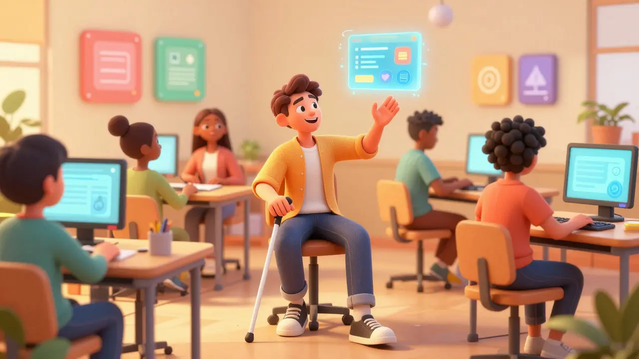
You spend weeks building a beautiful online course. The videos are crisp, the quizzes are interactive, and the layout is sleek. But then you realize your content is locked behind a digital wall for thousands of potential students. If a learner cannot navigate your quiz with a keyboard or understand your video without captions, your course isn’t just incomplete-it’s exclusionary.
Testing course accessibility is not a final checkbox before launch. It is an ongoing process that ensures every student, regardless of ability, can access, understand, and interact with your educational materials. With regulations like the ADA (Americans with Disabilities Act) and standards like WCAG 2.2 becoming stricter in 2026, getting this right protects your business legally and expands your audience ethically.
Why Automated Tools Are Not Enough
Many creators rely solely on automated scanners, assuming a high score means their course is ready. This is a dangerous misconception.
Automated tools are great for catching technical errors, but they miss the human experience. An automated checker might tell you that an image has an alt tag. It won’t tell you if that alt tag actually describes the chart’s data accurately enough for a blind user to grasp the concept. According to the World Wide Web Consortium (W3C), automated tools can only detect about 30% to 50% of accessibility issues. The rest requires human judgment.
To truly test your course, you need a hybrid approach: automated scanning for code-level fixes, followed by manual testing for usability and cognitive load. Let’s break down the specific tools and methods you need in your toolkit.
The Essential Tool Stack for 2026
You don’t need expensive enterprise software to start. A combination of free browser extensions and built-in OS features covers most bases. Here are the primary entities you should master:
- Lighthouse: Built into Chrome DevTools, this is your first line of defense. It runs a quick audit against WCAG criteria.
- NVDA (NonVisual Desktop Access): A free, open-source screen reader for Windows. It simulates how a blind user experiences your site.
- VoiceOver: The built-in screen reader for macOS and iOS. Essential if your audience uses Apple devices.
- Color Contrast Analyzers: Tools like Stark or WebAIM’s contrast checker ensure text is readable for users with low vision or color blindness.
- Keyboard Navigation: Not a software tool, but a method. You must be able to tab through your entire course using only the `Tab`, `Shift+Tab`, `Enter`, and `Space` keys.
| Tool Name | Type | Best For Detecting | Limitations |
|---|---|---|---|
| Lighthouse | Automated Audit | Missing alt tags, poor heading structure, low contrast | Cannot assess logical flow or meaningful context |
| NVDA / VoiceOver | Screen Reader | Aria label clarity, focus order, hidden text traps | Steep learning curve; requires patience to learn shortcuts |
| WebAIM Contrast Checker | Visual Analysis | Text-to-background color ratios | Does not check for color-only information conveyance |
| Manual Keyboard Test | Usability Method | Focus indicators, skip links, modal trapping | Time-consuming; requires meticulous attention to detail |
Method 1: The Screen Reader Simulation
If you want to know if your course is accessible, you have to listen to it. Turn off your monitor-or better yet, close your eyes-and navigate your course using a screen reader. This is the most effective way to identify "focus traps" and confusing navigation structures.
When testing with NVDA or VoiceOver, pay attention to these three things:
- Heading Hierarchy: Does the screen reader announce "Heading Level 1," then "Heading Level 2"? If it jumps from Level 1 to Level 4, you’ve broken the logical structure. Users who skim via headings will get lost.
- Form Labels: When you tab to a quiz input field, does the screen reader say "Enter your name" or just "Edit Text"? If it’s the latter, you’re missing explicit labels or `aria-labels`.
- Media Controls: Can you pause, play, and adjust volume using the keyboard? If the video player requires a mouse hover to show controls, it fails for motor-impaired users.
Pro Tip: Use the "Bypass Blocks" feature in screen readers. Pressing the 'H' key in NVDA jumps between headings. If this doesn't work smoothly on your LMS (Learning Management System) page, your HTML structure needs repair.
Method 2: Keyboard-Only Navigation
Millions of people cannot use a mouse due to motor disabilities, repetitive strain injuries, or situational limitations (like holding a baby while browsing). Your course must be fully operable via keyboard.
Start at the top of your course homepage. Press `Tab`. Watch the focus indicator-that glowing outline around buttons and links. Is it visible? If your custom CSS hides the default focus ring without providing a high-contrast alternative, you fail immediately.
As you tab through, ask yourself:
- Can I reach every interactive element?
- Is the order logical? (e.g., Title → Description → Button)
- Are there any "focus traps" where the cursor gets stuck in a menu or modal dialog?
- Do dropdown menus close when I press `Escape`?
If you find yourself needing to click the mouse to proceed, you have an accessibility barrier. Fix the JavaScript event listeners to handle `keydown` events properly.
Method 3: Color and Contrast Audits
Color blindness affects roughly 8% of men and 0.5% of women globally. Relying on color alone to convey information is a critical error. For example, do not use red text for "incorrect answers" and green for "correct" without also adding icons (like X and checkmarks) or distinct patterns.
Use the WebAIM Contrast Checker to verify your text meets WCAG AA standards. This requires a contrast ratio of at least 4.5:1 for normal text and 3:1 for large text. In 2026, many institutions are moving toward WCAG AAA (7:1 ratio) for even higher readability, especially for older learners with declining vision.
Also, test your course in grayscale mode. Most operating systems have a color filter setting. If you cannot distinguish between elements in black and white, your design relies too heavily on hue.
Method 4: Cognitive Load and Readability
Accessibility isn’t just about physical disabilities; it includes neurodivergent learners, such as those with dyslexia, ADHD, or autism. Complex layouts and dense paragraphs create cognitive barriers.
Apply these readability rules:
- Sentence Length: Keep sentences under 20 words where possible.
- Paragraph Structure: Break text into short chunks. Use bullet points instead of long lists.
- Font Choice: Avoid decorative scripts. Use sans-serif fonts like Arial, Verdana, or Open Sans, which are easier to read on screens.
- Motion Sensitivity: Disable auto-playing animations. Allow users to control motion. Flashing content above 3 Hz can trigger seizures in photosensitive individuals.
Read your text aloud. If you stumble over complex jargon or run out of breath mid-sentence, rewrite it for clarity. Simple language benefits everyone, not just those with cognitive disabilities.
Video and Audio Content Requirements
Media is often the hardest part of a course to make accessible. Here is your checklist for every video and audio file:
- Captions: Must be synchronized, accurate, and include speaker identification and sound effects (e.g., [upbeat music], [door slams]). Auto-generated captions are a starting point, but they often misinterpret technical terms. Always edit them manually.
- Transcripts: Provide a full text transcript for all audio and video content. This helps deaf users, non-native speakers, and those in noisy environments.
- Audio Descriptions: For videos where visual context is crucial (like a science experiment demo), add a secondary audio track that describes key visual actions during pauses in dialogue.
- Sign Language: While not always required by WCAG, including sign language interpreters in videos significantly boosts inclusivity for Deaf communities.
Integrating Testing Into Your Workflow
Don’t wait until launch day to test. Integrate accessibility checks into your development cycle:
- Design Phase: Check color contrasts and font sizes in your mockups.
- Development Phase: Run Lighthouse audits after each major update. Ensure semantic HTML (using `