How to Use Animations and Motion Graphics in Course Videos
 Apr, 8 2026
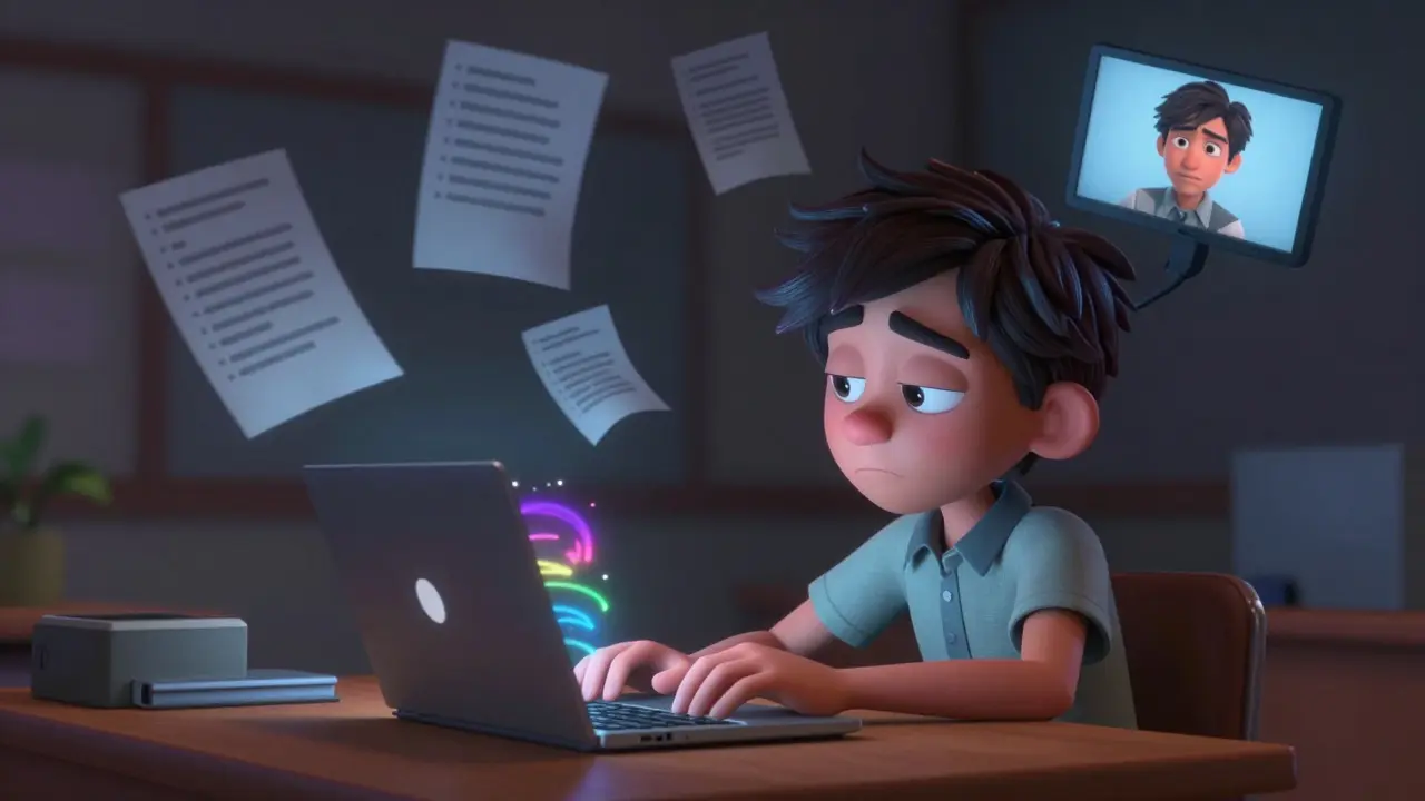
Let's be honest: most online course videos are incredibly boring. We've all sat through those endless slides of bullet points and a talking head that barely moves. The result? Students zone out, retention drops, and completion rates plummet. But you don't need a Hollywood budget to fix this. The secret is using course video animations and motion graphics to turn abstract concepts into visual stories that actually stick.
When you add movement to a lesson, you aren't just making it "look pretty." You're leveraging how the human brain processes information. Our eyes are naturally drawn to motion, which means you can use it to direct attention, simplify a complex process, or break the monotony of a long lecture. The goal isn't to distract the student with flashy effects, but to use visual cues that make the learning process feel intuitive and effortless.
Key Takeaways for Better Course Visuals
- Use animations to illustrate concepts that are impossible or too expensive to film.
- Follow the "Cognitive Load Theory" to avoid overwhelming your students with too much motion.
- Prioritize clarity over complexity; a simple moving arrow is often more effective than a 3D render.
- Consistency in style and color keeps the learner focused on the content, not the design.
Choosing the Right Type of Motion for Your Lesson
Not all animations are created equal. Depending on what you're teaching, a full-blown cinematic sequence might actually hinder learning, while a simple transition could be the key to a "lightbulb moment." Motion Graphics is a discipline of digital filmmaking that uses animated graphic design to create imagery that communicates a specific message. In the context of e-learning, this usually breaks down into a few practical styles.
First, there are 2D animations, which are the bread and butter of most online courses. Think of flat icons, moving diagrams, or character animations. These are great for explaining workflows or social scenarios. Then you have kinetic typography-basically, words that move. This is a lifesaver when you have a key quote or a technical term that students absolutely must remember. By making the word grow, shake, or slide into frame, you signal to the brain: "Pay attention, this is important."
Then we have screencasts with added motion. If you're teaching software, a raw recording of your screen is often cluttered. By adding animated callouts-like a pulsing yellow circle around a button you're clicking-you remove the guesswork for the student. Finally, there are 3D animations. These are powerful for medical, engineering, or architectural courses where you need to show the inside of a heart or the structural load of a bridge, but they require significantly more time and processing power.
| Style | Best Use Case | Complexity | Student Impact |
|---|---|---|---|
| Kinetic Typography | Key terms, quotes, definitions | Low | High recall of specific words |
| 2D Vector Animation | Process flows, conceptual models | Medium | Better conceptual understanding |
| Animated Screencasts | Software tutorials, UX walkthroughs | Low/Medium | Reduced friction in execution |
| 3D Motion Graphics | Complex anatomy, mechanical parts | High | Spatial awareness and depth |
Applying Cognitive Load Theory to Your Design
Here is where many creators fail: they add too much. When you flood a screen with floating icons, spinning text, and a background music track, you create "cognitive overload." Cognitive Load Theory is a psychological framework suggesting that since short-term memory is limited, instructional design should avoid unnecessary mental effort. If the student is spending 50% of their brainpower trying to figure out why a graphic is bouncing, they only have 50% left to actually learn your material.
To avoid this, follow the "Signaling Principle." This means using motion to highlight only the most relevant parts of the screen. For example, instead of showing a whole complex map and saying "Look at the top right," you should have the rest of the map fade slightly and a bright red circle animate around the specific area. You are literally guiding their eyes. Another tip is the "Temporal Contiguity Principle"-ensure the animation happens exactly when you are speaking about it. If the graphic appears five seconds after you've finished the explanation, it's a distraction, not a tool.
Think about a real-world scenario: teaching someone how to use a complex CRM like Salesforce is a cloud-based customer relationship management platform. If you just show the dashboard, it's a wall of data. But if you use a motion graphic to "zoom in" on the Lead tab and then animate a line connecting the Lead to the Opportunity tab, the student understands the relationship between these two entities instantly without you needing to explain the menu structure for ten minutes.
The Technical Workflow: From Script to Screen
You don't need to be a master animator to get professional results. The process starts long before you open your editing software. The biggest mistake is animating on the fly. Instead, start with a storyboard. A storyboard is just a rough sketch of what happens in every scene. If you can't sketch, use a two-column script: the left side is your spoken word, and the right side describes the visual motion.
Once you have your plan, choose your tools. For beginners, tools like Canva is a graphic design platform that allows users to create social media graphics, presentations, and simple animations. It's great for basic slide-based motion. If you want something more robust, Adobe After Effects is the industry-standard software for creating motion graphics and visual effects. It's a steep learning curve, but it allows for "keyframing," which is the process of defining a starting and ending point for a movement, letting the software fill in the gaps.
For those who prefer a faster, more templated approach, tools like Vyond or Powtoon allow you to drag and drop pre-animated characters. These are fantastic for Microlearning, an approach to learning that delivers content in small, highly focused chunks, where a 60-second animated story can replace a 10-minute lecture.
- Scripting: Write the core concept and identify the "friction points" where students usually get confused.
- Asset Creation: Design your icons, characters, or screenshots in a tool like Illustrator or Figma.
- Animation: Bring those assets into your motion tool. Use a consistent easing (the speed of the movement) so it doesn't feel robotic.
- Audio Sync: Import your voiceover and align the animation triggers to the specific words.
- Review: Watch the video on mute. If you can still understand the basic flow of the lesson just from the motion, your visuals are doing their job.
Common Pitfalls and How to Avoid Them
One of the most common traps is using "decoration" instead of "education." I've seen courses where a leaf sporadically flies across the screen just because the instructor likes nature. This is a distraction. Every single moving element must serve a purpose: to explain, to emphasize, or to transition. If it doesn't do one of those three things, delete it.
Another issue is poor timing. Many creators leave a graphic on screen for too long. This leads to a phenomenon where the student finishes processing the visual and starts wondering, "Why is this still here?" and loses focus on the voiceover. Use the "3-second rule": a simple graphic should generally appear, deliver its message, and either evolve or disappear within a few seconds unless it's a complex diagram that requires study.
Finally, watch out for color clashing. In a professional course, your motion graphics should follow a strict brand palette. If your slides are blue and white, but your animations are neon pink and green, it creates a visual disconnect that makes the course feel disjointed and amateur. Stick to two primary colors and one accent color for highlights.
Connecting Motion to Learning Outcomes
At the end of the day, animations are just a means to an end. Whether you are using LMS (Learning Management Systems) software applications for the administration, documentation, tracking, reporting, and delivery of educational courses like Moodle or Teachable, the goal is to increase the student's ability to apply the knowledge. Motion graphics are most powerful when they bridge the gap between theory and practice.
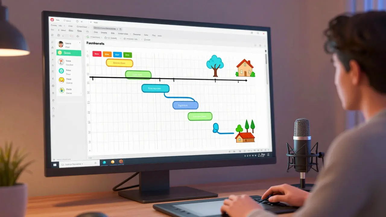
For instance, if you're teaching a course on Project Management is the application of processes, methods, skills, knowledge, and experience to achieve specific project objectives, a static image of a Gantt chart is confusing. But an animation that shows tasks sliding into place and dependencies linking together visually demonstrates how a schedule actually works. You've moved from telling them how it works to showing them how it works.
Do I need to be a professional animator to use motion graphics in my courses?
Absolutely not. You can start with basic tools like Canva or PowerPoint's "Morph" transition, which allows you to create smooth movements between slides. The key is not the complexity of the software, but the intentionality of the movement. Simple, clean transitions are often more effective for learning than complex 3D animations.
How much animation is too much for a 10-minute video?
There is no hard rule, but a good heuristic is to use motion during the most complex 20% of your content. If every second has something moving, the student becomes desensitized to the motion, and it loses its power as a signaling tool. Use motion for introductions, complex transitions, and key summaries.
Will animations slow down my course video loading times?
Animations are rendered into the video file, so they don't affect the loading speed of the video player itself. However, high-resolution 3D renders can make the overall file size much larger. To keep your videos lean, export in H.264 or H.265 formats, which provide a great balance between visual quality and file size.
What is the best way to sync voiceovers with animations?
Always record your voiceover first. It is much easier to time a graphic to a voice than it is to try and talk over a pre-rendered animation. Once you have your audio track, use a video editor to mark the exact timestamps where key terms are mentioned, and trigger your animations at those markers.
Can I use stock animations in my educational videos?
Yes, but use them sparingly. Stock animations can feel generic and may not perfectly fit your specific technical explanation. If you use stock footage, try to customize the colors to match your brand so they don't look like "plug-ins" that don't belong in the video.
Next Steps for Course Creators
If you're feeling overwhelmed, don't try to animate your entire library at once. Start with a "pilot" video. Pick the one lesson in your course that students always struggle with-the one where you get the most questions. Apply these motion principles to that specific video and track the results. Do students spend more time on it? Do they pass the quiz for that section more often?
For those already using motion, the next level is interactivity. Look into tools that allow students to click on animated elements to reveal more information. This transforms the experience from a passive viewing session into an active learning journey. Whether you're using a simple tool or a professional suite, remember that the goal is clarity, not spectacle.