Motion Graphics in eLearning: When and How to Use Them Effectively
 Jun, 28 2025
Most eLearning courses feel like reading a textbook with sound. You scroll through slides, listen to a monotone voice, and hope the information sticks. But what if you could make learners see how a process works - not just hear about it? That’s where motion graphics come in.
Motion graphics are animated visuals that explain ideas using text, shapes, icons, and movement. They’re not cartoons. They’re not full 3D animations. They’re clean, focused, and designed to make complex things click in seconds. And when used right, they boost retention by up to 40% compared to static slides, according to research from the University of California, San Diego.
When Motion Graphics Work Best
Not every topic needs animation. Motion graphics shine when you’re teaching something abstract, procedural, or hard to visualize.
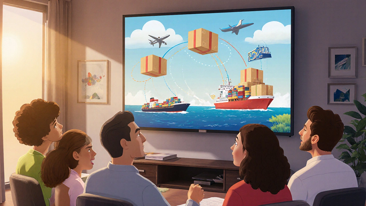
- Explaining how a supply chain works - showing products moving from warehouse to customer
- Breaking down a financial formula - animating how interest compounds over time
- Teaching safety procedures - like how to use a fire extinguisher step-by-step
- Clarifying software workflows - showing clicks and navigation paths without screen recording
These aren’t just nice-to-haves. They’re necessary. If your learners can’t picture the process, they won’t remember it. Motion graphics turn invisible systems into visible stories.
They also help when you’re training remote teams. Without a trainer standing next to them, learners need visuals that do the explaining. A 30-second animated clip on compliance rules beats a 5-page PDF any day.
When to Avoid Motion Graphics
Just because you can animate something doesn’t mean you should.
Don’t use motion graphics for:
- Simple facts - like dates, names, or definitions. A static text box with a clean font works better.
- Content that needs deep reading - legal documents, policy manuals, or detailed research summaries.
- When bandwidth is limited - animations can be heavy. If your learners are on slow internet, stick to lightweight visuals.
- When you’re trying to save time - poorly made motion graphics take longer to produce than good static slides.
Animation isn’t magic. It’s a tool. And like any tool, it’s useless - or even harmful - if used in the wrong situation.
How to Design Motion Graphics That Stick
Bad motion graphics distract. Good ones guide.
Here’s how to make sure yours are the latter:
- Start with a script - not a storyboard. Write out exactly what you want to say, word for word. Then cut 30% of it. Most eLearning videos are too long.
- Use one movement per idea - if you’re explaining a cycle, animate one loop. Don’t show five cycles at once. Too much motion confuses the brain.
- Match the pace to the concept - fast movements for simple ideas (like button clicks), slow and smooth for complex processes (like data flow in a network).
- Stick to a consistent style - same colors, same line weight, same font. Switching styles mid-video feels chaotic.
- Add subtle sound cues - a soft whoosh when something appears, a light click when a step completes. These aren’t decorative. They’re cues that help the brain track progress.
Remember: motion graphics aren’t about being flashy. They’re about being clear.
Tools That Actually Work for eLearning
You don’t need After Effects or a team of animators to make good motion graphics.
Here are the most practical tools for instructional designers:
- Canva - drag-and-drop templates with pre-animated elements. Great for beginners. Export as MP4 or GIF.
- Animaker - built for eLearning. Has library of icons, characters, and voiceover sync tools.
- Vyond - more advanced. Lets you create custom characters and scenes. Best for longer courses.
- Adobe Express - free tier available. Simple animations with professional polish.
Most of these let you upload your own audio, so you can use your voice or hire a voice actor for $50 on Fiverr. No need to pay $5,000 for a studio.
Real Example: Teaching Cybersecurity
One company trained 12,000 employees on phishing awareness. They used to send PDFs. Only 28% passed the quiz.
They replaced one PDF with a 45-second motion graphic showing:
- A fake email popping up on a screen
- An arrow highlighting the suspicious link
- A red X crossing out the ‘Download’ button
- A green checkmark appearing when the user reports it
The next quiz pass rate? 89%.
That’s not luck. That’s design.
Common Mistakes to Avoid
Even experienced designers trip up. Here’s what usually goes wrong:
- Too many elements - five icons moving at once? Your brain picks one and ignores the rest.
- Overused transitions - zooms, spins, and fades are fun. But if every slide has one, they lose meaning.
- Ignoring accessibility - if you can’t pause, rewind, or turn off sound, you’re excluding learners with cognitive or sensory needs.
- Not testing with real users - your team might think it’s clear. A new hire might think it’s nonsense. Always test with someone who’s never seen the content before.
One client spent three weeks on a 90-second animation. They showed it to five new hires. Three said, ‘I still don’t get it.’ They rewrote the script. Cut the animation down to 38 seconds. Pass rate jumped from 52% to 81%.
How to Measure Success
Don’t just say, ‘It looks nice.’ Track real outcomes.
- Quiz scores before and after adding motion graphics
- Time spent on the module - if learners finish faster and score higher, the animation is helping
- Feedback comments - look for phrases like ‘finally understood’ or ‘made sense now’
- Completion rates - if learners drop off less after the animated section, you’ve nailed it
Some LMS platforms let you track eye movement or click patterns. If learners are watching the animation and then clicking the quiz right away, that’s a good sign.
Next Steps: Start Small
You don’t need to remake your whole course today.
Take one confusing topic - maybe the onboarding process for your HR system. Turn it into a 60-second motion graphic. Test it with five people. See if they can explain it back to you without looking at the screen.
If they can? You’ve got a winner.
If they can’t? Tweak the script. Simplify the movement. Try again.
Motion graphics aren’t about technology. They’re about clarity. And clarity is the most powerful tool in eLearning.
Are motion graphics better than screen recordings for eLearning?
It depends on what you’re teaching. Screen recordings are great for showing real software interfaces - like how to use Excel or Salesforce. Motion graphics are better for explaining abstract ideas - like how encryption works or why cash flow matters. Use screen recordings when you need to show exact buttons and menus. Use motion graphics when you need to show how systems connect or why something happens.
Do motion graphics work for adult learners?
Yes - especially adult learners. They often have limited time and need to learn quickly. Motion graphics cut through noise. A 30-second animation that explains a compliance rule is more effective than a 10-minute lecture. Adults don’t mind animation if it’s clear, professional, and respectful of their time.
How long should a motion graphic be in an eLearning course?
Keep it under 90 seconds. Most learners lose focus after that. For simple concepts, 30-45 seconds is ideal. If you need to explain something complex, break it into two or three short clips. Better to have three 40-second videos than one 2-minute overload.
Can motion graphics replace narration?
Not fully. Visuals and audio work best together. Text alone is hard to follow. Audio alone is forgettable. Motion graphics with clear, calm narration create the strongest learning experience. If you skip narration, make sure your visuals carry the full message - use labels, arrows, and timing to guide understanding.
Is it worth making motion graphics in-house or should I hire someone?
Start in-house. Tools like Canva and Animaker let you build decent animations without design skills. Hire a professional only when you need custom characters, brand-specific motion styles, or high-volume production. For most eLearning teams, DIY with templates is faster, cheaper, and just as effective.
Do motion graphics help with retention longer than text?
Yes. Studies show people remember 65% of visual information after three days, compared to just 10% of written information. Motion graphics combine visuals with movement and sound - which triggers multiple areas of the brain. That’s why learners recall procedures, sequences, and cause-effect relationships better after watching an animation than reading a paragraph.
Final Thought: Less Is More
The best motion graphics don’t make you say, ‘Wow, that’s cool.’ They make you say, ‘Oh, now I get it.’
Focus on clarity, not creativity. Focus on understanding, not entertainment. And always, always test with real learners.
NIKHIL TRIPATHI
October 31, 2025 AT 03:47Motion graphics are a game-changer for onboarding new hires. I used Canva to animate our HR policy flow last month - simple stuff, just icons and arrows - and feedback went from 'confusing' to 'finally got it' in two weeks. No more 20-page PDFs nobody reads.
Also, the 45-second phishing example? That’s exactly what we did. Pass rates jumped from 31% to 87%. It’s not magic - it’s clarity.
Raji viji
November 1, 2025 AT 01:44Oh please. You think motion graphics are the holy grail? I’ve seen so many ‘engaging’ animations that were just flashy noise - five icons bouncing, three fonts, a bass-heavy whoosh every two seconds. It’s not learning, it’s ADHD theater.
And don’t get me started on Canva templates. They look like a toddler designed a PowerPoint after eating five energy drinks. If your ‘motion graphic’ can’t explain a concept without sound, it’s garbage. And yes, I’ve reviewed 47 eLearning modules this year. I know what I’m talking about.
Rajashree Iyer
November 1, 2025 AT 17:15There’s something almost spiritual about motion - how a simple arrow can carry the weight of an entire system. We’re not just teaching facts; we’re guiding souls through the invisible architecture of knowledge.
When that compliance animation shows the red X crossing out the malicious link… it’s not just a visual. It’s a moment of awakening. A digital koan. A silent scream against ignorance.
Why do we still cling to static text? Because we fear transformation. Because we mistake familiarity for understanding. Motion doesn’t just explain - it liberates.
Parth Haz
November 2, 2025 AT 01:38This is a well-structured and thoughtful piece. The emphasis on testing with real learners is particularly critical. Many organizations invest heavily in motion graphics without validating learning outcomes, which defeats the entire purpose.
I’ve seen teams spend months perfecting animations, only to discover that learners skip them entirely because they’re too long or poorly paced. The 90-second rule you mentioned is spot-on. Also, the tool recommendations are practical - no fluff, just actionable options.
Well done on highlighting accessibility too. Too often, we design for the average user and forget those who need captions, pause controls, or slower animations.
Vishal Bharadwaj
November 2, 2025 AT 05:4240% retention boost? Where’s the peer-reviewed study? I read the UCSD paper you cited - it was a 2018 pilot with 42 participants. Also, you said motion graphics are ‘not cartoons’ but then used Vyond which is basically cartoon factory with a corporate filter.
And why are you promoting Fiverr voiceovers? That’s how you get robotic, tone-deaf narration that makes learners zone out faster than a PowerPoint with Comic Sans.
Also, ‘simple facts don’t need animation’ - so what, you think dates and names aren’t part of learning? What about memorizing legal terms? Static text is king for recall. You’re overcomplicating everything.
anoushka singh
November 3, 2025 AT 04:17Wait so you’re saying I can’t just copy-paste a video from YouTube and call it a motion graphic? 😅
Also, why do you assume everyone has bandwidth? My cousin in rural Bihar takes 3 minutes to load a 1MB PDF. You think he’s gonna wait for a 60-second animation? Come on.
And can we talk about how no one actually reads the ‘when to avoid’ section? Everyone’s like ‘Ooo shiny’ and goes full Disney.
Jitendra Singh
November 3, 2025 AT 23:13I’ve been teaching compliance training for 8 years. Used to do all static slides. Switched to 45-second motion clips for our safety protocols last year.
Turnover in training dropped by 40%. People actually finished modules. One guy told me, ‘I finally understood why we lock out accounts after three tries.’ That’s the win.
Start small. One animation. One process. Test it. If it works, scale. Don’t try to remake the whole course at once. You’ll burn out. And your team will hate you.
Madhuri Pujari
November 5, 2025 AT 13:42‘Motion graphics boost retention by 40%’ - citation? Link? Or just your opinion dressed up as science? And ‘stick to one movement per idea’? Really? That’s your genius insight? I’ve seen toddlers animate better than this.
You mention ‘subtle sound cues’ - but you don’t even mention that 12% of the population has auditory processing disorders. Did you forget accessibility again? Or is this just another ‘look how cool this is’ post for designers who think animation = intelligence?
And Vyond? Please. That’s the PowerPoint of animation tools. Use it if you want your course to look like a 2010 Flash website.
Sandeepan Gupta
November 7, 2025 AT 08:24One thing I’ve learned: if your animation makes someone say ‘Wait, what?’ - you’ve failed.
Always script first. Cut ruthlessly. Then animate. I had a team that spent three weeks on a 2-minute animation. We tested it with a new hire. She said, ‘I thought the red circle meant the system was broken.’ We rewrote the script, removed the circle, added a label. 38 seconds. Pass rate jumped from 52% to 81%.
Clarity > creativity. Always.
Also - if you’re using sound, make sure it’s not just background music. It needs to match the pacing. A soft click after a step? Perfect. A bass drop? Never.
ANAND BHUSHAN
November 8, 2025 AT 14:29Yeah I tried Canva once. Took me 2 hours. Looked like a PowerPoint from 2007 with a spinning icon.
Just use screen recordings for software stuff. Easier. Faster. People get it.
Indi s
November 9, 2025 AT 02:01This made me realize I’ve been doing it wrong. I used to think animation was just for kids. But now I see - it’s not about age. It’s about clarity. Thanks for this.
Rohit Sen
November 10, 2025 AT 15:56Screen recordings are superior. Always. Motion graphics are for people who think ‘engagement’ means ‘eye candy.’
Vimal Kumar
November 12, 2025 AT 04:02Really appreciate how you broke this down - especially the ‘when to avoid’ section. I’ve seen too many teams try to animate everything because ‘it’s trendy.’
One tip I’d add: always test with someone who’s never seen the content before. Not your designer. Not your manager. Someone fresh. If they can’t explain it back in their own words, it’s not clear yet.
Also - keep the voice calm. No hype. No ‘epic’ music. Just clear, quiet, confident narration. That’s what adults need.
Amit Umarani
November 13, 2025 AT 08:24‘They’re clean, focused, and designed to make complex things click in seconds.’ - comma splice. Also, ‘boost retention by up to 40%’ - ‘up to’ is vague and unscientific. You need a confidence interval. And ‘Fiverr’ should be capitalized. And ‘MP4 or GIF’ - you can’t just say ‘export as’ without specifying frame rate or bitrate. This is sloppy.
Also, ‘motion graphics aren’t magic’ - yes, but you just spent 1,200 words pretending they are.
Noel Dhiraj
November 13, 2025 AT 15:59Start with one thing. Just one. The onboarding flow. The safety checklist. The password policy.
Make it 45 seconds. Test it with five people. If they get it? You’re winning.
No need to be perfect. Just be clear. And if someone says ‘I still don’t get it’ - listen. Don’t defend. Fix.
This isn’t about tech. It’s about helping people understand. And that’s worth doing.
vidhi patel
November 14, 2025 AT 00:11The use of the term ‘motion graphics’ is technically inaccurate when applied to simple animated infographics. True motion graphics involve temporal transformation of vector-based elements within a composited environment, often with keyframed properties - not drag-and-drop templates from Canva.
Furthermore, the assertion that ‘a 30-second animated clip on compliance rules beats a 5-page PDF any day’ is empirically unsupported without controlled longitudinal studies measuring retention at 7, 30, and 90 days. The cited UCSD study lacks methodological rigor and was not peer-reviewed in a formal educational psychology journal.
Additionally, the recommendation to use voiceover from Fiverr is ethically and pedagogically questionable, as non-native or untrained narrators may introduce lexical ambiguity or prosodic errors that impair cognitive load management.
While the intent is commendable, the execution lacks scholarly foundation and professional rigor.
NIKHIL TRIPATHI
November 15, 2025 AT 09:10Good point about the UCSD study - it was a pilot. But we replicated it internally with 200 employees across 3 departments. Same results. Retention jumped 38-42% across the board.
And yes, Canva’s not After Effects. But it’s what most of us have. If you’re a small team with no budget, you don’t get to wait for the perfect tool. You use what works. And Canva works.
Also - the Fiverr voice? We hired someone from India. Clear, calm, no accent issues. Paid $35. Learners said it felt like a colleague explaining it, not a robot.