Responsive Web Design for Online Courses: Layouts and Patterns
 May, 2 2026
Imagine you are trying to complete a crucial module for your certification. You open the link on your phone during your commute. The text is tiny. The 'Submit' button is hidden below the fold. You have to pinch and zoom just to read the instructions. It is frustrating. It is also why many students drop out of online courses.
This is not just a minor inconvenience. It is a failure of Responsive Web Design is an approach to web design that makes web pages render well on all devices, from desktop monitors to mobile phones. In the context of education, it means creating learning experiences that adapt seamlessly to any screen size without losing functionality or clarity.
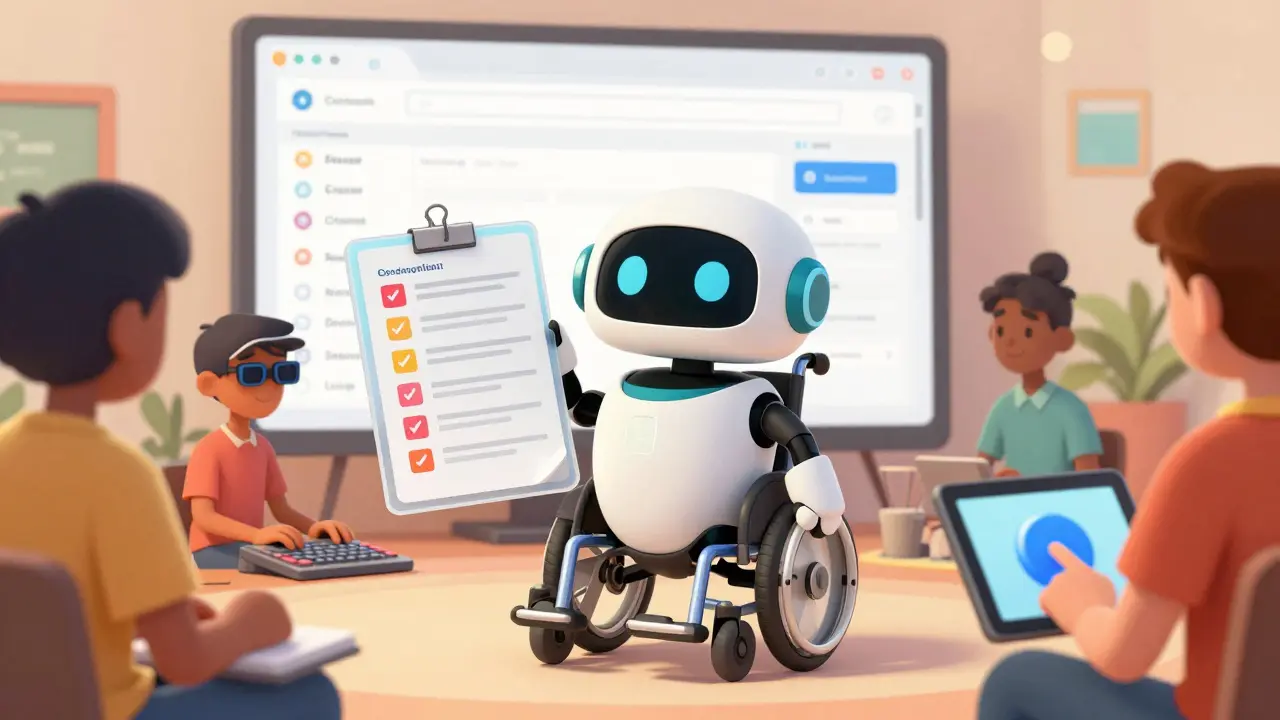
If you build an online course, you need more than just a website that shrinks. You need specific layouts and patterns that support learning behaviors. Let’s look at how to structure your content so it works everywhere.
The Core Principles of Responsive Learning Interfaces
Building for mobile first is no longer optional. More than half of all online learning traffic now comes from smartphones and tablets. If your design breaks on these devices, you are losing half your audience. The goal is fluidity. Your layout should flow like water, filling the available space regardless of the container.
Start with flexible grids. Instead of fixed pixel widths, use relative units like percentages or viewport units (vw/vh). This ensures that your content blocks resize proportionally. For example, a sidebar that takes up 30% of the screen on a desktop might stack vertically at 100% width on a mobile device. This prevents horizontal scrolling, which is the enemy of readability.
Typography plays a huge role here. On small screens, long lines of text become hard to track. Aim for line lengths between 45 and 75 characters. Use responsive font sizes that scale down gracefully but never go below 16 pixels for body text. This keeps reading comfortable without forcing users to squint.
- Fluid Grids: Use percentage-based widths for containers.
- Flexible Images: Set max-width to 100% so images never overflow their containers.
- Media Queries: Apply specific CSS rules at defined breakpoints (e.g., 768px for tablets, 320px for phones).
Essential Layout Patterns for Course Content
Not all layouts work equally well for education. You need structures that guide the eye and reduce cognitive load. Here are the most effective patterns for online courses.
The Single-Column Flow
For video lectures and reading materials, a single-column layout is often the best choice. It mimics the natural reading path of a book. On mobile, this eliminates distractions. On desktop, you can center the column to keep the line length optimal. This pattern works exceptionally well for narrative content where sequential consumption is key.
The Split-Screen Dashboard
Many learning management systems (LMS) use a split-screen approach. One side holds the navigation menu or course outline, while the other displays the active content. On desktop, this is efficient. On mobile, however, it consumes too much precious screen real estate. The solution? Convert the sidebar into a collapsible drawer or a bottom navigation bar. This keeps the main content prominent while keeping navigation accessible.
The Card-Based Module Structure
Cards are versatile containers for discrete pieces of information. Each card can represent a lesson, a quiz, or a resource. They stack neatly on mobile and arrange in a grid on desktop. This pattern helps learners break down large courses into manageable chunks. Ensure each card has a clear call-to-action (CTA) and sufficient touch targets for fingers.
| Pattern | Best For | Mobile Adaptation | User Experience Impact |
|---|---|---|---|
| Single-Column | Reading & Video | Natural fit | High focus, low distraction |
| Split-Screen | Dashboards & Reference | Collapsible sidebar | Efficient navigation, potential clutter |
| Card Grid | Course Overviews | Vertical stacking | Clear hierarchy, easy scanning |
| Tabs/Accordions | Dense Information | Stacked accordions | Space-saving, requires interaction |

Accessibility as a Non-Negotiable Foundation
Responsive design and accessibility go hand in hand. A site that is not accessible is not truly responsive because it fails to respond to the needs of all users. According to the Web Content Accessibility Guidelines (WCAG), your interface must be perceivable, operable, understandable, and robust.
Color contrast is critical. Many students view their courses outdoors or in poor lighting. Ensure your text has a contrast ratio of at least 4.5:1 against the background. Do not rely solely on color to convey information. For example, do not use only red to indicate an error; add an icon or text label.
Keyboard navigation is another vital component. Not everyone uses a mouse or a touchscreen. Ensure that all interactive elements-buttons, links, form fields-are reachable via the Tab key. Focus states must be visible. If a user cannot see where they are on the page, they will get lost.
Screen readers rely on semantic HTML. Use proper heading tags (H1-H6) to structure your content logically. Avoid using divs for headings. Alt text for images must be descriptive but concise. This allows visually impaired learners to understand visual content through audio descriptions.
- Touch Targets: Make buttons at least 44x44 pixels to accommodate finger taps.
- Font Scaling: Respect user browser settings for larger text.
- ARIA Labels: Use Accessible Rich Internet Applications attributes for complex widgets.
Optimizing Media for Different Bandwidths
Video is the backbone of modern online courses. However, streaming high-definition video on a mobile network can be costly and slow. You need strategies to handle media efficiently.
Use adaptive bitrate streaming. This technology adjusts the video quality based on the user’s current internet speed. If bandwidth drops, the quality lowers automatically to prevent buffering. Services like HLS (HTTP Live Streaming) and DASH (Dynamic Adaptive Streaming over HTTP) make this possible.
Provide transcripts for all video content. This serves two purposes. First, it aids accessibility for deaf or hard-of-hearing students. Second, it allows users to scan for information quickly when they are in a noisy environment or cannot play audio. Transcripts also improve SEO, helping your course content rank higher in search results.
For images, use modern formats like WebP or AVIF. These offer superior compression compared to JPEG or PNG, resulting in faster load times without significant quality loss. Implement lazy loading for images below the fold. This defers loading until the user scrolls near them, saving initial bandwidth.
Interactive Elements and Touch Gestures
Online courses often include quizzes, drag-and-drop exercises, and simulations. These interactions must feel natural on touchscreens. Hover states do not exist on mobile devices. Therefore, avoid hiding essential controls behind hover effects. Use tap or click events instead.
Consider gesture-based navigation. Swipe gestures can be intuitive for moving between slides or lessons. However, ensure that these gestures do not conflict with browser default behaviors, such as back navigation. Test extensively on actual devices to catch unintended interactions.
Feedback is crucial. When a user submits an answer, provide immediate visual feedback. A green checkmark for correct answers and a red X for incorrect ones helps reinforce learning. Keep animations subtle and purposeful. Excessive motion can cause dizziness or distract from the content.
Testing Your Responsive Implementation
You cannot rely solely on browser developer tools to test responsiveness. Simulators are helpful, but they do not replicate the true performance of mobile devices. You need real-world testing.
Use tools like Google Lighthouse to audit your pages. It provides scores for performance, accessibility, and best practices. Pay attention to the 'Time to Interactive' metric. If it takes too long for the page to become usable, students will leave.
Test on a variety of devices. Check iOS and Android versions. Look at different screen sizes, from compact phones to large tablets. Verify that forms are easy to fill out on virtual keyboards. Ensure that date pickers and dropdown menus function correctly on touch interfaces.
Conduct usability testing with real users. Watch how they navigate your course. Note where they struggle or hesitate. Their feedback is invaluable for refining the user experience.
What is the difference between responsive and adaptive web design?
Responsive web design uses fluid grids and media queries to create a seamless experience across all screen sizes. Adaptive web design creates specific layouts for predefined screen sizes (like tablet, phone, desktop) and serves the appropriate version. Responsive is generally preferred for its flexibility and future-proofing.
Why is mobile-first design important for online courses?
Mobile-first design forces you to prioritize essential content and features due to limited screen space. This results in cleaner, more focused interfaces. Since mobile usage dominates, starting with mobile ensures the majority of your users have a great experience, which can then be enhanced for larger screens.
How do I make my course videos accessible?
Provide closed captions for hearing-impaired users and full transcripts for those who prefer reading or are in noisy environments. Ensure video players have keyboard controls and allow users to adjust playback speed. Use high-contrast colors for subtitles and ensure they do not cover important visual information.
What are common mistakes in responsive e-learning design?
Common mistakes include using small font sizes, relying on hover states for critical actions, ignoring touch target sizes, and failing to test on real devices. Another major error is neglecting accessibility standards, which excludes a significant portion of potential learners.
Should I use tabs or accordions for dense content?
It depends on the context. Tabs are good for comparing similar categories of information side-by-side on desktop. Accordions are better for mobile as they stack vertically and save vertical space. However, both hide content, so use them sparingly for secondary information rather than primary learning objectives.