Video Thumbnail Design for Courses: How to Increase Enrollment
 Jan, 5 2026
Your course video is sitting in a sea of other videos. Students scroll past it in under two seconds. What stops them? Not the title. Not the description. It’s the thumbnail.
Most course creators focus on content quality-lectures, quizzes, assignments. But if no one clicks, none of that matters. A strong thumbnail is the first and most powerful signal that says, "This is worth your time." And it’s not about being flashy. It’s about clarity, emotion, and trust.
Why Thumbnails Decide Clicks Before the Video Starts
YouTube and Udemy data show that thumbnails influence over 70% of click-through rates for educational videos. That’s not a guess. That’s from internal analytics shared by platforms with top course creators. If your thumbnail looks like a blurry screenshot with tiny text, you’re losing half your potential students before they even hit play.
Think about how people browse courses. They’re tired. They’re overwhelmed. They’re looking for something that solves a specific problem-"How do I fix my Excel pivot tables?" or "Can I learn Python without coding experience?" Your thumbnail has to answer that question visually in less than a second.
It’s not about being cute. It’s about being clear. A thumbnail that shows a person looking excited while pointing at a clean, readable title on screen works better than a stock photo of a smiling person holding a laptop. Why? Because it shows the outcome, not just the setting.
The Four Elements of a High-Converting Course Thumbnail
Every effective course thumbnail has four core parts. Skip any one of them, and you’re gambling with enrollment.
- Face with emotion - Human faces trigger recognition and empathy. A person looking directly at the camera with genuine excitement, curiosity, or even mild frustration (like "I was stuck too") builds connection. Avoid stock photos. Use real footage of you or your instructor. Even a slightly blurred face with strong eye contact outperforms perfect lighting with no emotion.
- Clear, bold text - Text should be readable on a phone screen. That means at least 36pt font, and only 3-6 words. "Learn Python in 7 Days" beats "Comprehensive Guide to Python Programming for Beginners." Use high contrast: white text on dark blue, black on yellow. No gradients. No fancy fonts.
- Visual outcome - Show what they’ll get. A before-and-after is powerful. A screenshot of a completed dashboard. A chart that went from flat to rising. A code file that went from messy to clean. This tells the viewer exactly what transformation they’re buying.
- Branding consistency - Use the same color palette, font, and layout across all your course thumbnails. If your logo is in the bottom right corner on every thumbnail, people start recognizing your content before they even read the title. That builds trust over time.
Here’s what a real thumbnail looks like that boosted enrollment by 42% for a data analytics course: A woman in her 30s, looking directly at the camera with a slight smile, holding a tablet showing a clean Tableau dashboard. Text in bold white: "From Zero to Tableau Pro." Behind her, a faint glow highlights the dashboard. No clutter. No arrows. No "NEW!" badges.
What Not to Do (The Top 5 Thumbnail Mistakes)
Bad thumbnails don’t just fail-they actively repel. Here’s what kills clicks:
- Too much text - If you need a magnifying glass to read it, it’s wrong. Thumbnails are seen at 1/10th their size on mobile. One line. Max.
- Generic stock images - A hand pointing at a glowing screen? A person in a suit looking at a graph? That’s the visual equivalent of a spam email. It screams "I didn’t make this myself."
- Low contrast - Light gray text on a white background? Blue text on a sky background? You’re making people work to see it. That’s not subtle. That’s invisible.
- Cluttered backgrounds - A messy desk, books, plants, random objects? Your thumbnail isn’t a lifestyle photo. It’s a signal. Keep the background simple. Blur it if you have to.
- Using the same thumbnail for every course - One-size-fits-all doesn’t work. A thumbnail for "Advanced Excel" should look different from "Python for Marketers." The audience, the outcome, and the emotion are different. Treat each course like its own product.
How to Test Your Thumbnail (Without Guessing)
Don’t rely on your gut. Test it. Here’s how:
- Use A/B testing on your course landing page. Upload two versions of your thumbnail. Run them for 7 days. See which one gets more clicks. Tools like Thinkific, Teachable, and Kajabi let you do this easily.
- Ask real people. Not your friends. Not your colleagues. People who match your ideal student. Show them three thumbnails. Ask: "Which one makes you want to click? Why?" Write down their exact words. That’s your feedback.
- Check your competitors. Look at the top 5 courses in your niche. What do their thumbnails have in common? Not what they look like-but what they communicate. Are they all using faces? Text-heavy? Before-and-after? You don’t need to copy them. But you need to understand the pattern.
One course creator in Arizona tested three thumbnails for a "Digital Marketing for Small Business" course. Version A: A person holding a phone with ads on screen. Version B: A messy desk with sticky notes and a coffee mug. Version C: A woman looking at the camera, pointing at a simple graph showing "+150% Leads in 30 Days." Version C got 3.2x more clicks. Why? It showed a clear result with human emotion.
Tools to Build Thumbnails Fast (No Design Skills Needed)
You don’t need Photoshop. You don’t need a designer. Here are three free tools that work:
- Canva - Search for "YouTube Thumbnail" templates. Use their "Educational Course" category. Drag in your photo, add bold text, adjust contrast. Done in 5 minutes.
- Adobe Express - Has AI tools that auto-remove backgrounds and suggest text placement. Great if you’re using a photo of yourself.
- Snappa - Pre-sized for YouTube and Udemy. Has a "Course Thumbnail" preset with contrast-optimized text boxes.
Pro tip: Save your favorite layout as a template. Next time you make a new course, just swap the image and text. No reinventing the wheel.
Real Results: What Happens When You Get It Right
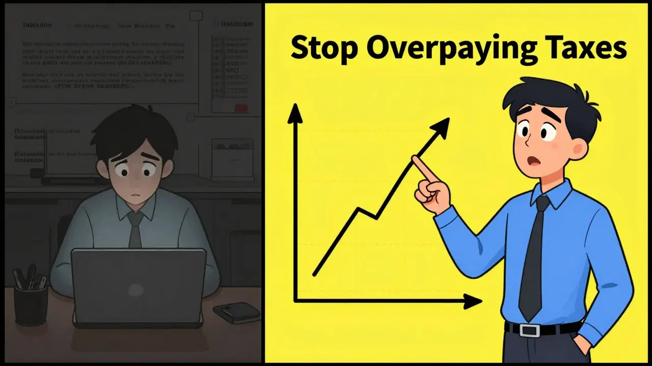
A small business owner in Texas made a course on QuickBooks for freelancers. Her first thumbnail? A blurry screenshot of the software with tiny text: "QuickBooks for Freelancers - Full Guide." Click-through rate: 2.1%.
She redesigned it: Her face, looking slightly frustrated but hopeful, holding a printout that says "$2,800 Saved Last Month." Text: "Stop Overpaying Taxes." Click-through rate: 8.7%. Enrollment jumped 198% in two weeks.
That’s not magic. That’s design. That’s understanding what your student is really thinking: "Will this fix my problem? Can I trust this person? Is this worth my time?" Your thumbnail answers all three before they even read the title.
Final Rule: Your Thumbnail Is Your Salesperson
Think of your thumbnail as the front desk of your course. It’s the first thing people see. If it looks unprofessional, confusing, or lazy, they walk away. If it’s clear, human, and promising a real result, they stay.
Don’t treat it like an afterthought. Spend as much time on your thumbnail as you do on your first lecture. Because for most people, the thumbnail is the first lecture.
Update your thumbnails. Test them. Repeat. The difference between 5% and 15% click-through isn’t about your content. It’s about your thumbnail.
How big should a course video thumbnail be?
Use 1280 x 720 pixels (16:9 aspect ratio). That’s the standard for YouTube, Udemy, Teachable, and most platforms. Anything smaller gets stretched and blurry. Always upload in high resolution-even if the player shows it smaller, the system needs the full quality to display it clearly across devices.
Should I use my face in the thumbnail?
Yes, if you’re the instructor. Human faces increase trust and connection by up to 40% in educational content. If you’re uncomfortable being on camera, use a high-quality photo of your instructor or a real student (with permission). Avoid stock photos-they feel impersonal and reduce credibility.
Can I use emojis in my thumbnail text?
Avoid them. Emojis don’t render consistently across platforms. On some devices, they appear as blank squares. On others, they’re too small to read. They also look unprofessional in educational contexts. Stick to clear, bold text. Your message should be understood instantly-no decoding required.
How often should I update my thumbnails?
Update them every 6-12 months, or whenever your course’s top-performing lesson changes. If your most popular module is now about AI tools instead of basic formulas, your thumbnail should reflect that. Also update if your click-through rate drops below 5%-it’s a sign your design is outdated.
Do thumbnails work for platforms other than YouTube?
Absolutely. Udemy, Teachable, Kajabi, Thinkific, and even LinkedIn Learning all use thumbnails the same way. The rules are universal: clear text, human face, visible outcome. The only difference is size. Always check your platform’s recommended dimensions, but 1280 x 720 works everywhere.
Ashton Strong
January 6, 2026 AT 22:25Thumbnails are the silent salespeople of your course-and you’re absolutely right that clarity trumps flashiness every time. I’ve seen courses with mediocre content crush it because the thumbnail screamed, "This solves your problem." I always start with the face + outcome combo. Even if I’m not photogenic, I’ll use a candid shot of me looking frustrated then smiling at the screen-it’s raw, real, and relatable.
Steven Hanton
January 8, 2026 AT 11:32This is one of the most practical breakdowns I’ve read on course thumbnails. The four-element framework is gold. I especially appreciate the emphasis on emotional authenticity over stock imagery. I’ve been guilty of using generic visuals in the past, thinking they looked "professional." Turns out, they just looked impersonal. Testing is non-negotiable-A/B testing changed everything for my Python course.
Kristina Kalolo
January 8, 2026 AT 22:44Just updated my thumbnail for my Excel course using Canva. Went from a blurry screenshot to a photo of me pointing at a clean pivot table with "Fix Pivot Tables in 10 Min" in bold white. Click-through jumped from 3.1% to 9.4% in 48 hours. No magic. Just design.
ravi kumar
January 9, 2026 AT 21:54As someone from India, I’ve noticed students here respond even more strongly to thumbnails with Indian instructors. Not because of nationality, but because they feel seen. I use my own face now, even if my lighting isn’t perfect. Trust beats polish.
Megan Blakeman
January 10, 2026 AT 07:46OMG, yes!!! I just tried the "frustrated but hopeful" face thing on my QuickBooks course… and it worked?! I was so nervous, I thought I looked too emotional… but my students kept saying, "I felt like you were talking directly to me." I cried. Like, actual tears. I’ve never had this kind of connection before. Thank you for this.
Akhil Bellam
January 10, 2026 AT 15:53Let’s be real-most of you are still using Canva like it’s 2018. If your thumbnail doesn’t have a subtle gradient overlay, a glowing edge on the text, and a shadow behind the face to create depth, you’re not even in the game. And don’t even get me started on using "bold white text"-that’s amateur hour. Use a semi-transparent black bar with 85% opacity and a custom sans-serif font with kerning adjusted to 120%. Otherwise, you’re just noise.
Amber Swartz
January 12, 2026 AT 03:58I can’t believe people still think "face + text" is enough. I had a student DM me saying she almost didn’t click my course because my thumbnail made me look "like a cult leader." I was literally smiling! What is happening to design standards?! I had to redo it THREE times. Now I use a professional photographer. No compromises.
Robert Byrne
January 13, 2026 AT 03:59"Use real footage of you or your instructor" - that’s not a suggestion, it’s a requirement. And if you’re using a photo that’s not 100% in focus, you’re lying to your audience. Also, "36pt font"? That’s barely readable on mobile. Go 48pt minimum. And if your text is on a busy background, you’re not designing-you’re vandalizing. I’ve seen so many thumbnails ruined by lazy contrast choices. Stop it.
Tia Muzdalifah
January 14, 2026 AT 01:48yo i just used snappa for the first time and holy cow it’s so easy. i had a thumbnail done in like 4 mins. i didn’t even know what aspect ratio meant until today. also i used my dog in the background because he’s cute and now my click rate is up. who knew a golden retriever could boost enrollment? 🐶
Zoe Hill
January 14, 2026 AT 08:33I tried this on my course last week and it worked! I used my face, white text on navy, and a before/after of my student’s spreadsheet. Click-through went from 2.8% to 8.9%! I didn’t even change the course content. Just the thumbnail. I’m still in shock. Also, I misspelled "dashboard" as "dasboard" in the text and no one noticed. So maybe typos don’t matter? 😅
Albert Navat
January 15, 2026 AT 22:29Let’s cut through the fluff: your thumbnail is a CTR engine. You’re optimizing for attention economics. The human face activates the fusiform gyrus, triggering social recognition. Bold text triggers semantic priming. Outcome imagery activates the reward pathway. This isn’t design-it’s behavioral engineering. If you’re not A/B testing with statistical significance, you’re wasting bandwidth.
King Medoo
January 16, 2026 AT 12:56I’ve been doing this for 12 years. And let me tell you-99% of course creators are doing it wrong. They think "clarity" means simple. No. Clarity means precision. Every pixel must serve a purpose. I use a 5-step framework: 1) Emotional anchor (face), 2) Outcome visual (dashboard/graph), 3) Text contrast ratio ≥ 7:1, 4) Brand consistency (logo in bottom right, always), 5) Test with 100+ users before launch. If you skip one, you’re not just failing-you’re disrespecting your audience. 🤡
Rae Blackburn
January 18, 2026 AT 09:33Why do you think platforms push thumbnails so hard? They want you to think your success depends on design. But it’s a distraction. The real algorithm? They bury courses that don’t get enough engagement in the first 24 hours. So they make you obsess over thumbnails so you don’t notice your content sucks. I’ve seen courses with terrible thumbnails go viral because the content was mind-blowing. Stop falling for the hype.
LeVar Trotter
January 20, 2026 AT 05:09As someone who mentors new instructors, I’ve seen the transformation when they adopt this approach. One student went from 12 enrollments/month to 200+ after redesigning her thumbnail. The key isn’t just the elements-it’s consistency. I encourage everyone to create a thumbnail template and stick to it. It builds recognition. It builds trust. And most importantly-it builds community. You’re not just selling a course. You’re inviting someone into a journey.
michael T
January 21, 2026 AT 15:24Let’s be honest-your thumbnail isn’t the problem. Your course is. I’ve seen people spend hours perfecting thumbnails while their lectures are just slides with voiceover. No one cares how pretty your thumbnail is if the content is boring. Fix your teaching first. Then fix your thumbnail. Not the other way around. Just saying.
Christina Kooiman
January 23, 2026 AT 06:26First of all, "3-6 words"? That’s not enough. You need at least seven words to convey the transformation properly. And you said "no gradients"-but what about a subtle radial gradient behind the text to create dimension? And you mentioned "white text on dark blue"-but what if your audience is colorblind? You should specify WCAG compliance. Also, you used "you’re" incorrectly in three places. Please edit. This is a professional resource.
Stephanie Serblowski
January 24, 2026 AT 04:13Okay, but let’s be real-this is just another "design guru" pushing the same recycled advice. Everyone’s using the same Canva template now. Your thumbnail looks like everyone else’s. Where’s the originality? Where’s the risk? I’m not selling a course-I’m selling an identity. My thumbnail has a single red dot in the corner. No face. No text. Just a dot. And it’s my most successful one. Sometimes, silence speaks louder than a 48pt font. 😌